1/7
2/7
3/7
4/7
5/7
6/7
7/7
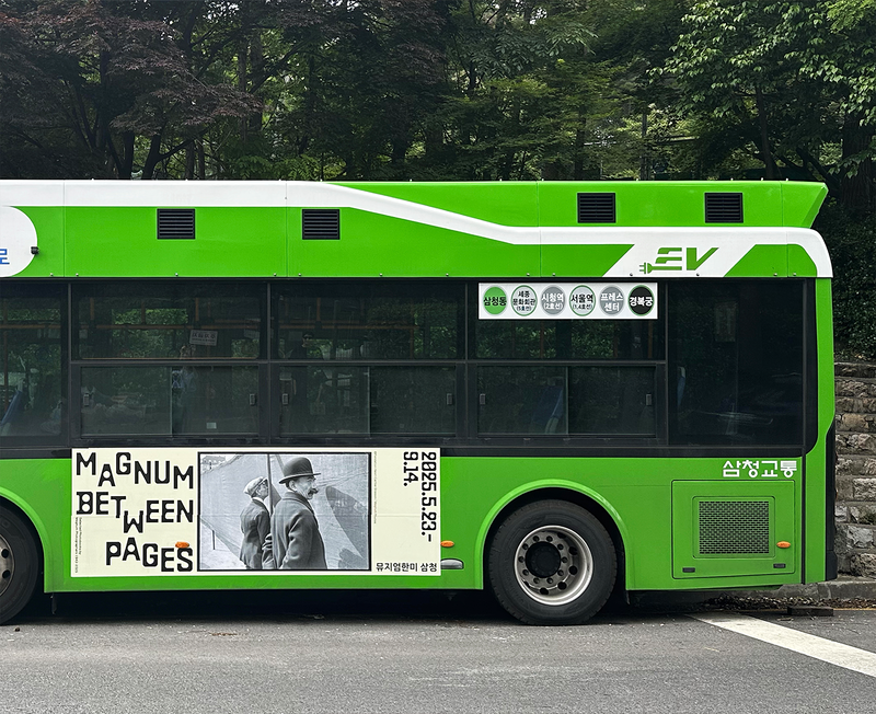
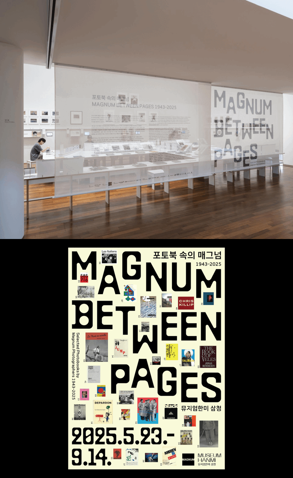
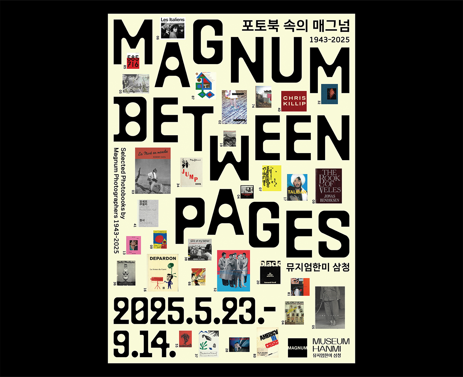
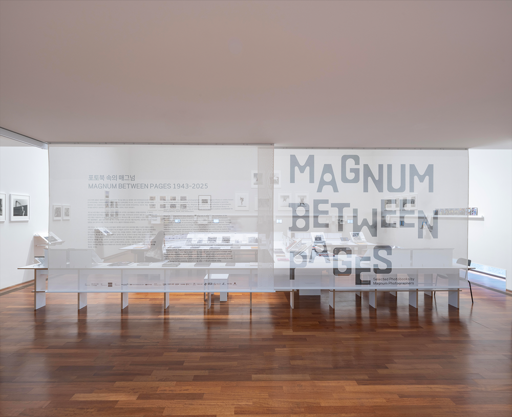
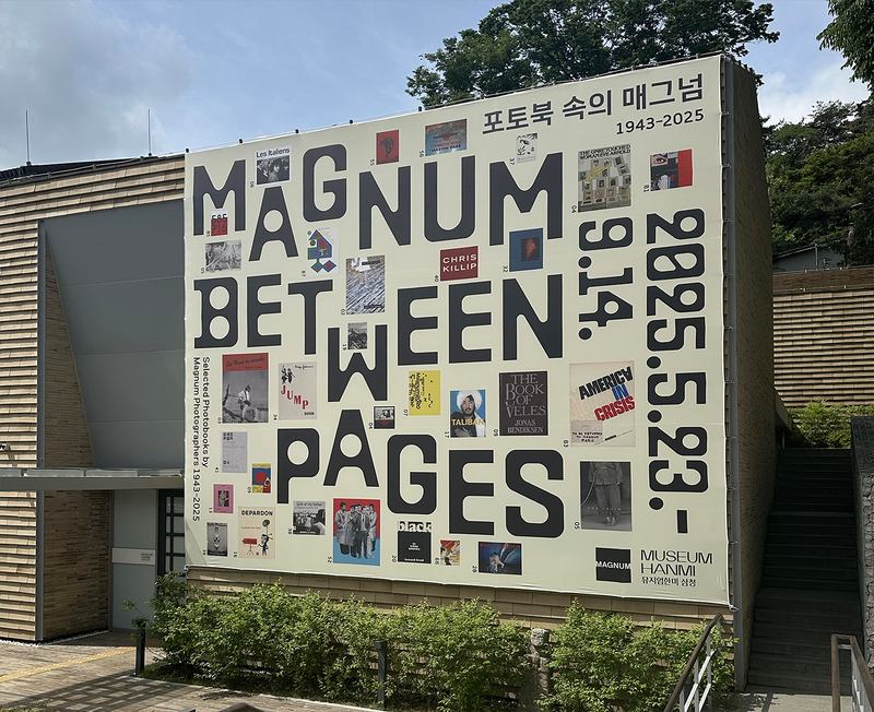
《포토북 속의 매그넘 1943–2025》 전시 브랜드 디자인
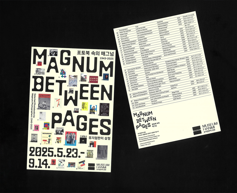
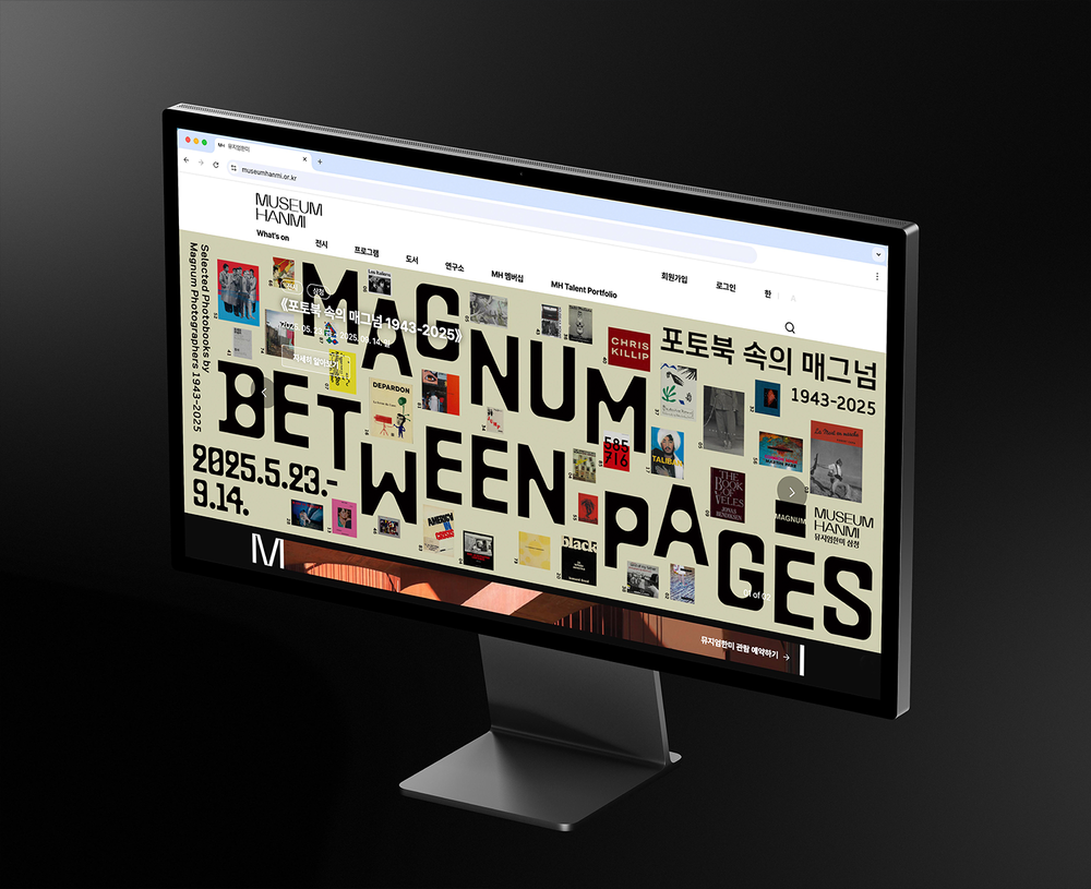
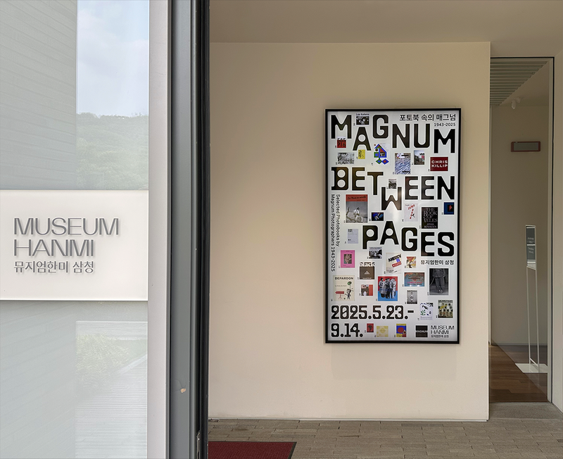
뮤지엄한미가 개최한 매그넘 포토스(Magnum Photos) 포토북 전시를 위해 제작한 포스터와 어플리케이션 디자인입니다. 책을 위에서 내려다본 형태를 반영한 서체와 전시 포토북 이미지를 결합해, 서로 다른 시대와 주제가 타이포그래피와 함께 하나의 시각적 서사로 이어지도록 구성했습니다.
본 작업은 김지현 학예연구관 총괄 아래 정다운 디자이너와 협업하여 진행했습니다.
총괄: 최봉림
기획: 김선영 학예연구관, 매그넘 포토스, 안드레아 홀즈헤르, 마틴 파, 천경우
진행: 김지현 학예연구관, 정지윤 학예연구사, 최은정 학예연구사, 김소정 인턴
디자인: 정다슬, 정다운
교육: 박민호 학예연구사, 이화연 교육연구원
공간디자인: COM
©museumhanmi
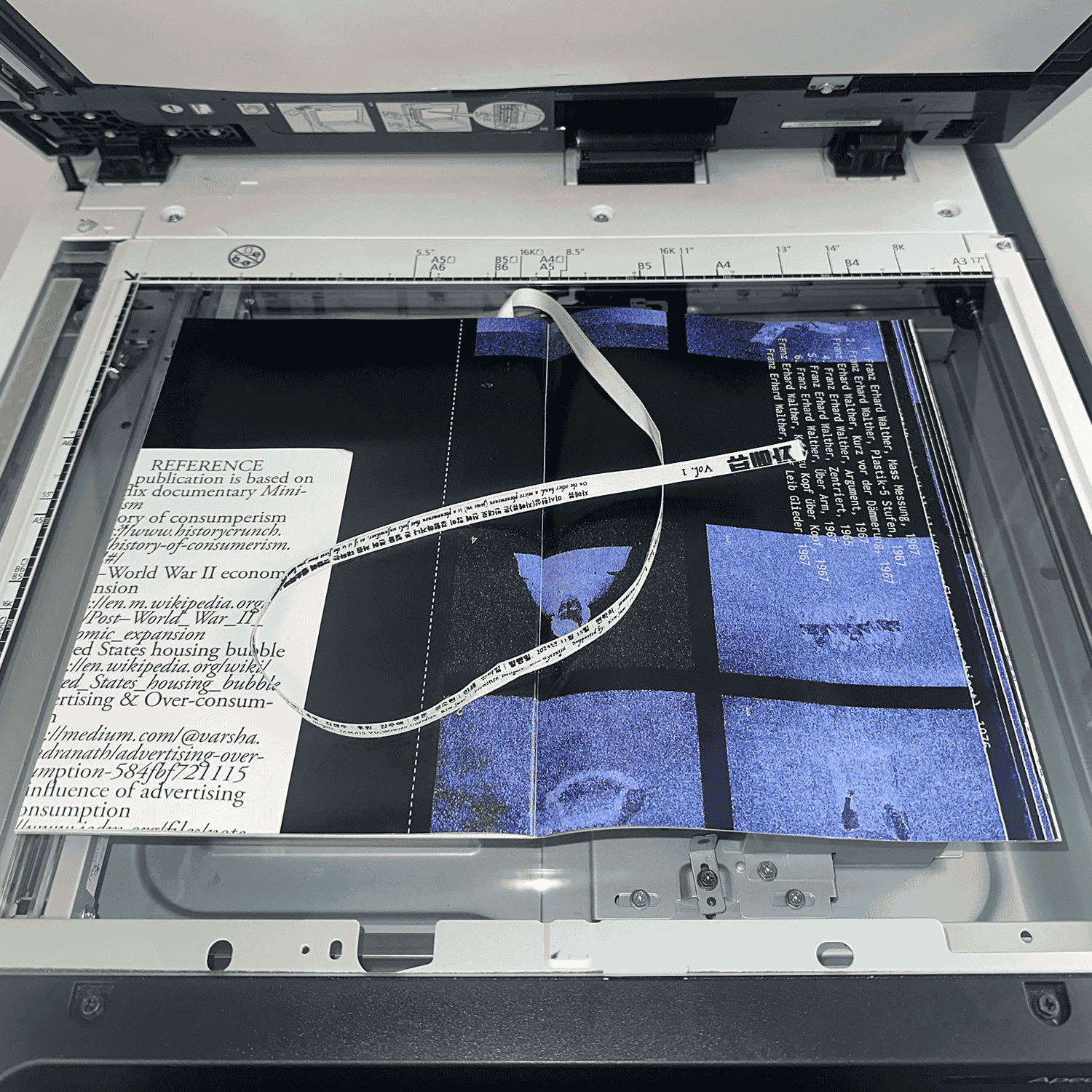
잡지 『자메뷰』 pp. 36-39 그래픽 디자인
2024
1/5
2/5
3/5
4/5
5/5
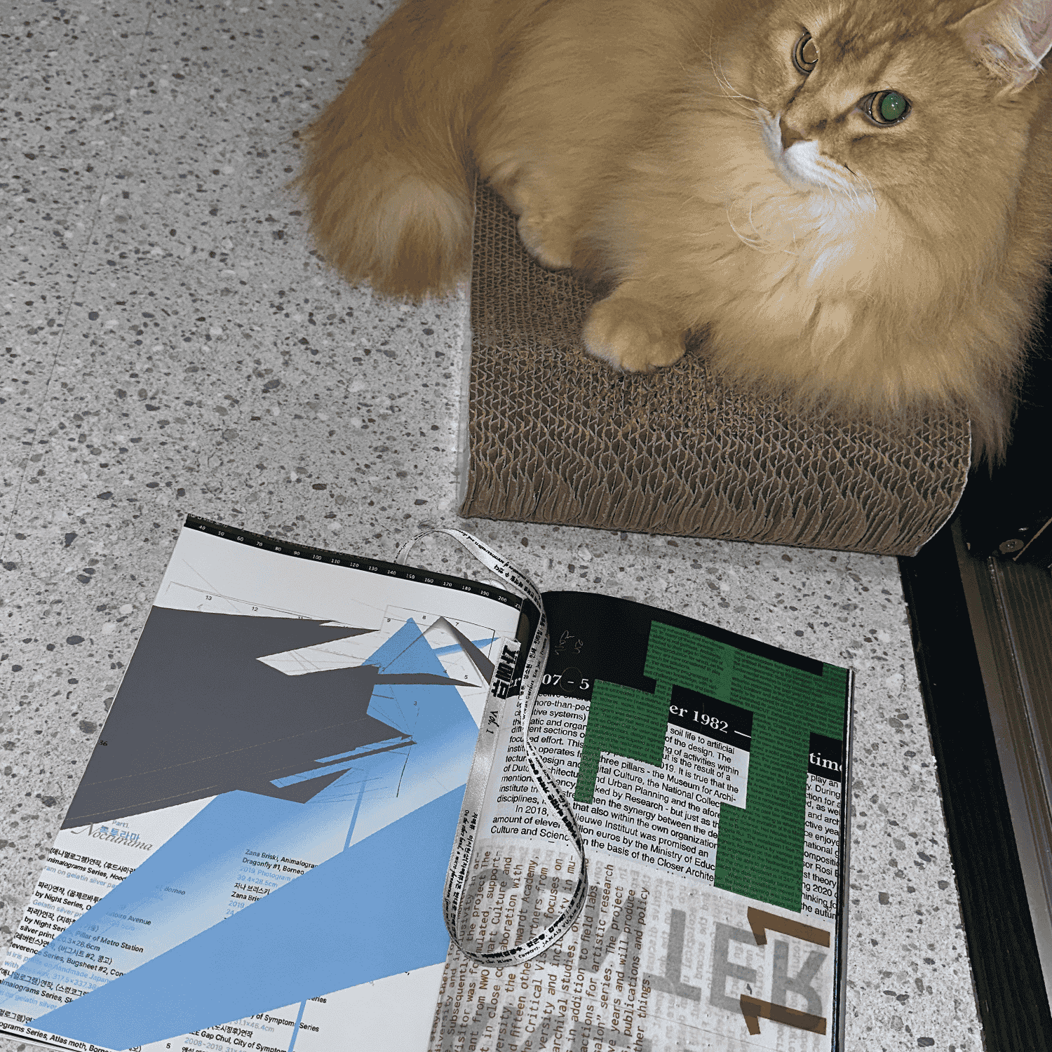
잡지 『자메뷰』 pp. 36-39 그래픽 디자인
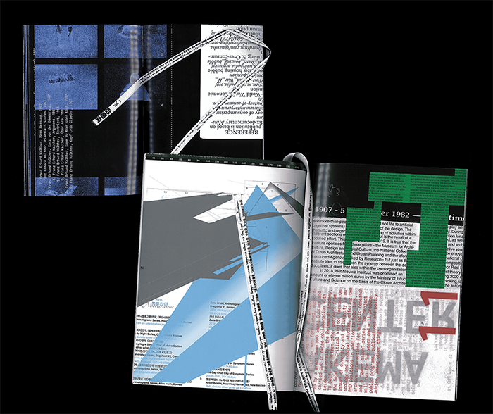
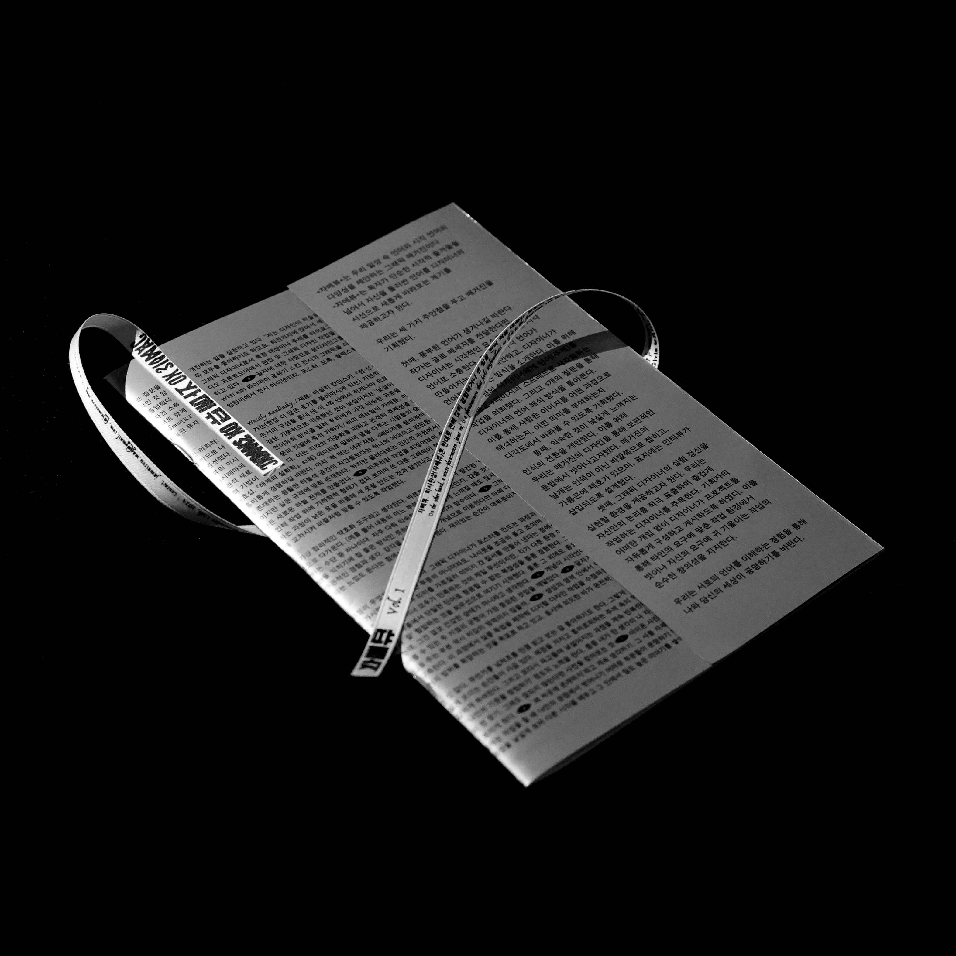
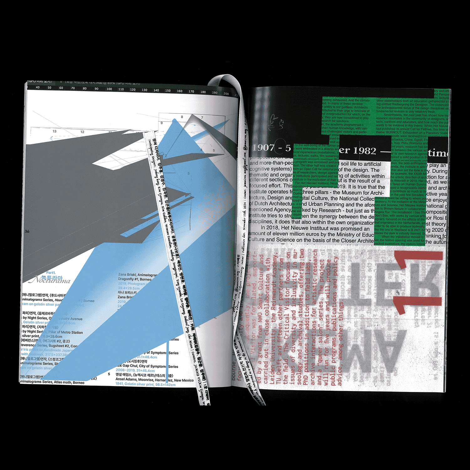
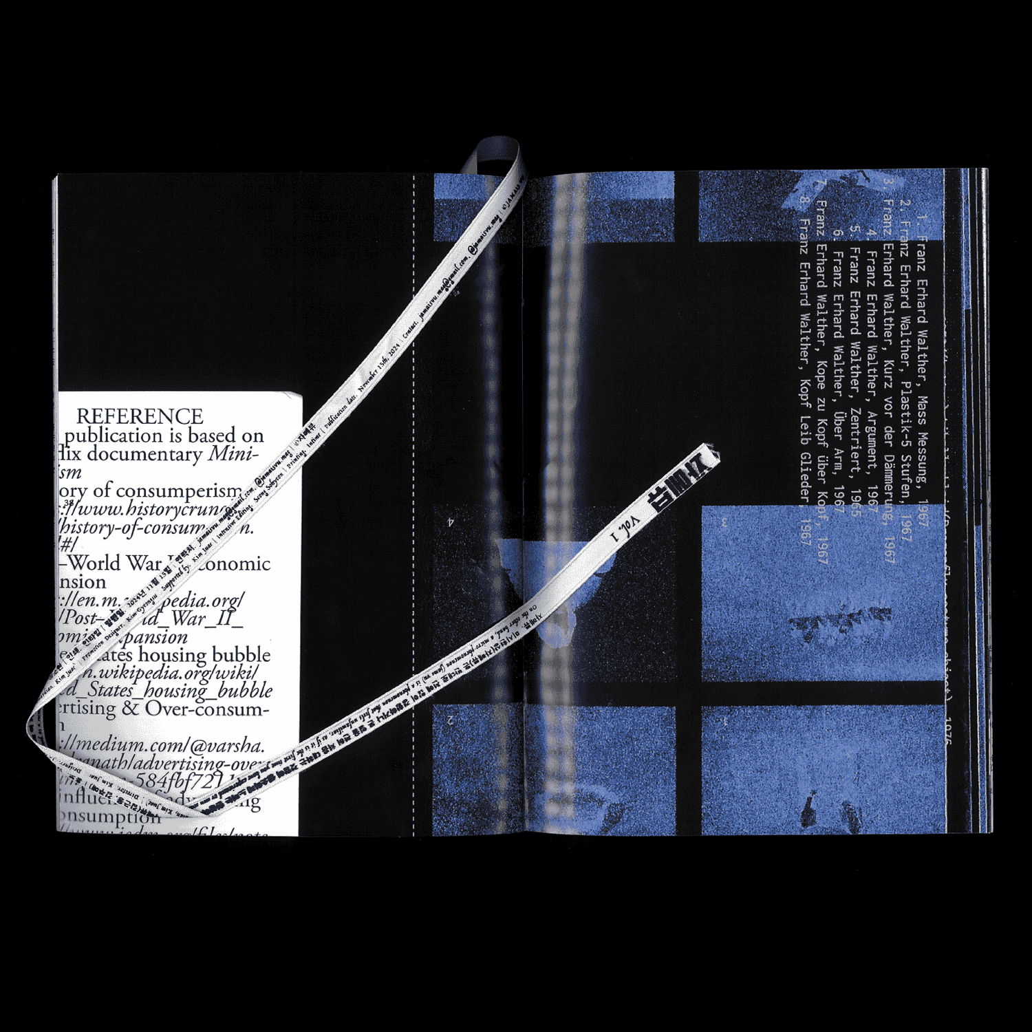
『자메뷰』는 익숙한 언어와 이미지를 낯설게 바라보도록 제안하는 책으로, 단순한 시각적 즐거움을 넘어 디자이너의 시선에서 언어를 새롭게 읽고 경험할 기회를 제공합니다. 이번 참여를 통해 텍스트와 이미지가 교차하는 지점에서 ‘낯섦’과 ‘새로운 읽기’라는 기획 의도를 그래픽 작업으로 확장했습니다.
참여 디자이너
강주홍, 김경수, 김국한, 김근용, 나보콩, 배성진, 양현호, 이가영, 정다슬, 최미선
기획: 김경수, 김근용, 김주애
1호 디렉터: 김주애
디자인: 김주애, 김근용
로고: 김근용
윤문: 성소현
제작 도움: 김선민, 김규연
Mood Sampler Direction & Arrangement
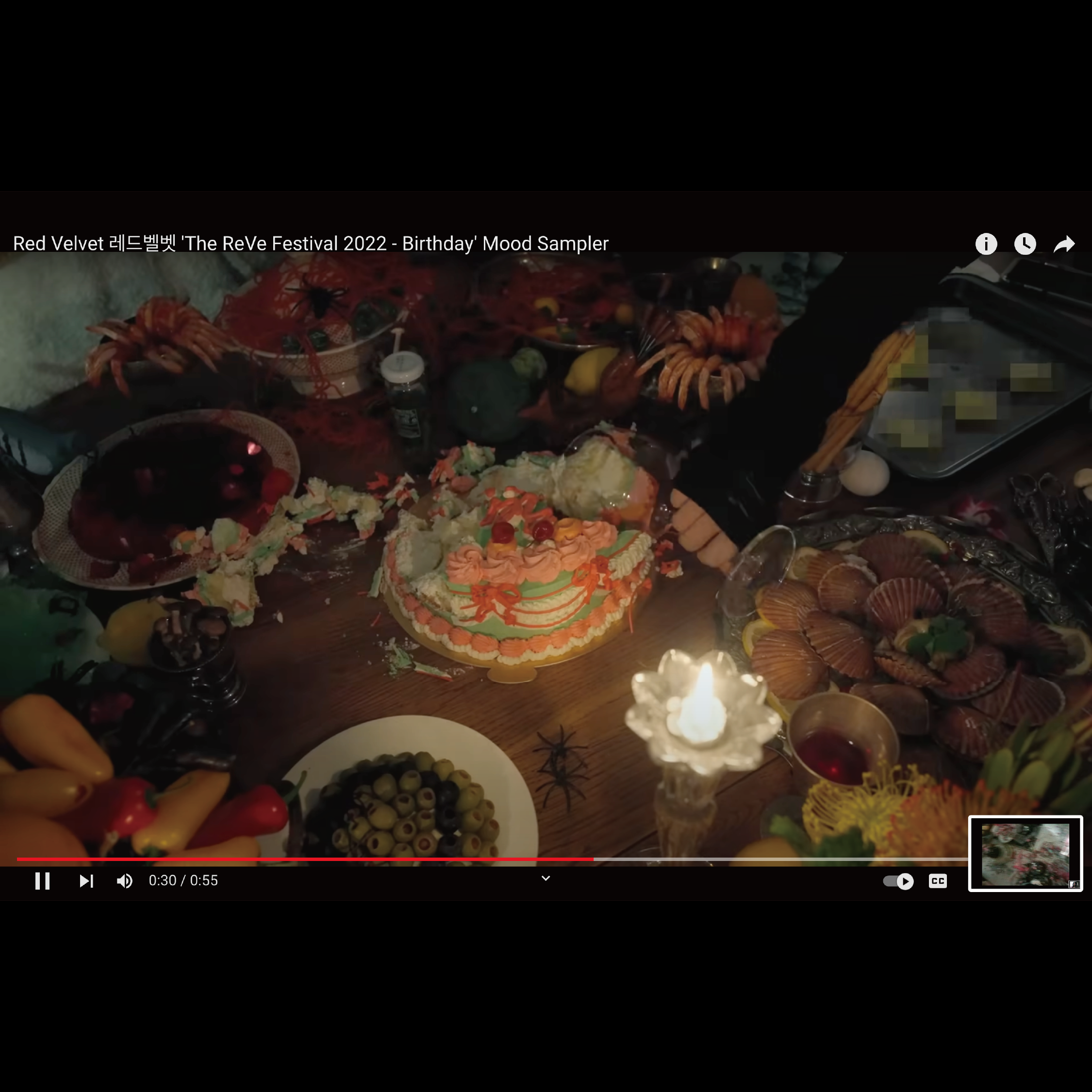
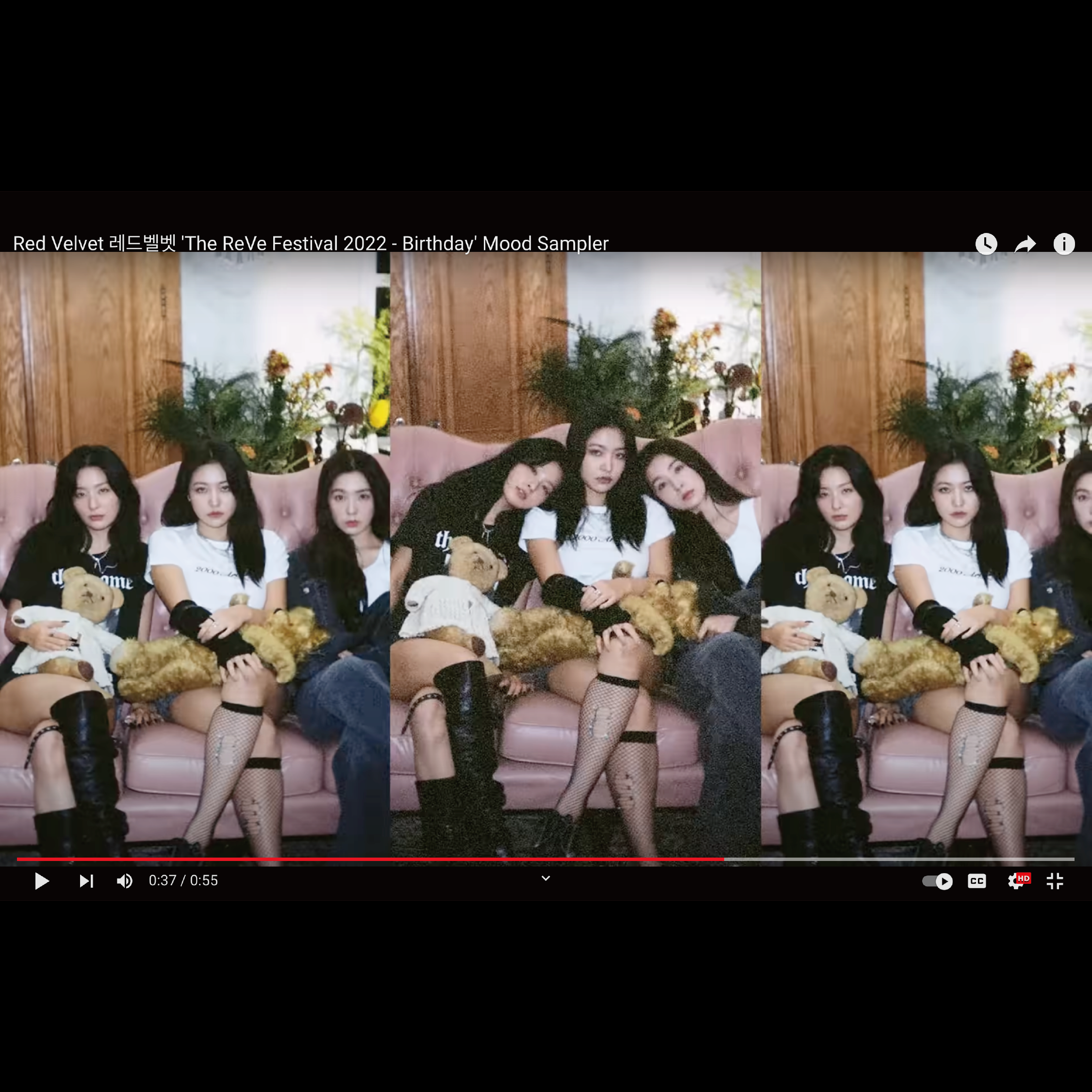
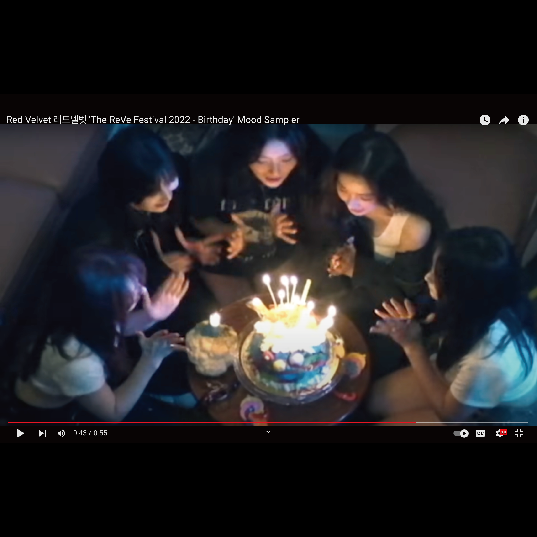
'The ReVe Festival 2022 – Birthday’
SM ENTERTAINMENT
2022
1/5
2/5
3/5
4/5
Mood Sampler Direction & Arrangement 'The ReVe Festival 2022 – Birthday’, SM ENTERTAINMENT
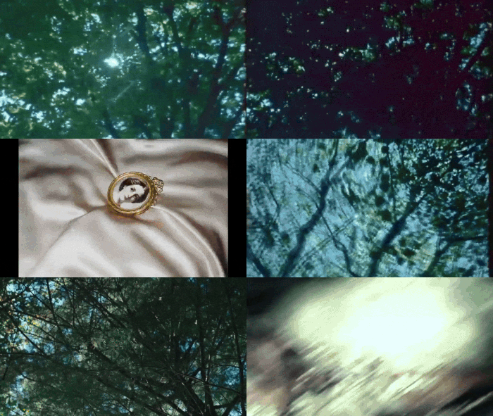
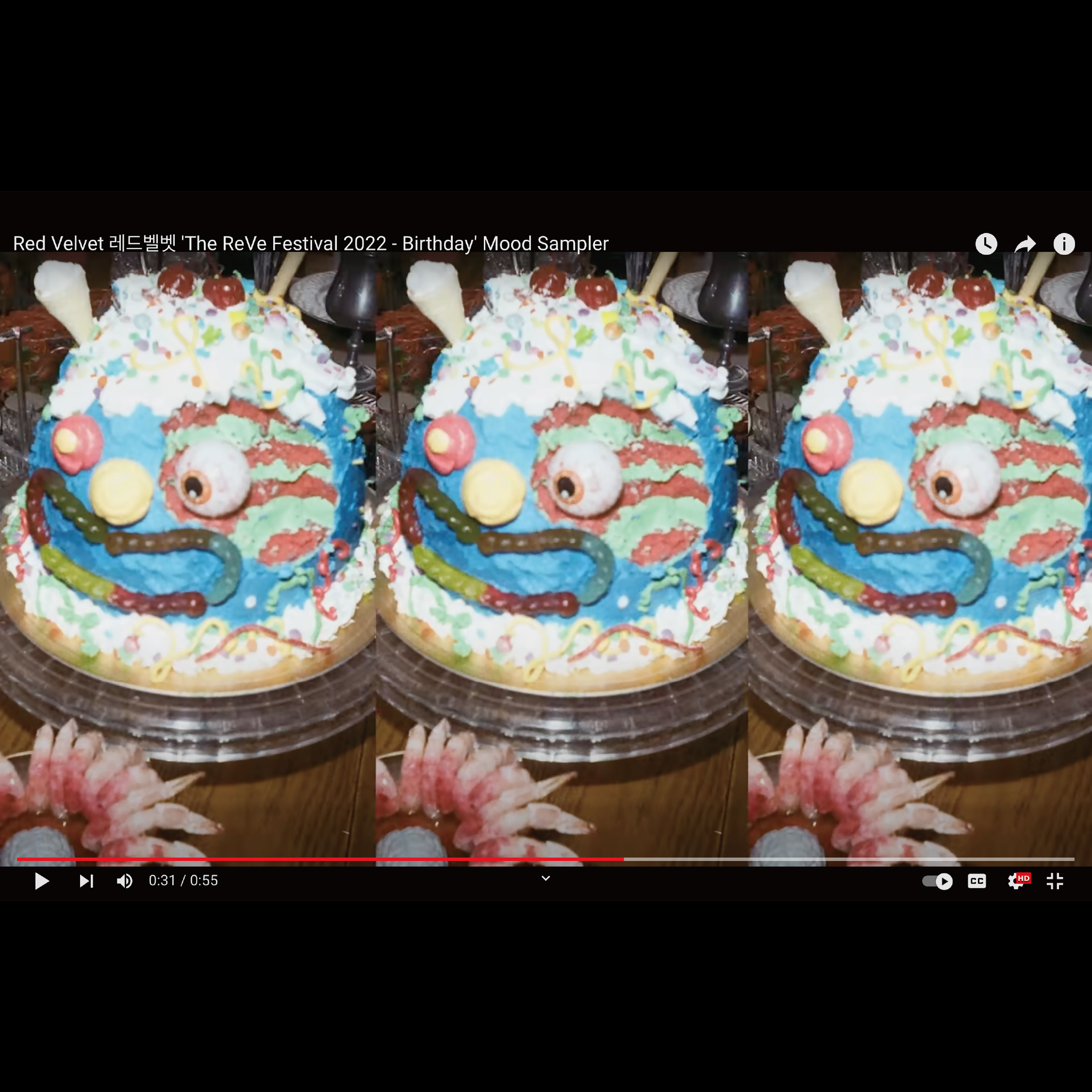
레드벨벳의 미니앨범 The ReVe Festival 2022 – Birthday의 무드 샘플러(앨범 티저 영상)의 디렉션과 촬영 어레인지먼트에 참여했습니다.
Art Direction: 조우철
Creative Concept Planning & Graphic Design: 이샛별, 정다슬(Assistant)
Photography: 윤지용
Set Design: 전민규
Illustration: Made In Hell
Mood Sampler Direction & Arrangement: 조우철, 이샛별, 정다슬
Mood Sampler Direction: 박수빈
©2022 SM ENTERTAINMENT Co., Ltd. ALL RIGHTS RESERVED.
Luigi Ghirri 《Infinite Landscapes》 전시 브랜드 디자인
뮤지엄한미
2025
1/9
2/9

3/9
4/9
5/9
6/9
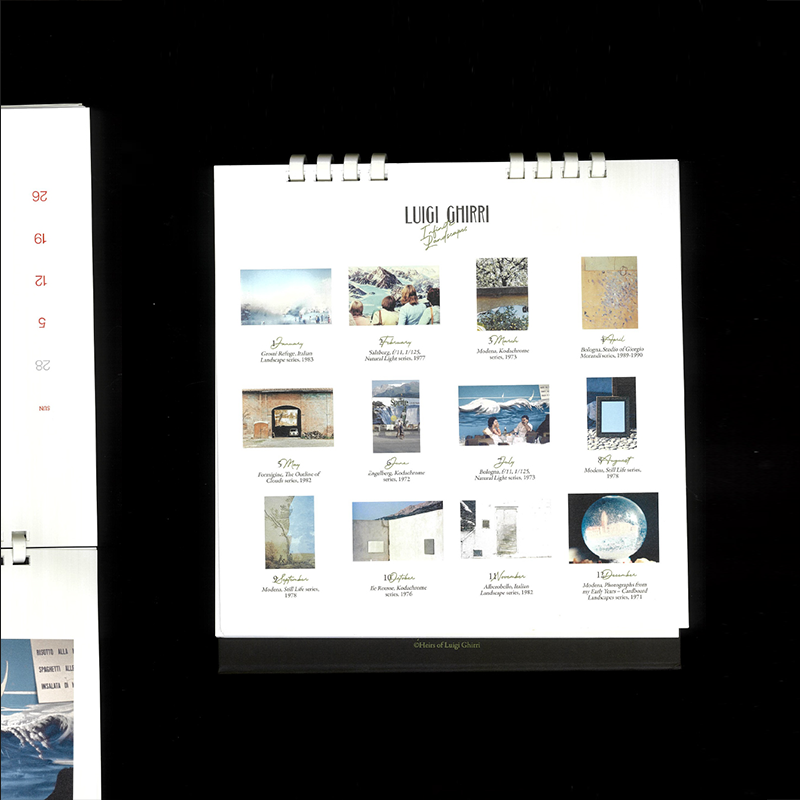
Luigi Ghirri 《Infinite Landscapes》 전시 브랜드 디자인
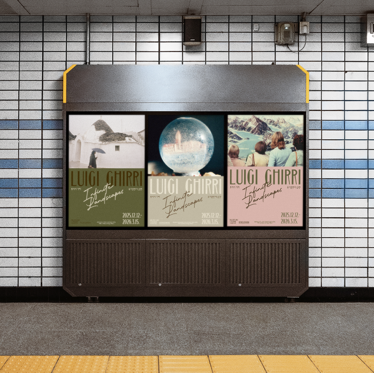
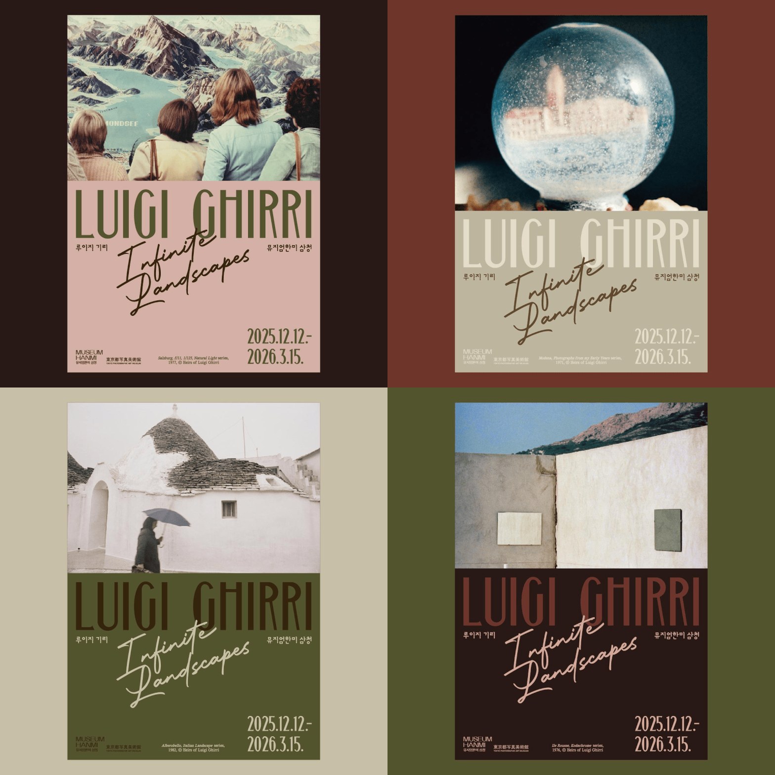
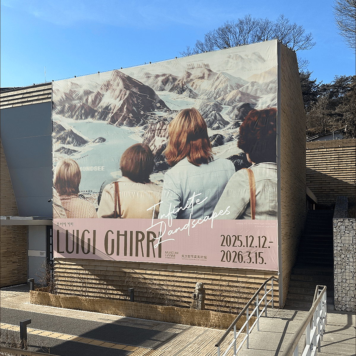
루이지 기리의 개인전 《Infinite Landscapes》을 위한 전시 브랜드 디자인을 진행했습니다. 기리의 사진에서 반복적으로 등장하는 ‘사진 속의 사진’이라는 메타적 시선을 반영해, 등산 코스 안내도를 바라보는 관광객의 장면을 메인 키비주얼로 사용했습니다. 이를 통해 이미지를 바라보는 시선이라는 기리 작업의 특징을 시각적으로 드러냈습니다.
타이포그래피는 세로 비례가 강조된 콘덴스드 서체로 시선의 깊이와 공간감을 형성하고, 전시명은 손글씨 스크립트를 겹쳐 배치해 풍경 위를 스쳐 지나가는 시선의 궤적을 표현했습니다.
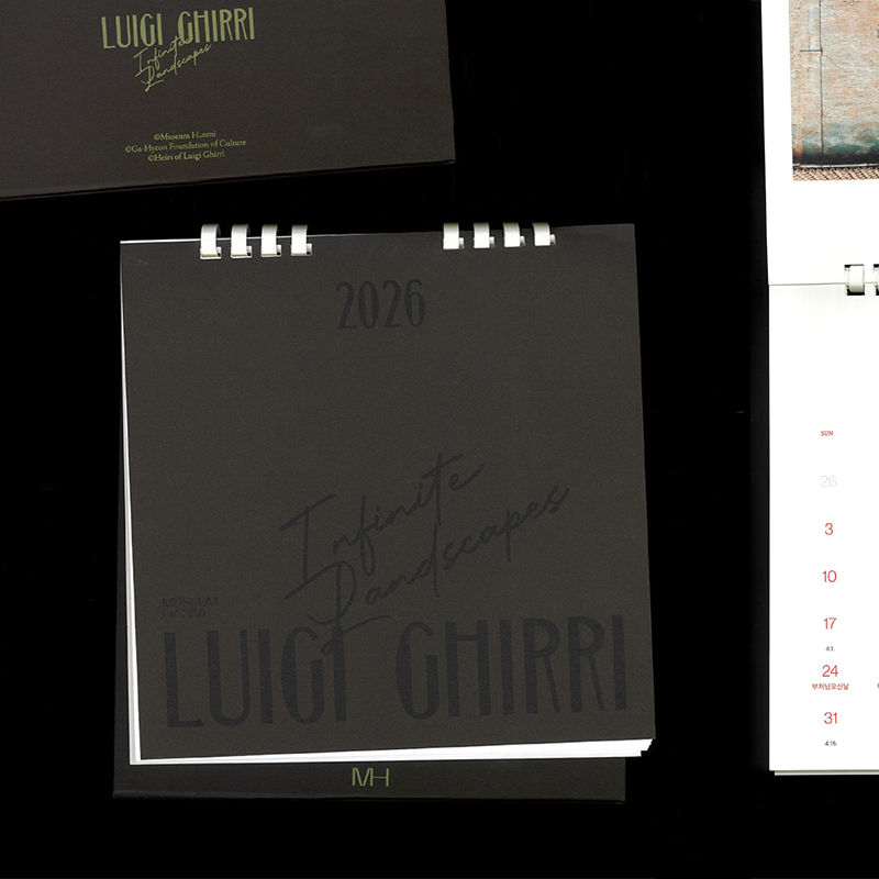
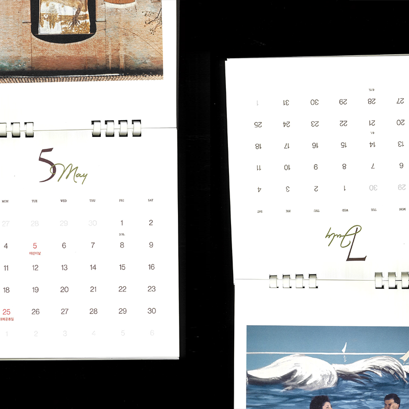
구축된 그래픽 시스템은 포스터, 건물 외벽 현수막, 온오프라인 광고 등 다양한 홍보 매체와 인쇄물로 확장했으며, 전시 기간과 연계한 2026년 달력 디자인을 제작해 전시의 시각적 언어가 일상 속에서도 이어지도록 구성했습니다.
총괄: 최봉림
기획: 도쿄도사진미술관(Tokyo Photographic Art Museum), Luigi Ghirri FOUNDATION
진행: 김선영 학예연구관, 김지현 학예연구관, 정지윤 학예연구사, 최은정 학예연구사, 김소정 인턴
디자인: 정다슬, 정다운
교육: 박민호 학예연구사, 이화연 교육연구원
©museumhanmi
1/6
2/6
3/6
4/6
5/6
6/6
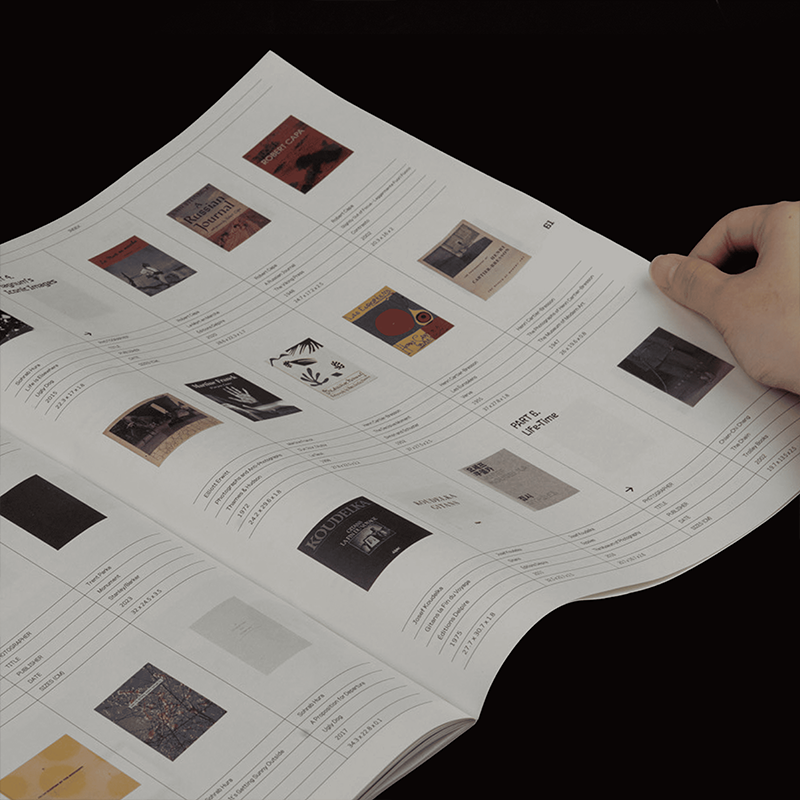
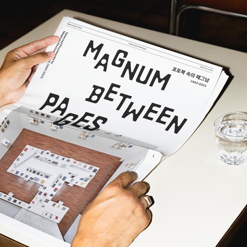
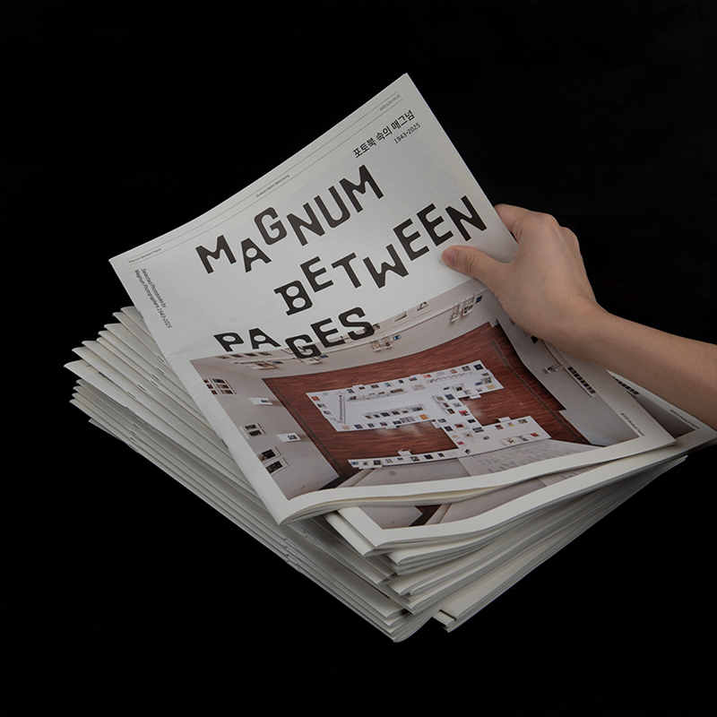
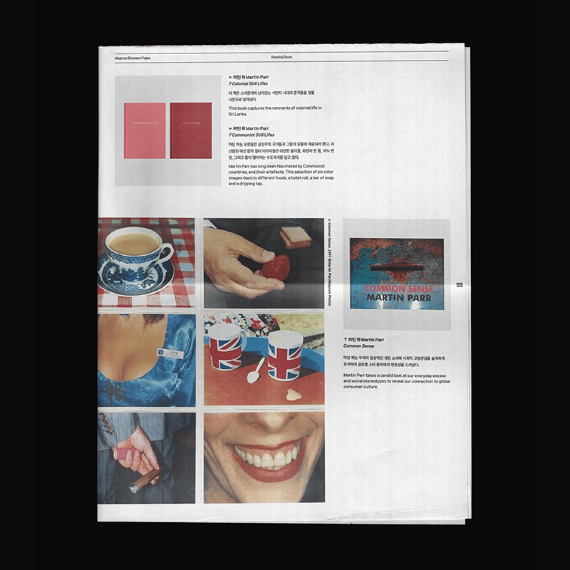
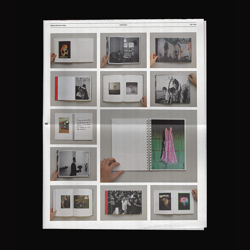
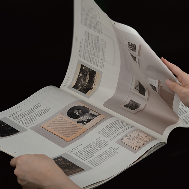
전시 연계 타블로이드 『포토북 속의 매그넘 1943–2025』
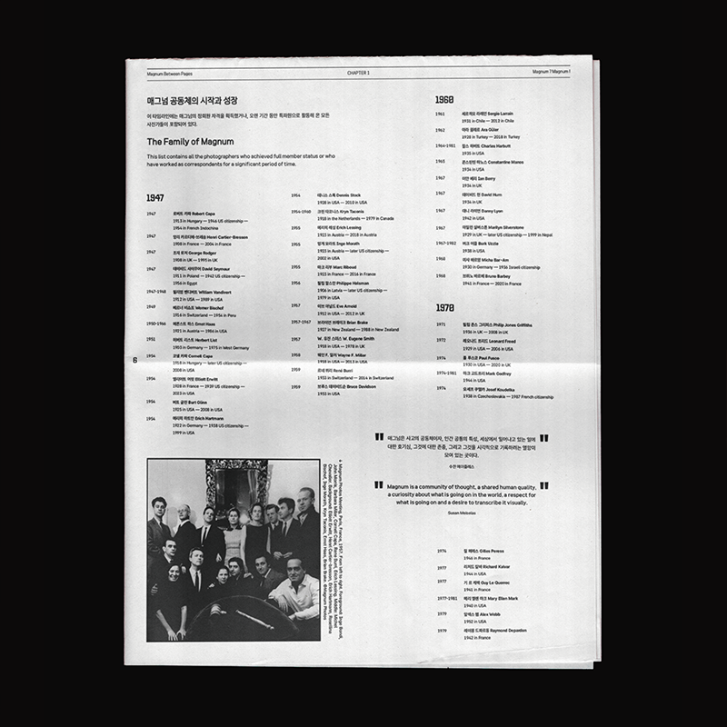
뮤지엄한미 삼청에서 열린 《포토북 속의 매그넘 1943–2025》 전시와 연계하여 특별 인쇄물인 타블로이드를 제작하였습니다. 이번 작업은 전시 도록의 전통적인 형식에서 벗어나, 포토북의 예술적 속성인 ‘읽히는 사진’을 일상적이고 감각적인 매체인 타블로이드로 확장하고자 했습니다.
인쇄물은 전시에 소개된 주요 포토북과 그에 대한 설명을 담아, 관람객이 전시 내용을 새로운 방식으로 다시 읽고 경험할 수 있도록 구성했습니다.
편집: 김지현 학예연구관
번역: 한국외대통번역센터
디자인: 정다슬, 정다운
촬영: 박민호, 박형렬, 지니프로젝트
인쇄: 문성인쇄
©museumhanmi
전시 연계 리플릿 루이지기리 『Infinite Landscapes』
뮤지엄한미
2025, 110×210mm, 50p
1/9
2/9
3/9
4/9
5/9
6/9
7/9
8/9
9/9
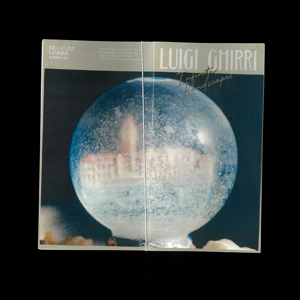
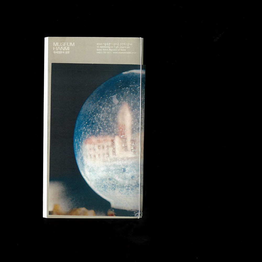
전시 연계 리플릿 루이지기리 『Infinite Landscapes』
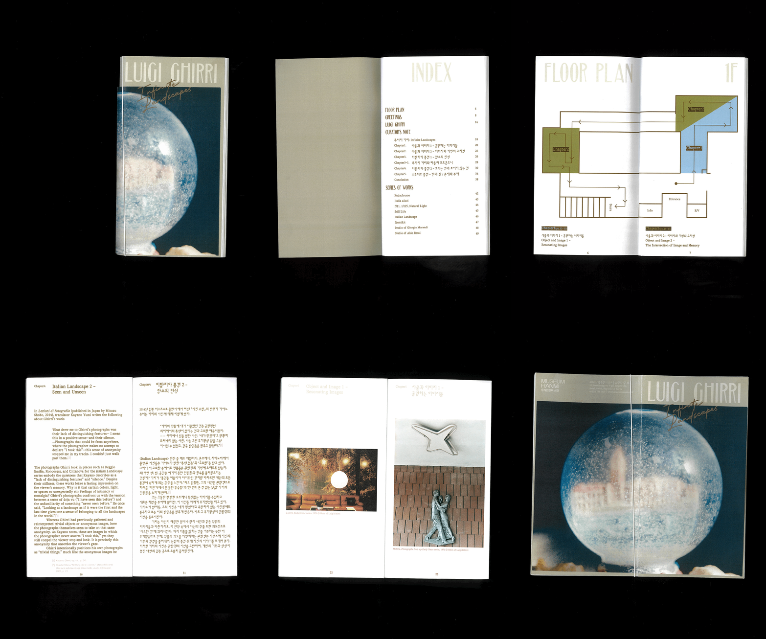
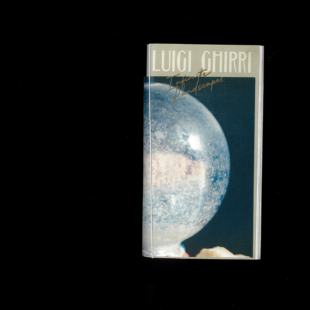
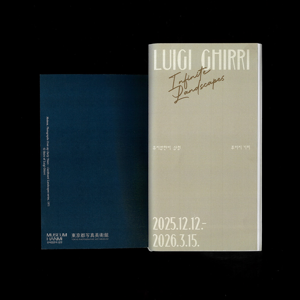
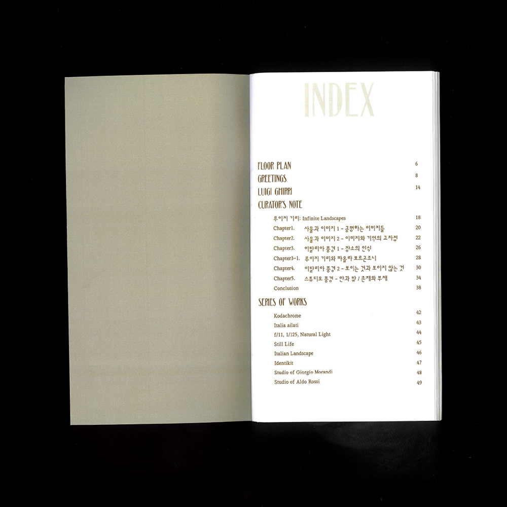
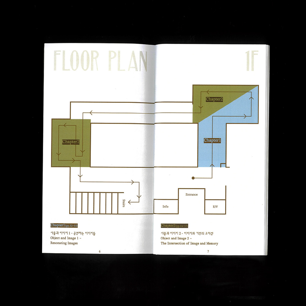
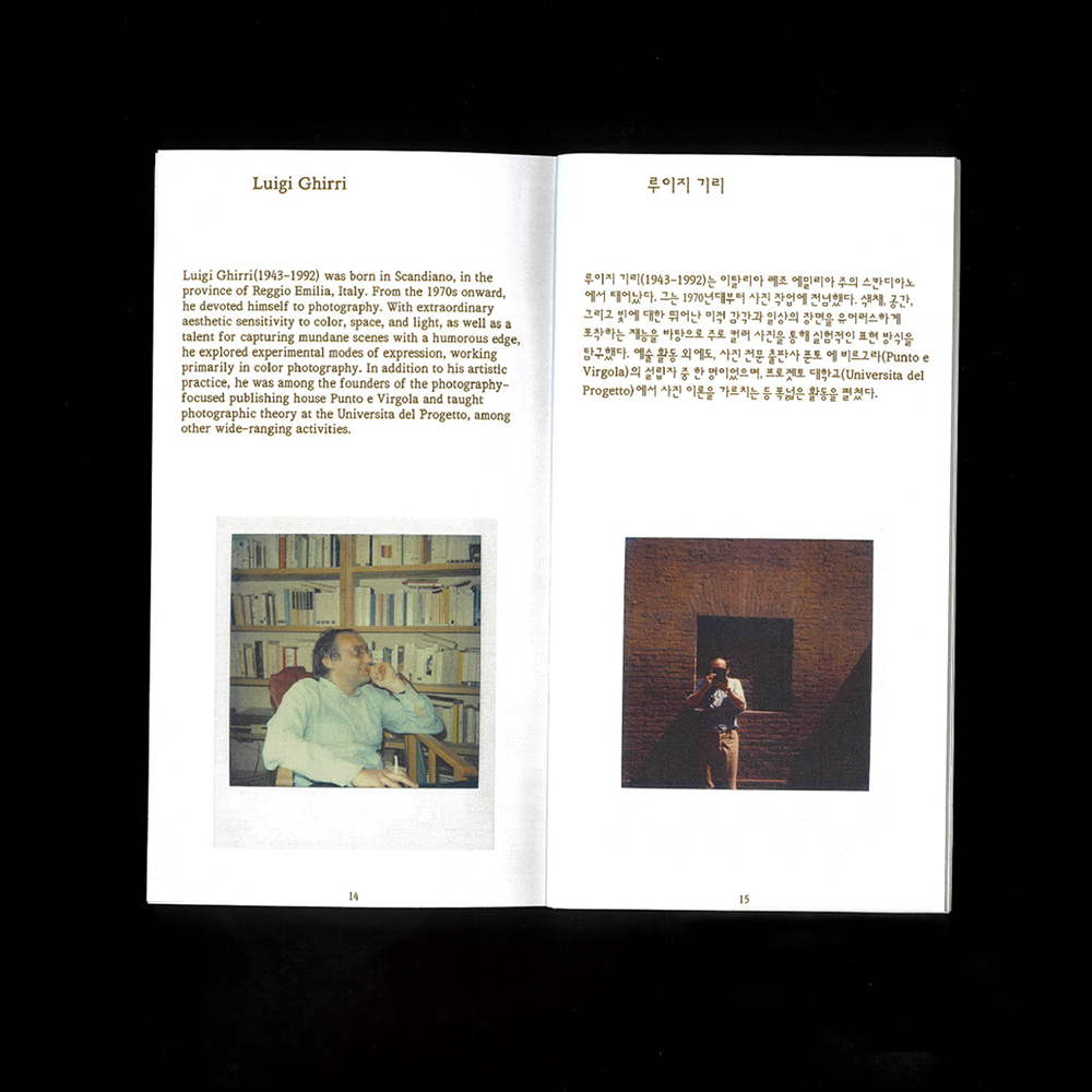
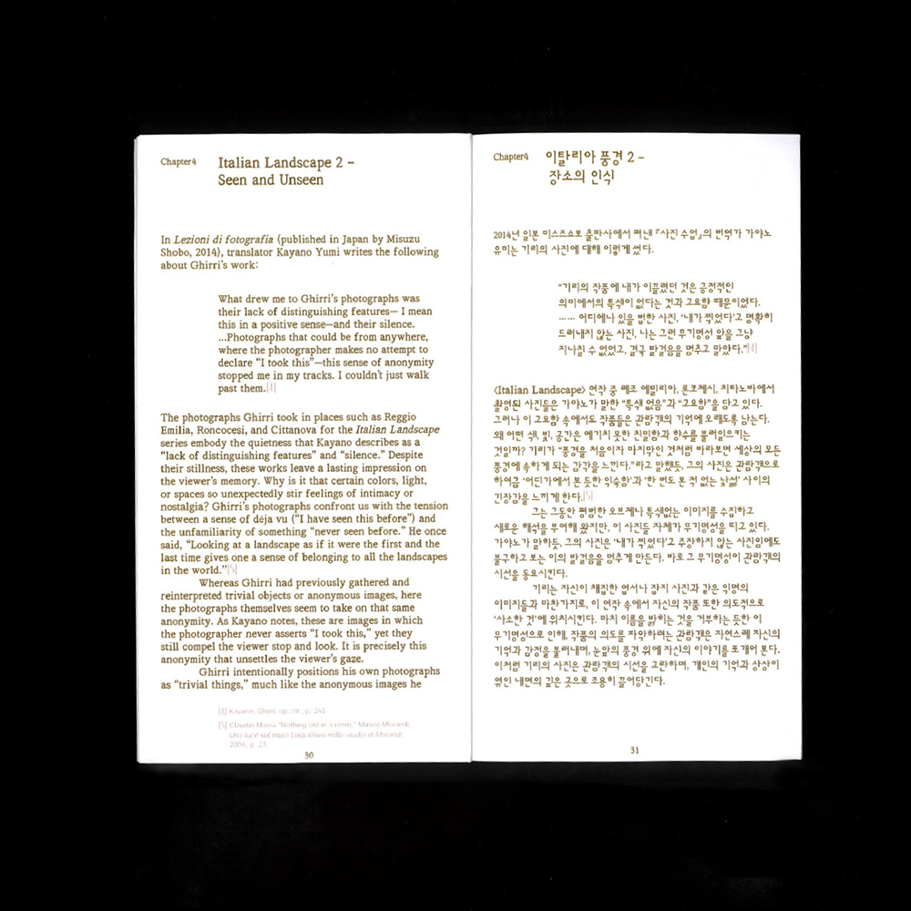
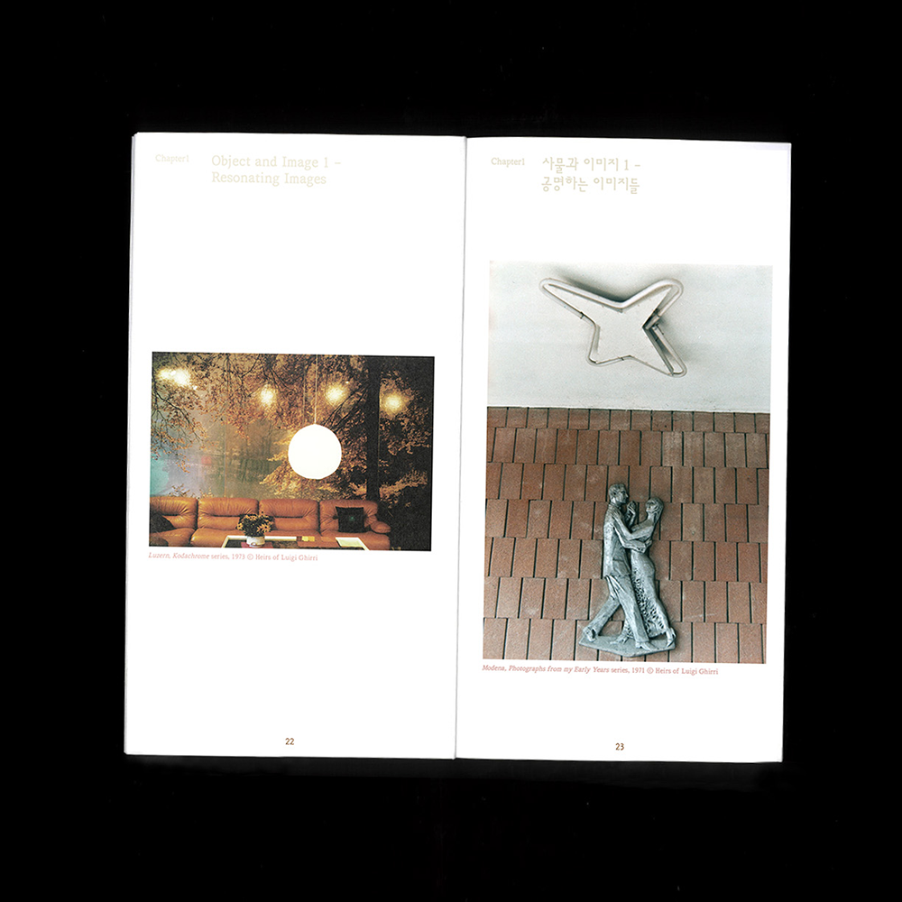
뮤지엄한미 삼청에서 열린 《Infinite Landscapes》 전시와 연계하여 제작한 리플릿입니다.
전시장 동선 안내와 챕터별 소개를 담아 관람객이 전시 공간을 이동하며 작품과 공간을 함께 경험할 수 있도록 구성했습니다. 한 손에 들어오는 컴팩트한 사이즈로 제작하고, 커버를 내지와 다른 크기로 설계해 위트 있는 시각적 장치를 더했습니다.
편집: 김지현 학예연구관
진행: 정지윤 학예연구사, 최은정 학예연구사, 김소정 인턴
디자인: 정다슬
인쇄: 문성인쇄
©museumhanmi
1/9
2/9

3/9

4/9

5/9
6/9
7/9

8/9
9/9
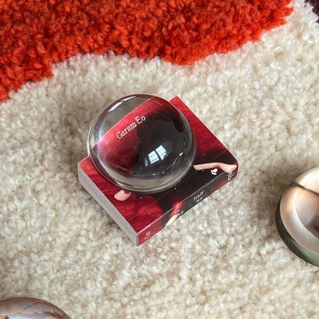
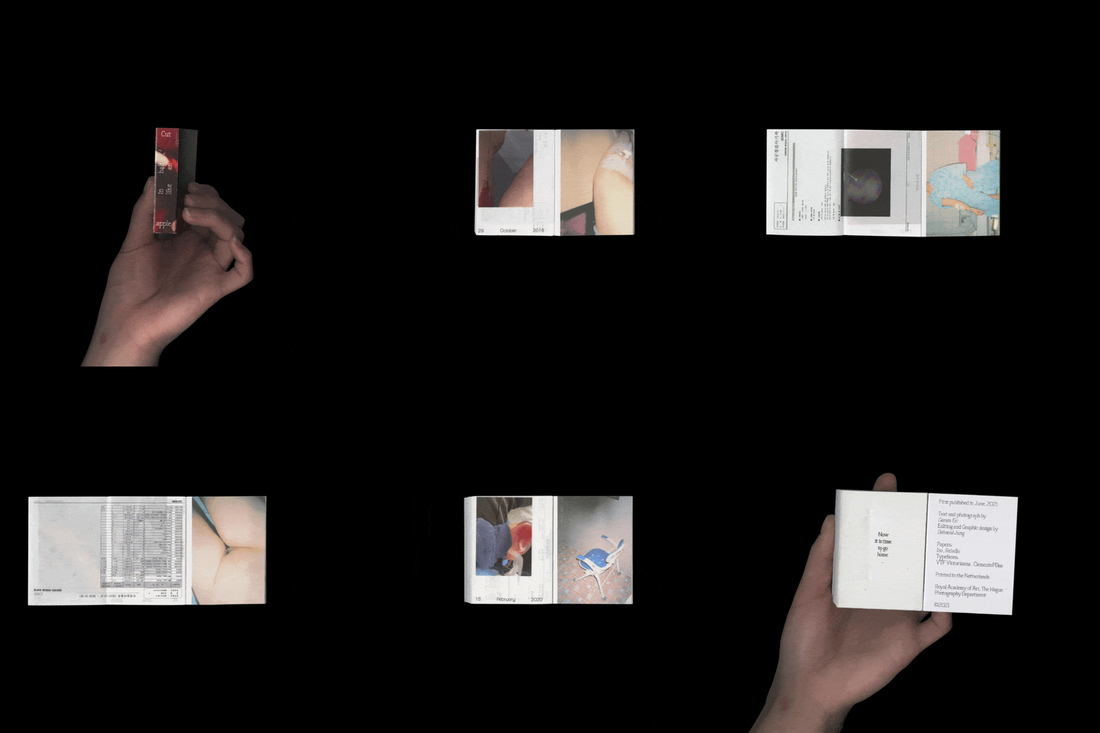
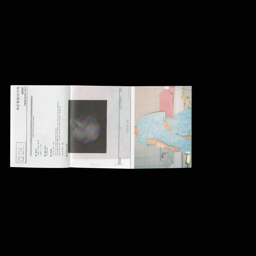
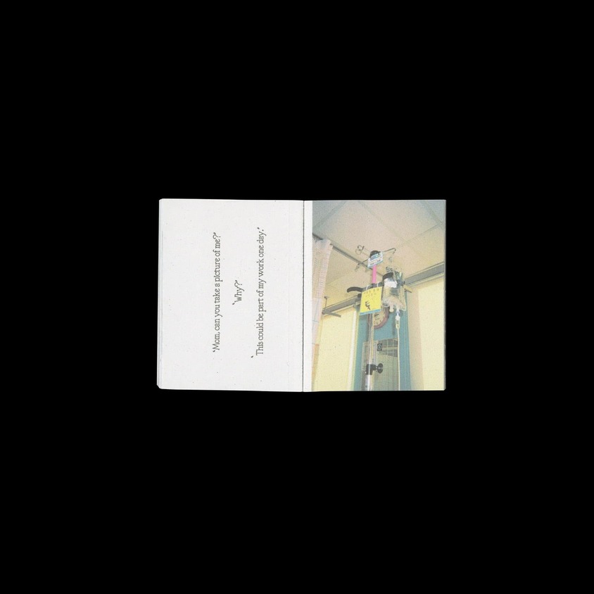
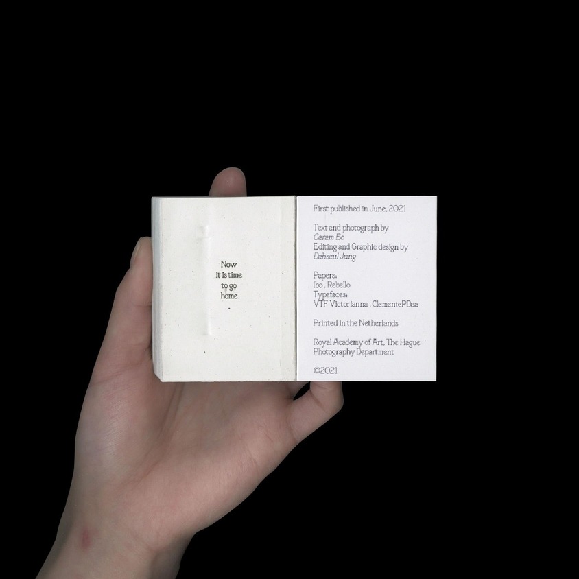
Cut in half like an apple,
Photobook design for a photographer Garam Eoji
Photobook design for Garam Eoji's BA graduation project, Cut in half like an apple.
1/3
2/3
3/3
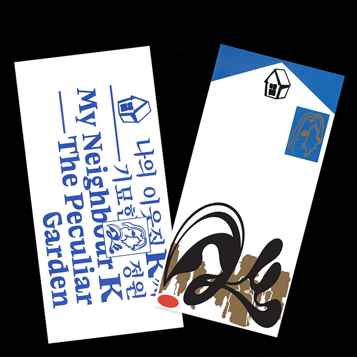
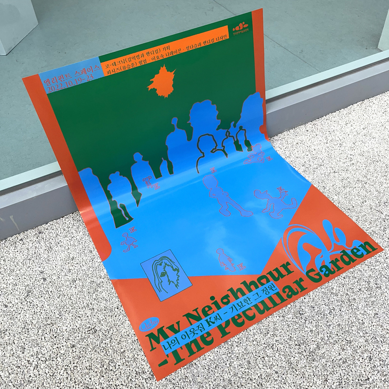
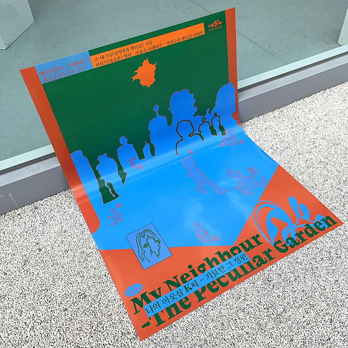
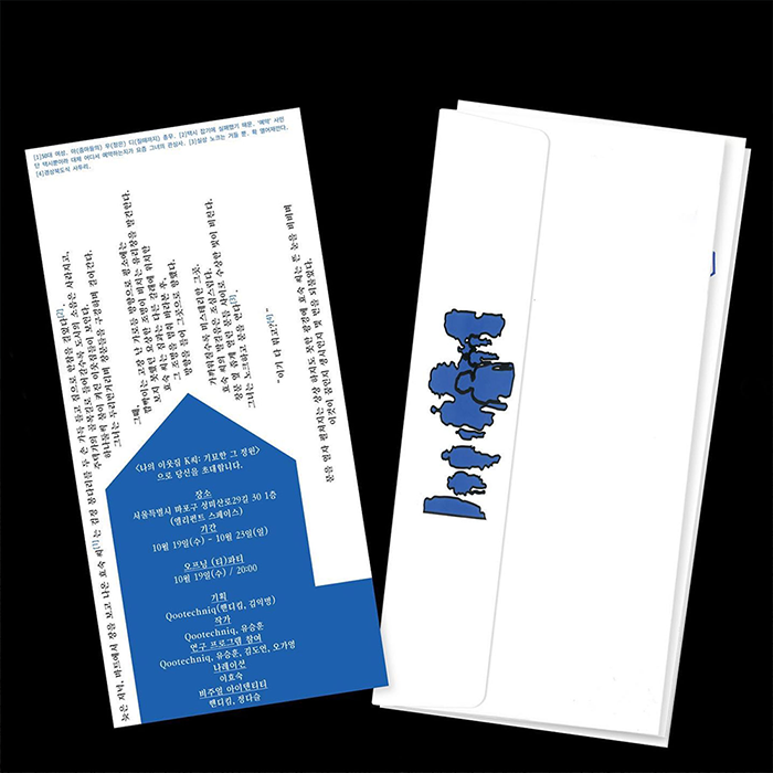
김핸디 《나의 이웃집 K씨 - 기묘한 그 정원》 전시 포스터 & 초대장-Assistant
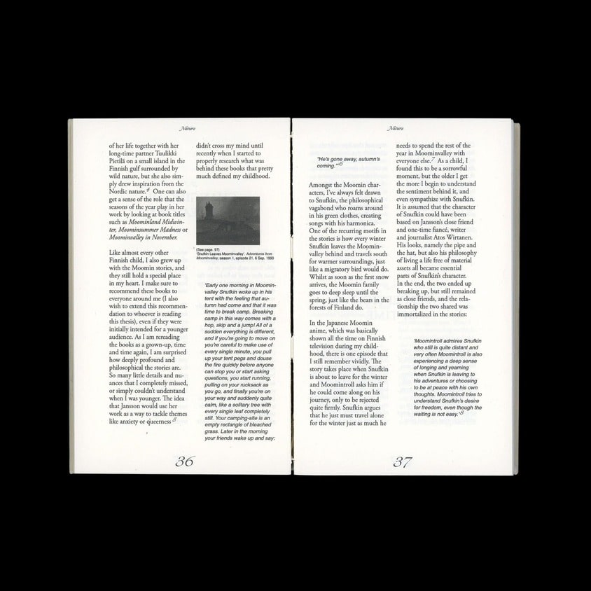
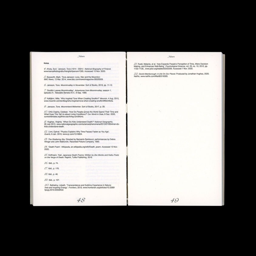
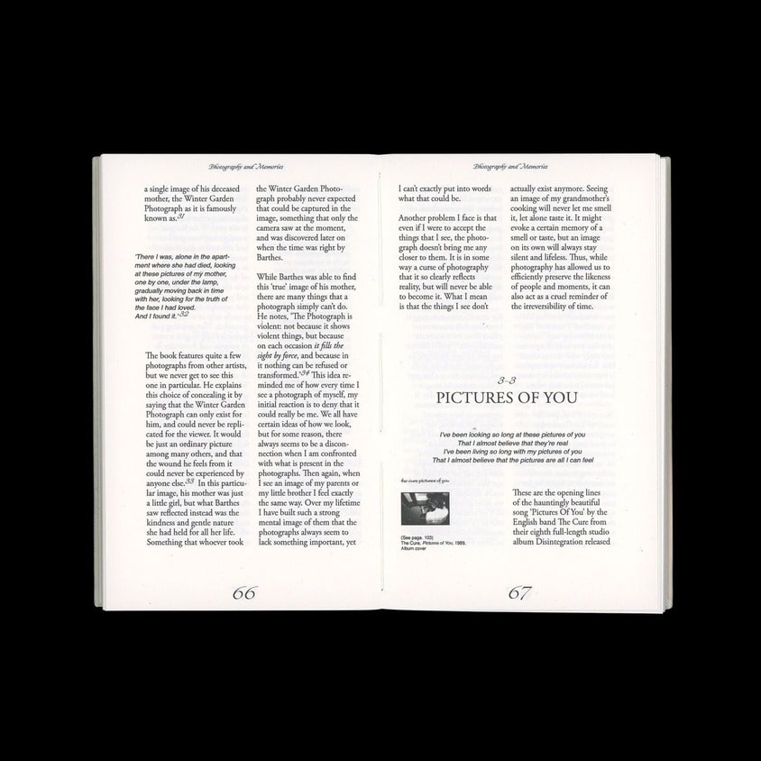
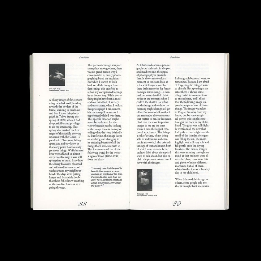
김핸디 작가의 전시 《나의 기묘한 이웃 K씨 – 기묘한 그 정원 My Neighbour K – The Peculiar Garden》의 포스터와 초대장 작업에 디자인 어시스트로 참여했습니다.
디렉션: 코-테크닠
디자인: 핸디킴
디자인도움: 정다슬
©핸디킴 Very Handy Service
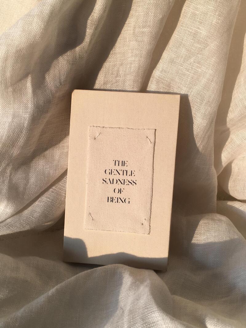
1/11
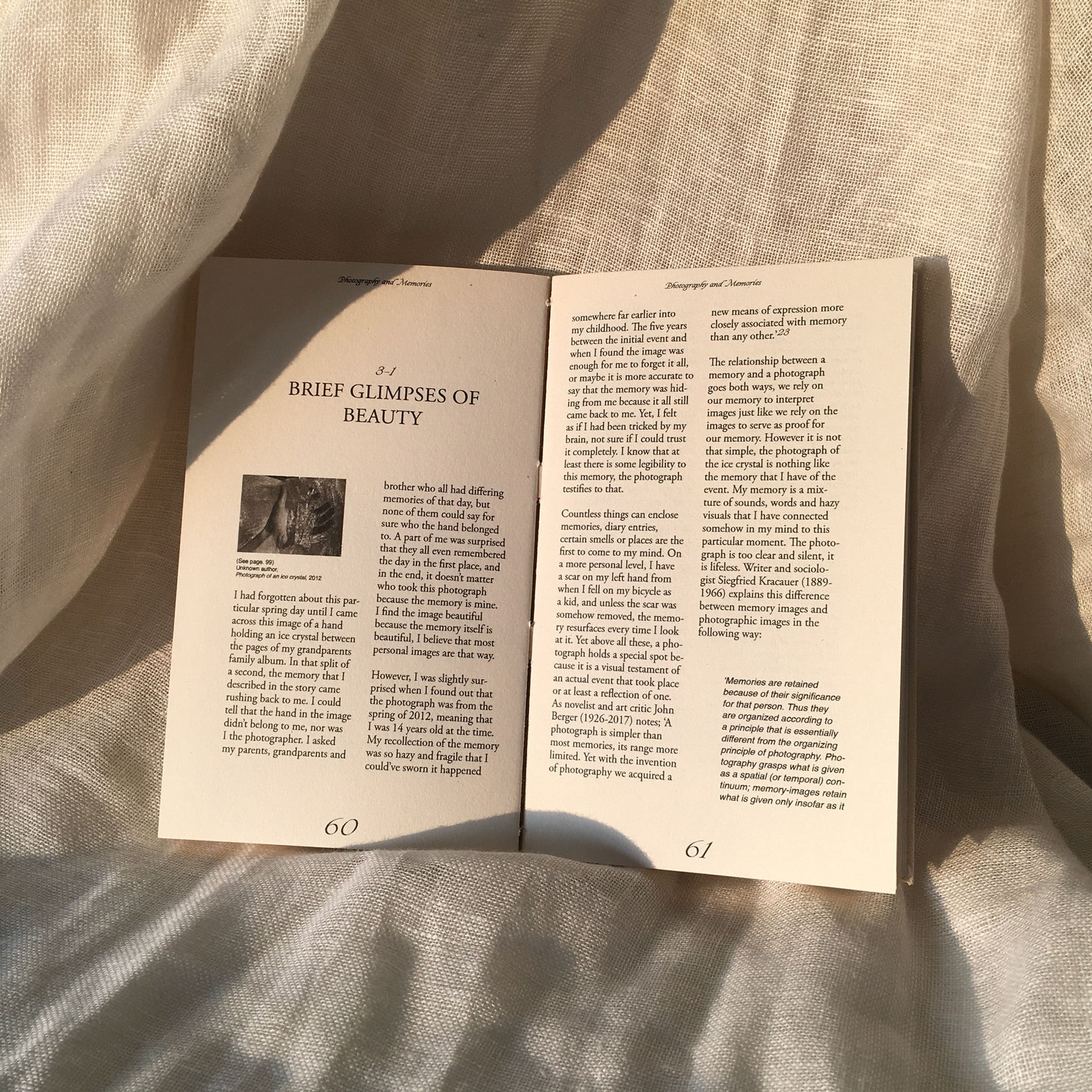
2/11
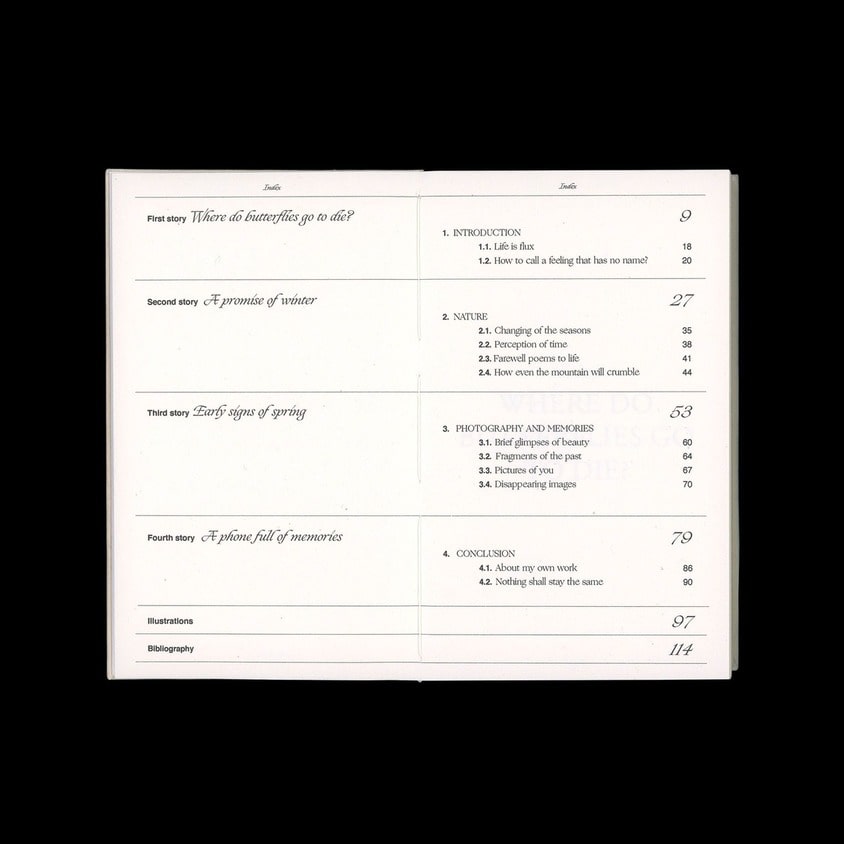
3/11
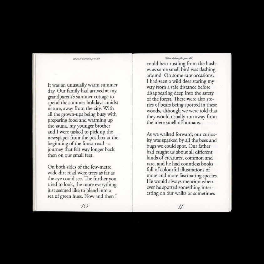
4/11
5/11
6/11
7/11
8/11
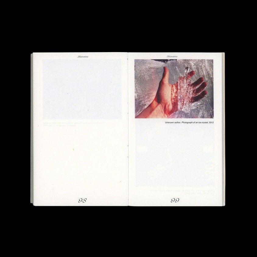
9/11
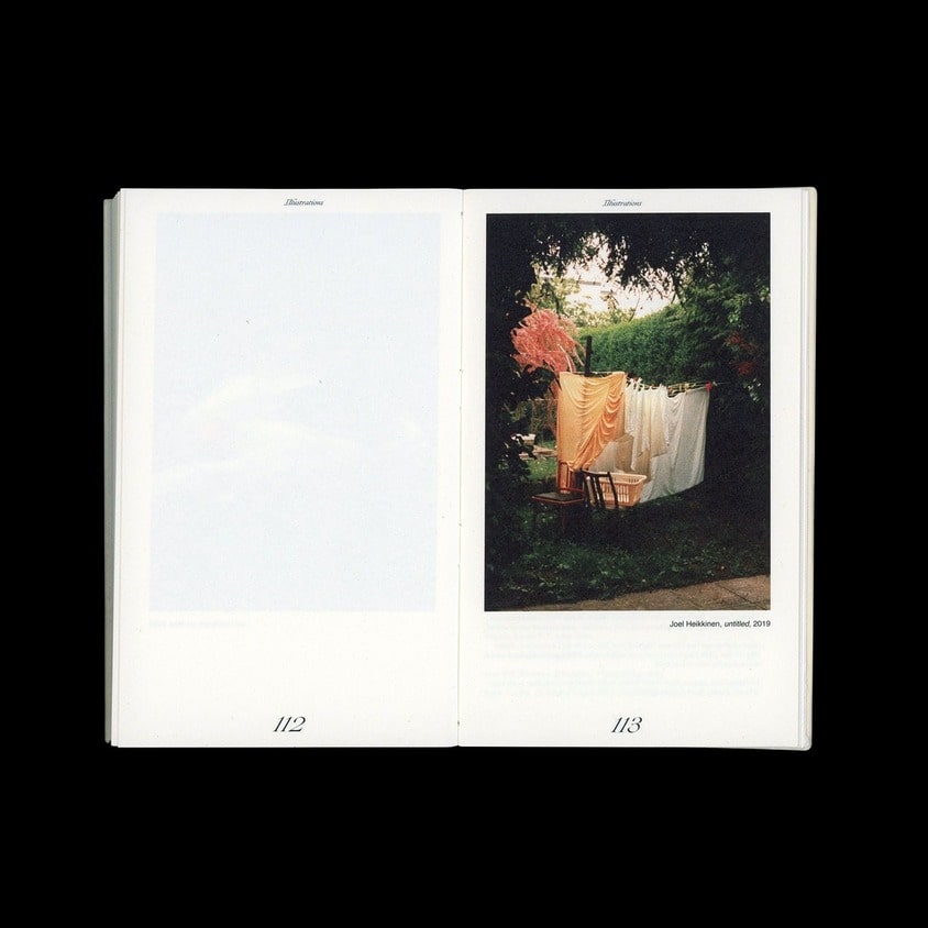
10/11
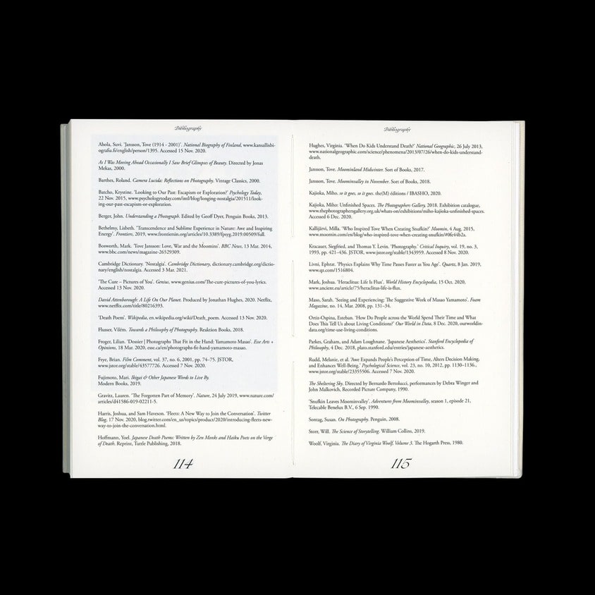
The gentle sadness of being, Thesis book design for Joel Heikkinen
Mail project
2020, 150x95mm
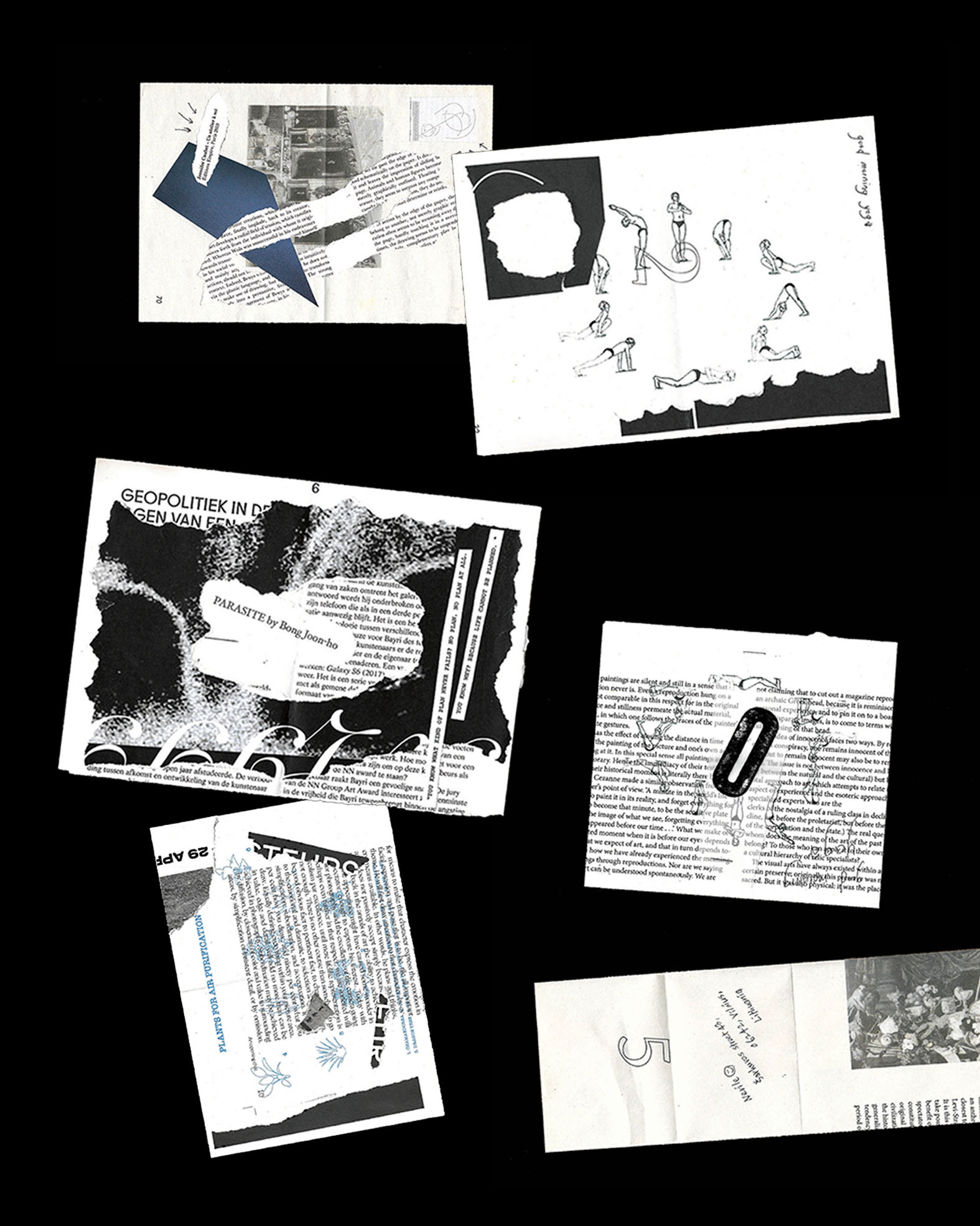
1/6
2/6
3/6
4/6
5/6
5/6
Mail project
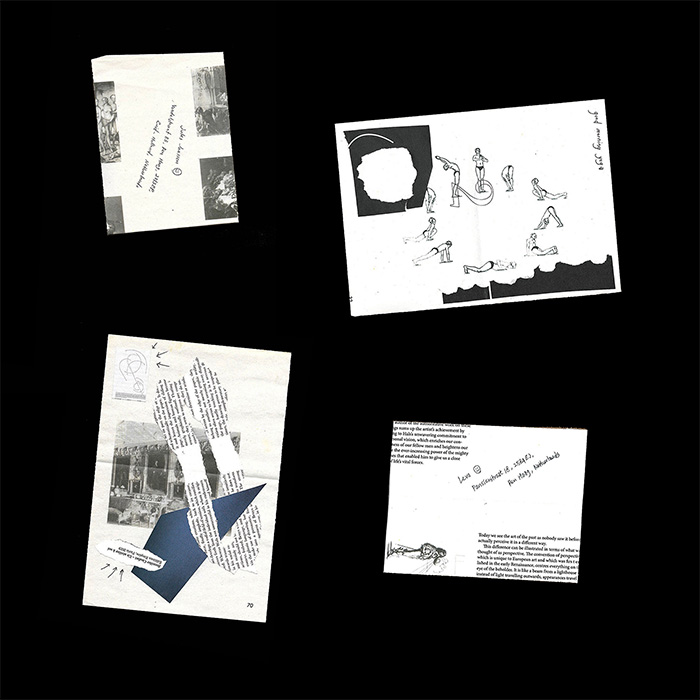
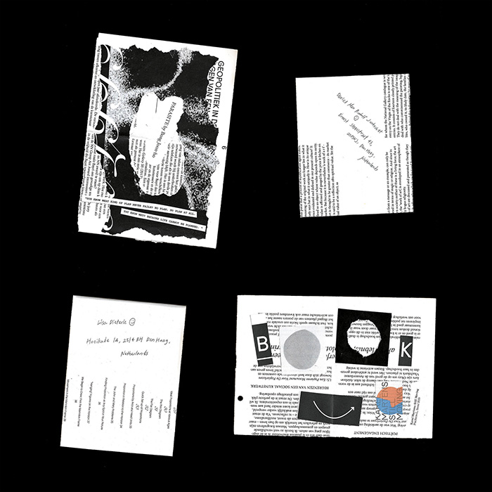
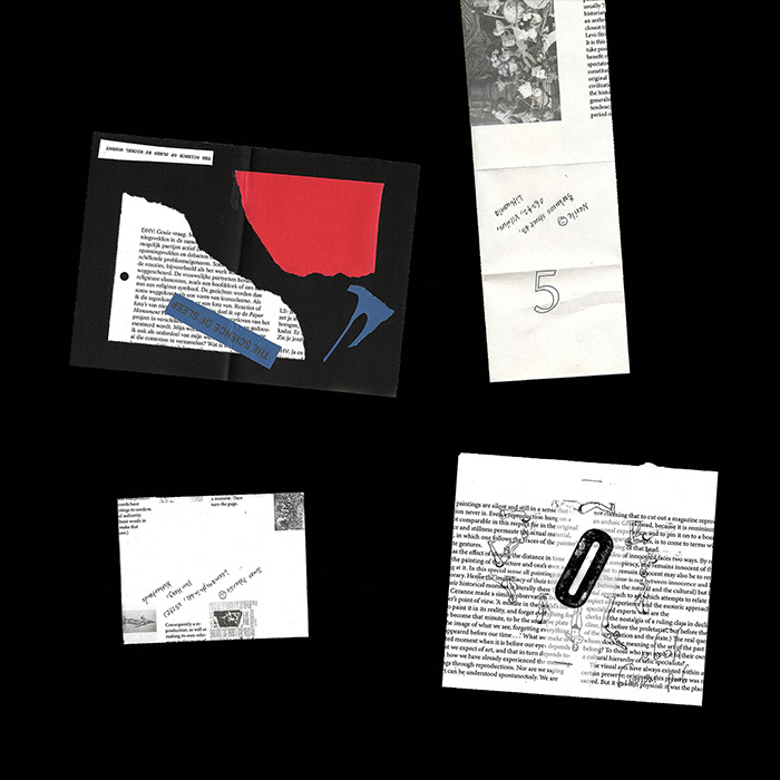
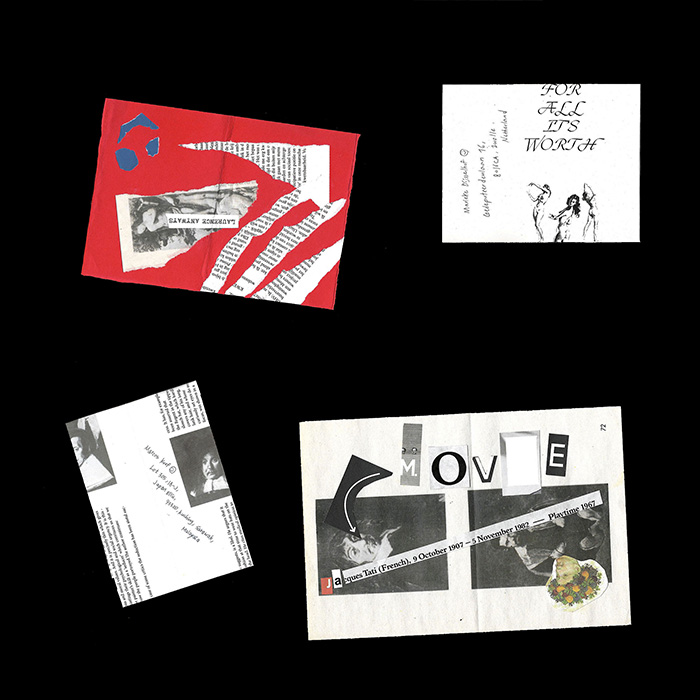
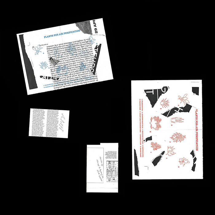
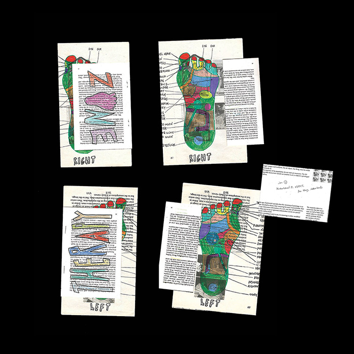
In 2020, the unexpected pandemic suddenly isolated and trapped us. I used to spend spiritless time sitting in front of my laptop and believed that most of my friends were in the same situation. Therefore, I started Mail Project to take care of my friends and share healthy and useful informations.
Sleep Loan
2020
Poster: 420x594mm
Brochure: 140x297mm

1/6
2/6
3/6
4/6
5/6
6/6
Sleep Loan
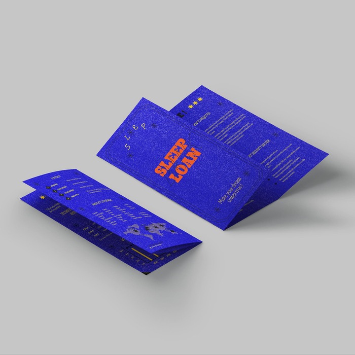
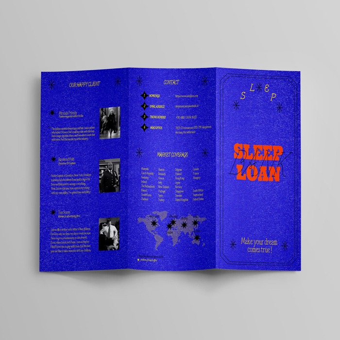
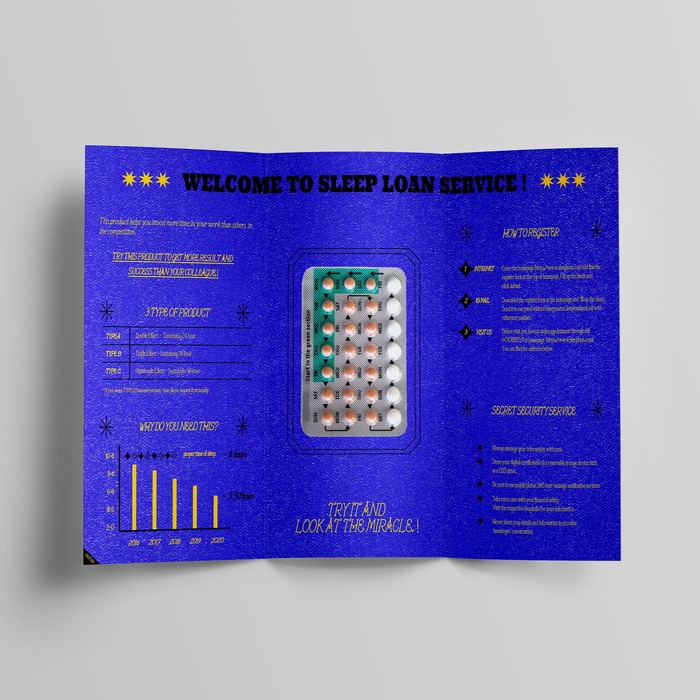
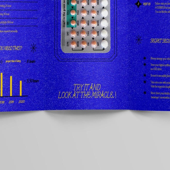
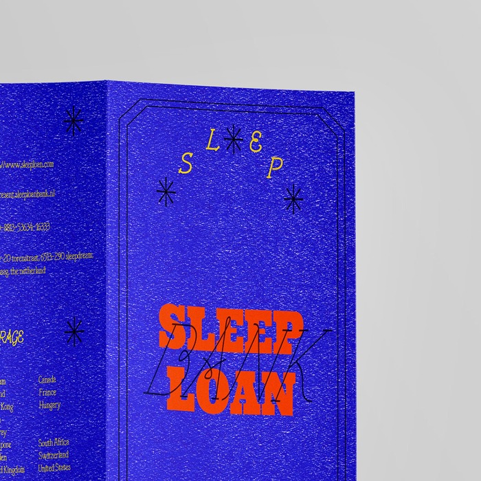
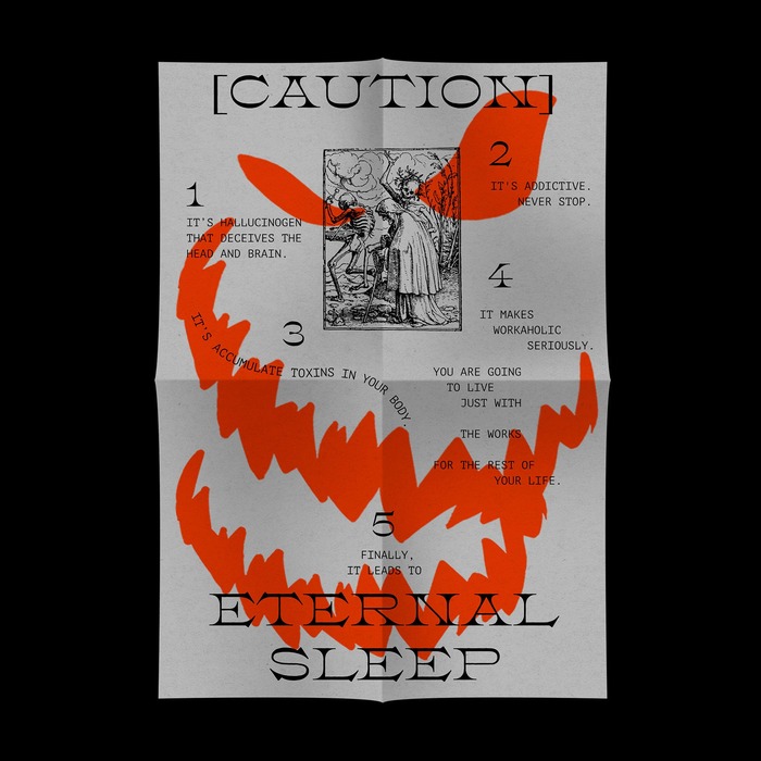
I proposed a fictional alternative to lending sleep. To promote the product of Sleep Loan, I designed a brochure and poster.
Creative Concept Planning & Graphic Design Assistant
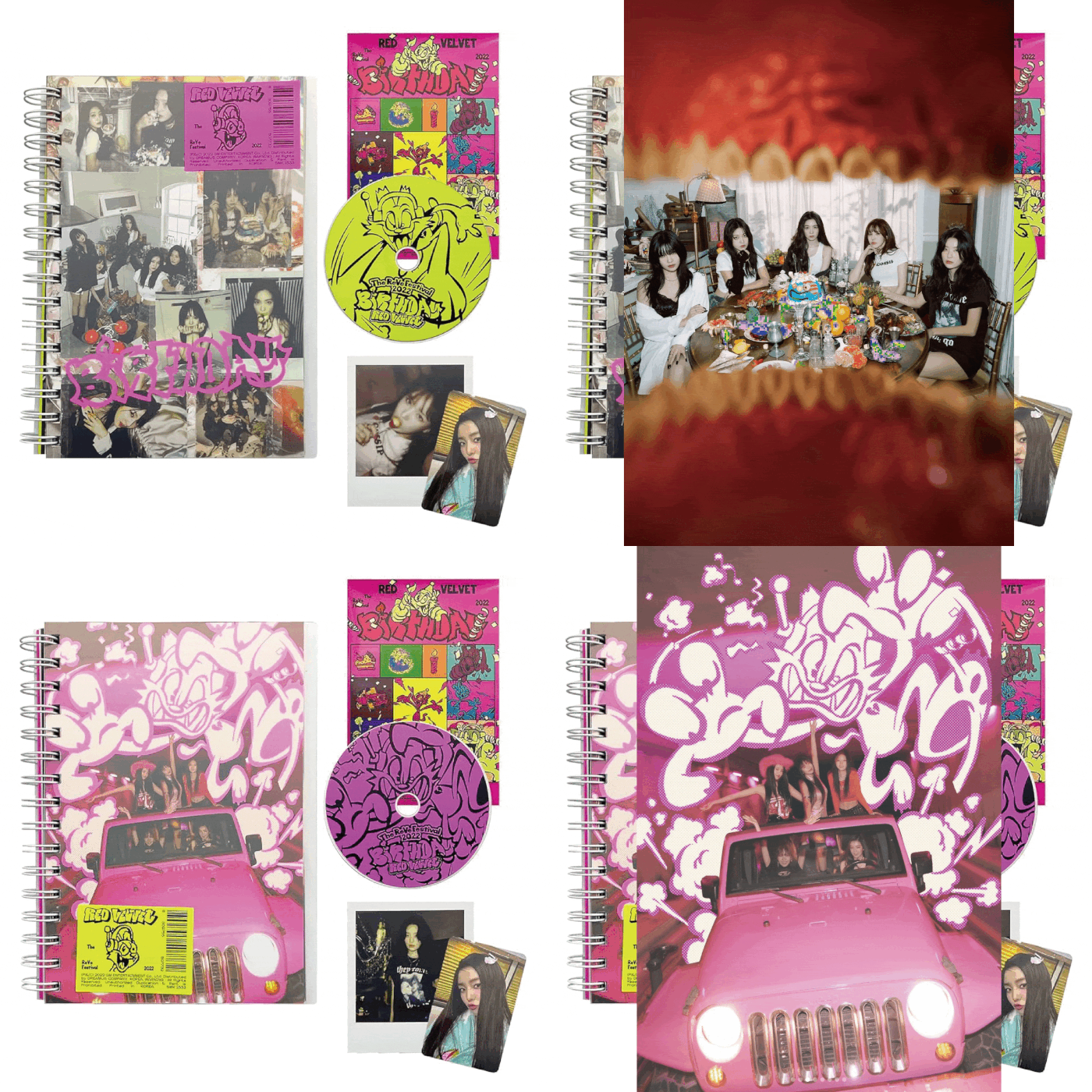
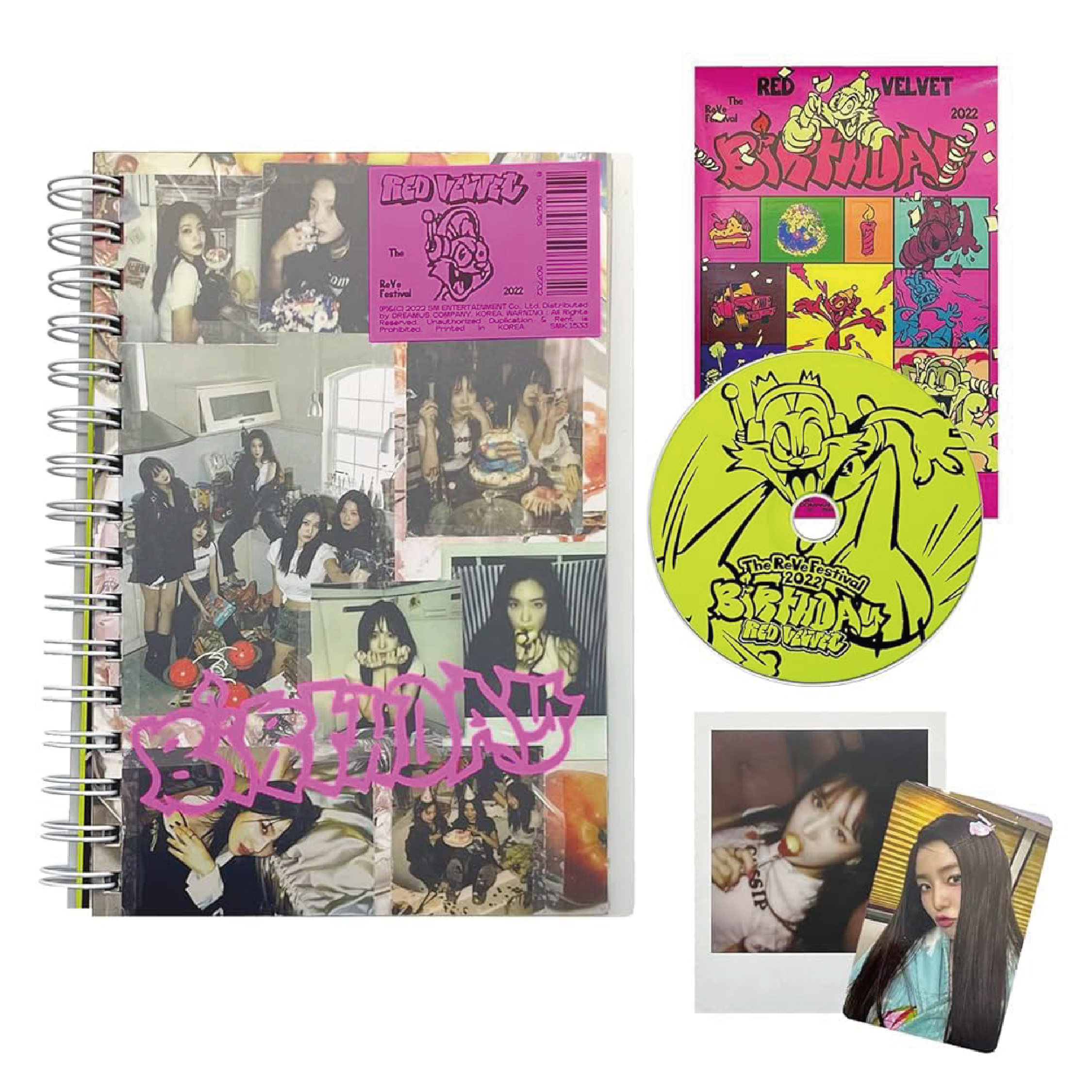
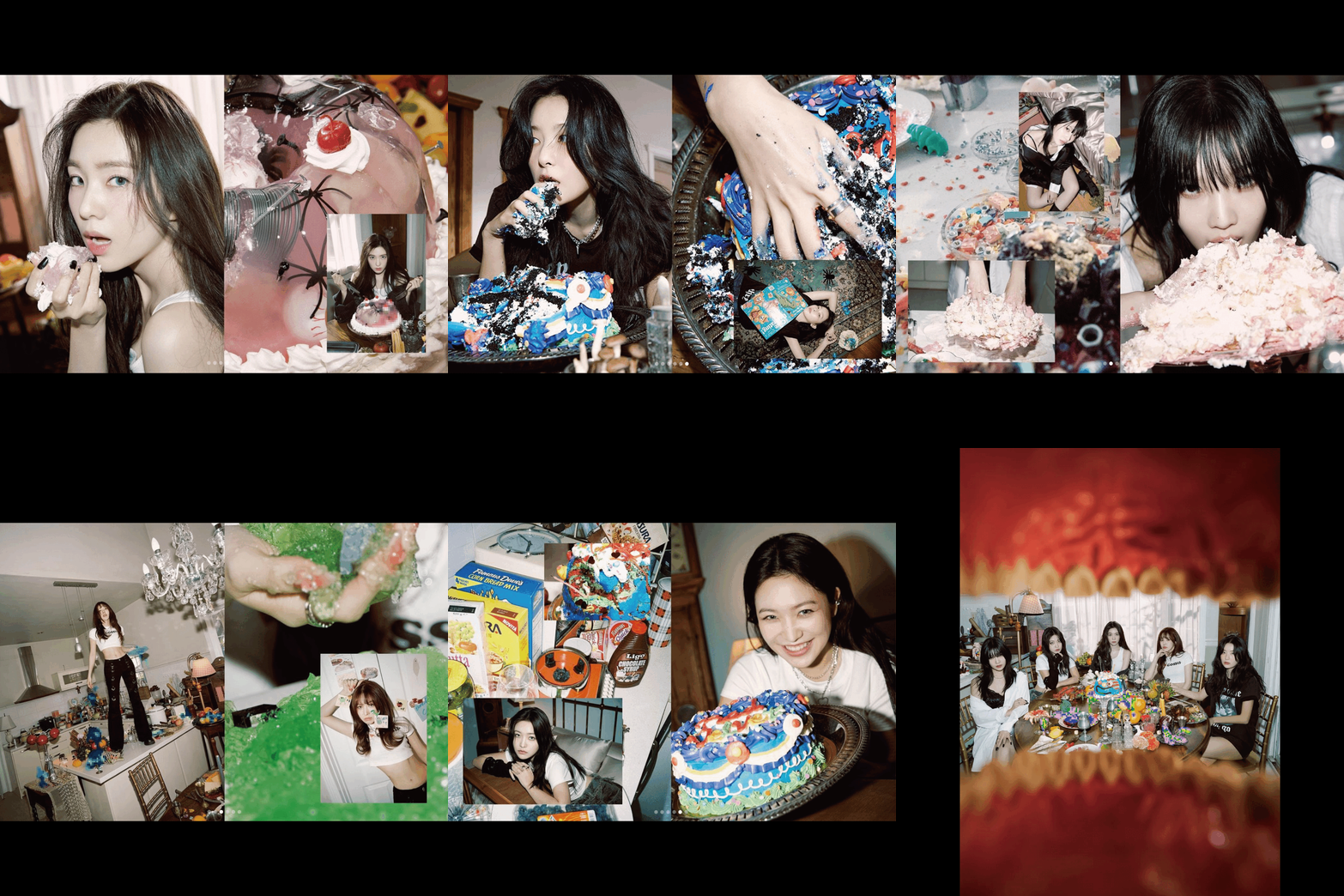
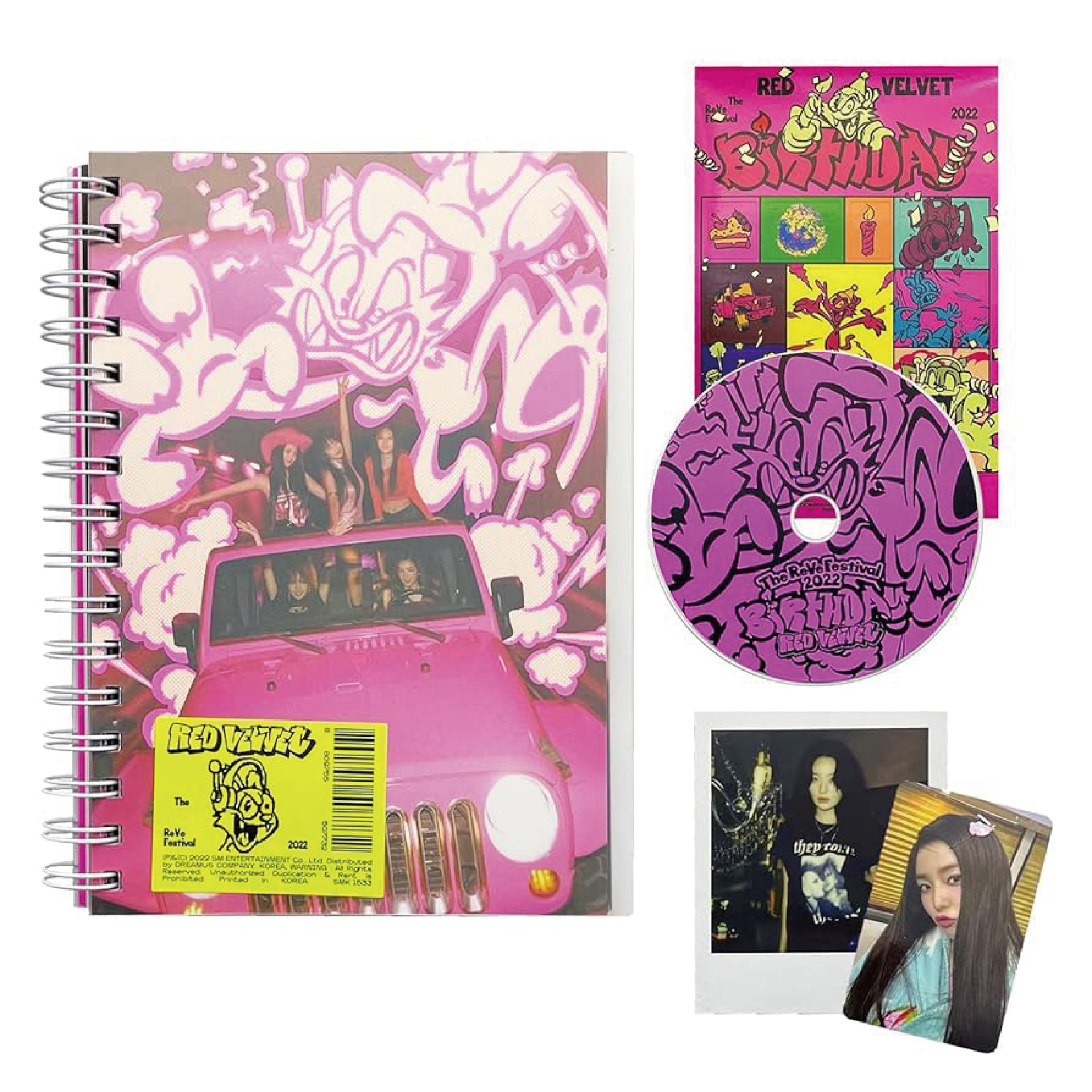
'The ReVe Festival 2022 – Birthday’
SM ENTERTAINMENT
2022
1/5
2/5
3/5
4/5
5/5

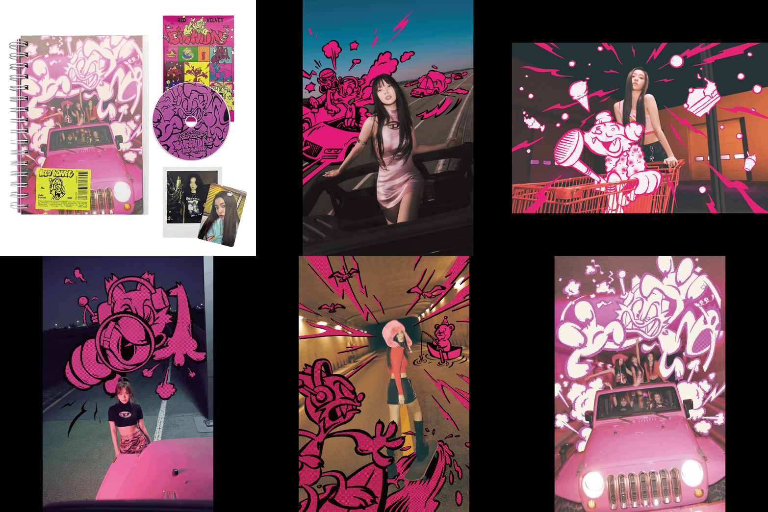
Creative Concept Planning & Graphic Design Assistant 'The ReVe Festival 2022 – Birthday’, SM ENTERTAINMENT
레드벨벳의 미니앨범 The ReVe Festival 2022 – Birthday의 콘셉트 플래닝, 그래픽 디자인 작업에 어시스턴트로 참여했습니다.
Art Direction: 조우철
Creative Concept Planning & Graphic Design: 이샛별, 정다슬(Assistant)
Photography: 윤지용
Set Design: 전민규
Illustration: Made In Hell
Mood Sampler Direction & Arrangement: 조우철, 이샛별, 정다슬
Mood Sampler Direction: 박수빈
©2022 SM ENTERTAINMENT Co., Ltd. ALL RIGHTS RESERVED.
《밤 끝으로의 여행》 전시 브랜드 디자인
뮤지엄한미
2024
1/6
2/6
3/6

4/6
5/6
6/6
5/6
6/6
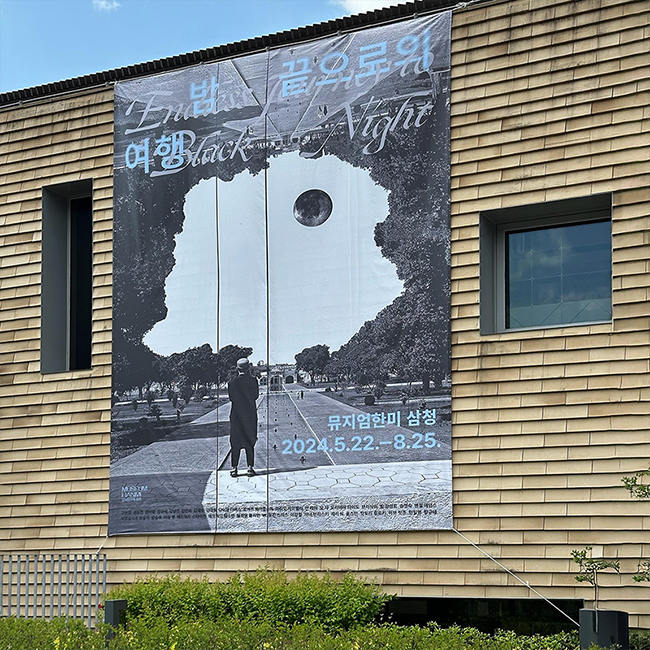
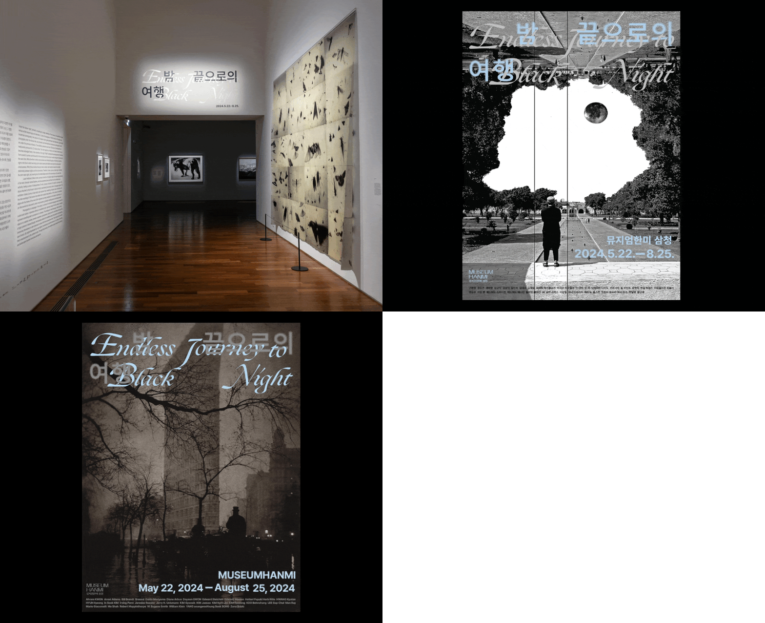
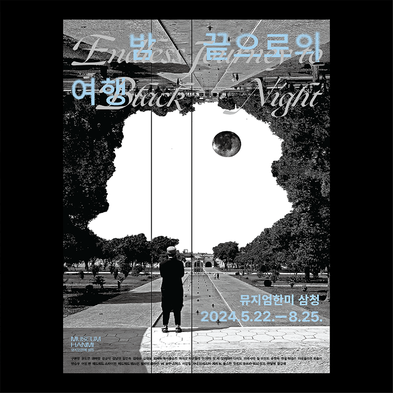
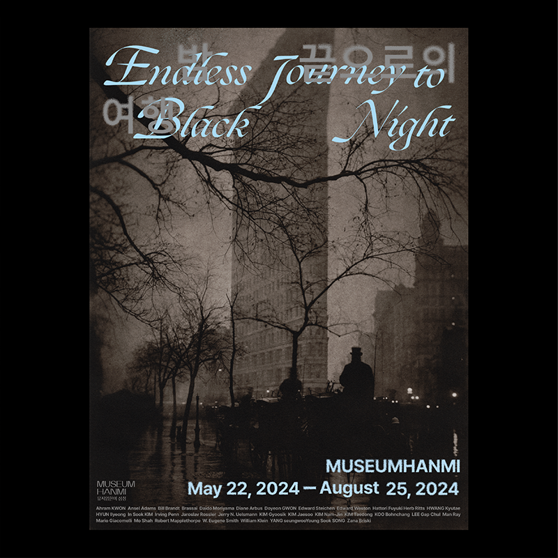
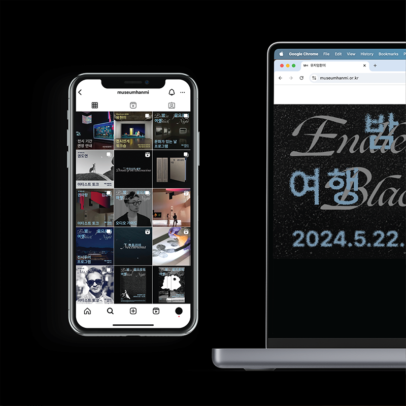
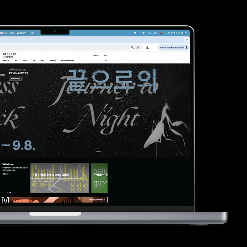
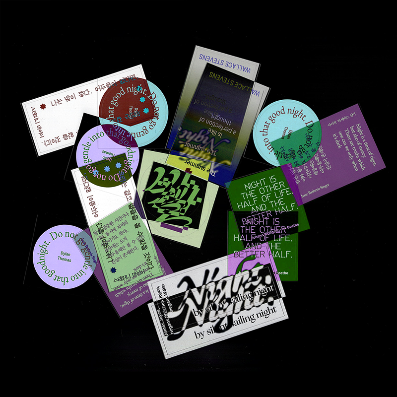
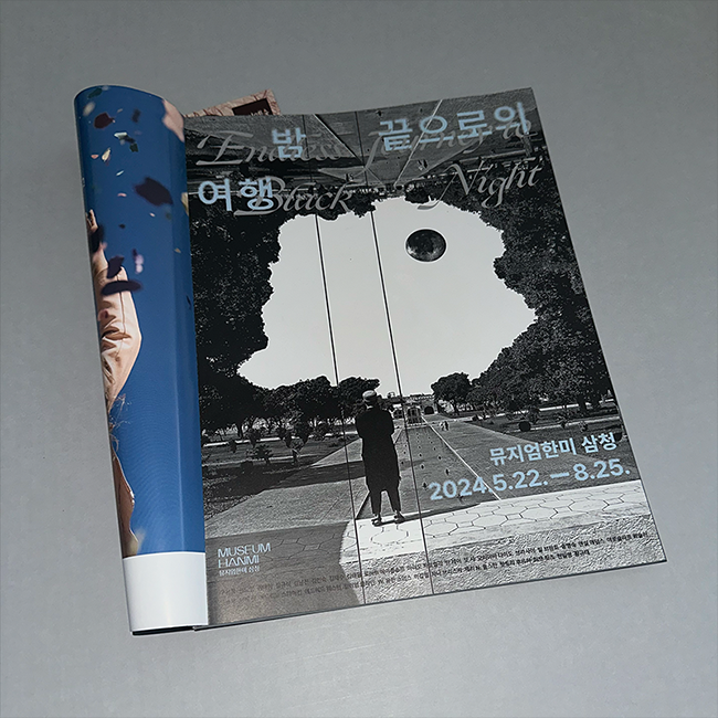
《밤 끝으로의 여행》 전시 브랜드 디자인
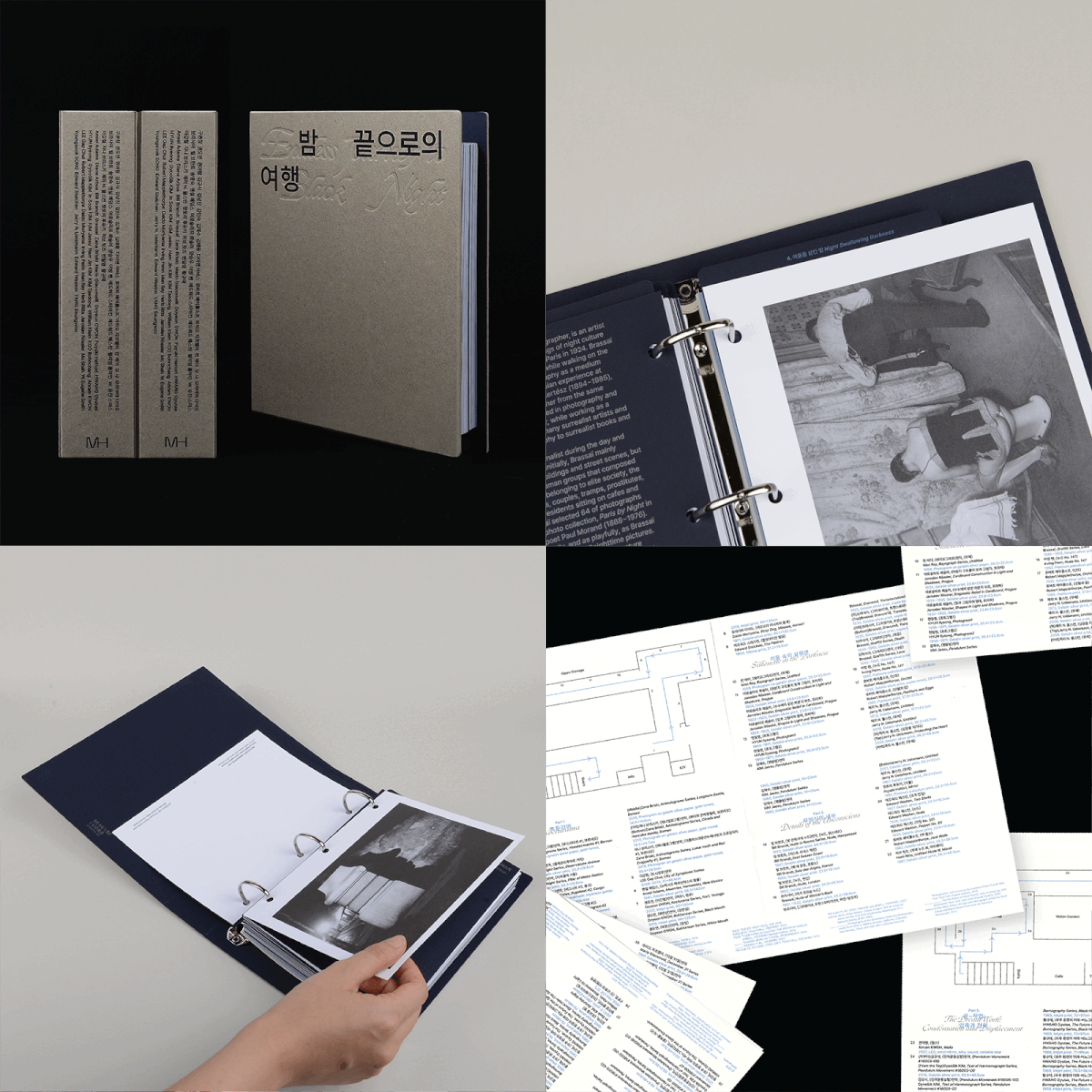
아이덴티티 디자인으로 전시 기획의 핵심 요소인 무의식에서 영감을 받아, 국문 타이포그래피를 안개처럼 점차 사라져가는 잔상의 형태로 표현했습니다. 또한 영문과 중첩 배치하여 의식과 무의식이 서로 얽혀 있는 듯한 긴장감을 연출했습니다. 이를 바탕으로 포스터, 엽서, 도록, 월텍스트, 지면 및 온라인 광고 등 전시 관련 전반의 시각 디자인을 작업했습니다.
총괄: 최봉림
기획: 김선영 학예연구관
진행: 김지현 학예연구관, 정지윤 학예연구사, 최은정 학예연구사, 김소은 인턴, 원성은 인턴
디자인: 정다슬
교육: 박민호 학예연구사, 신혜림
©museumhanmi
[Installation Ver.] Bubble in a Bubble
BA Graduation Project→Online Graduation Catalogue
2022, 1450x2010mm
1/4
2/4
3/4
4/4
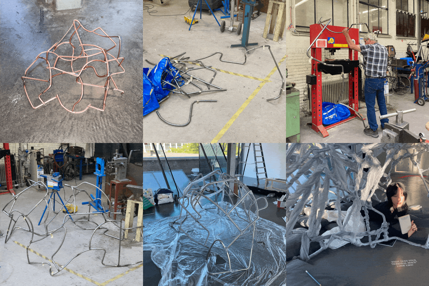
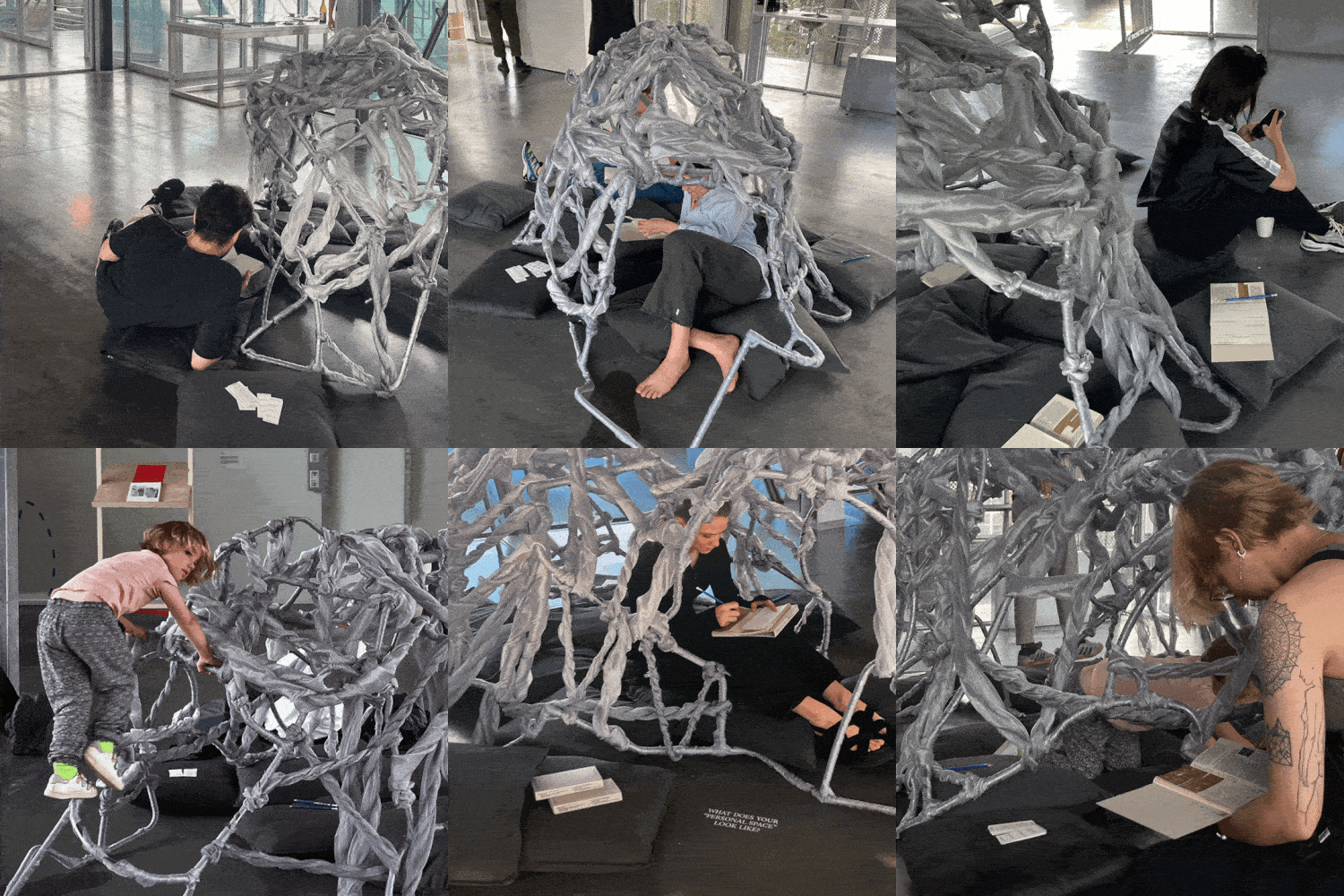
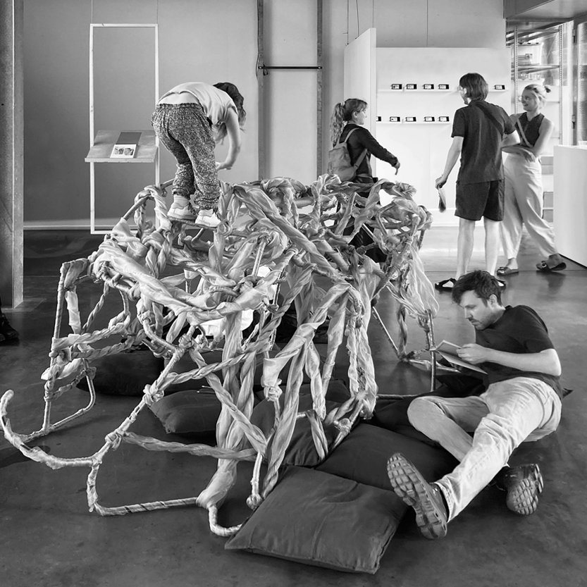
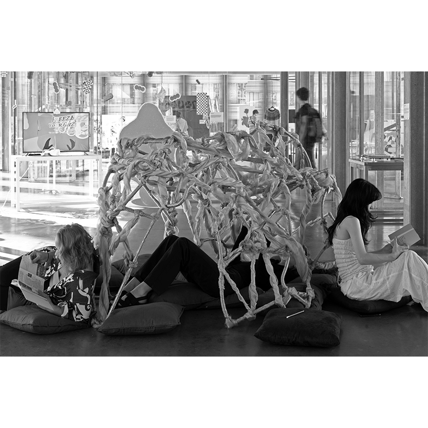
[Installation Ver.] Bubble in a Bubble
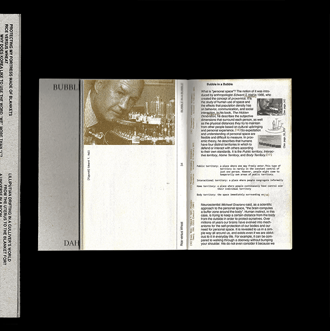
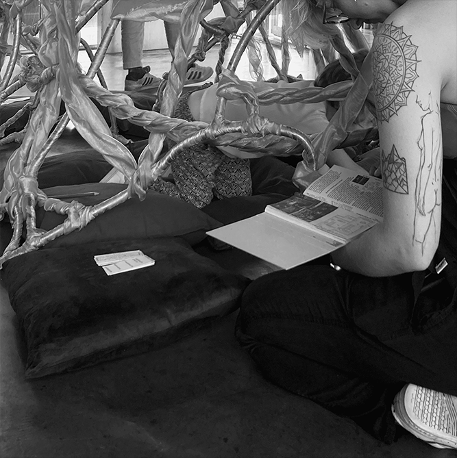
Humans unconsciously remember that space in our mother’s womb from birth, which is supported by the cave, the home of our primitive ancestors. Inspired by the shape of a uterus and caves, I designed and built the installation which was allowed to be used as a cave, shelter, sofa, playground, and whatever else people wanted during the exhibition.
→Go to Bubble in a Bubble
[Book Ver.] Bubble in a Bubble
BA Graduation Project & Thesis→Online Graduation Catalogue
110 x 188 x 15(mm), 2022
1/6
2/6
3/6
4/6
5/6
6/6
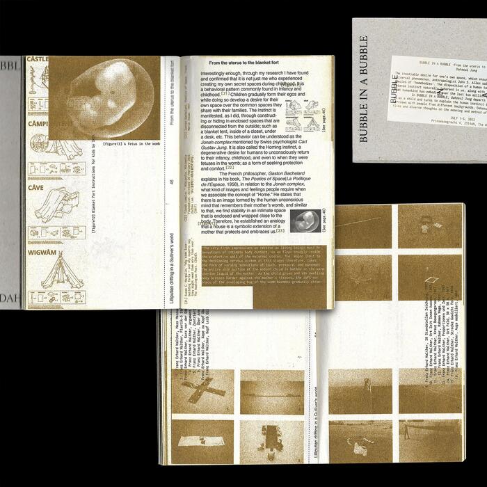
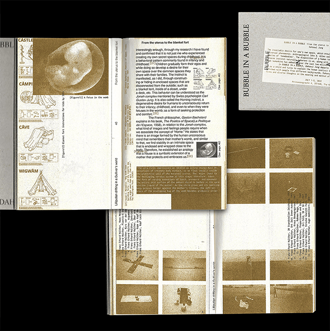
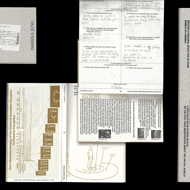
[Book Ver.] Bubble in a Bubble
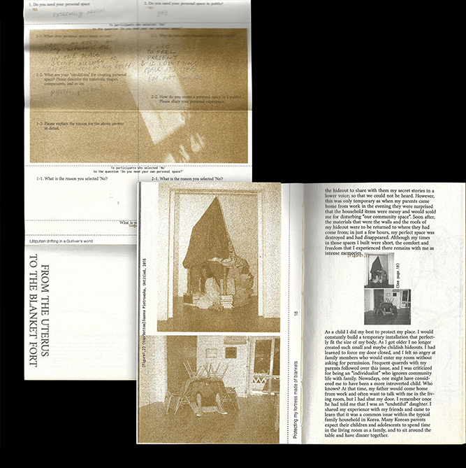
As part of the research for the paper, interviews with people from various social and cultural backgrounds were part of the book to share their perspectives on personal space, and blank questionnaire pages were included in the book to allow visitors to participate and share their thoughts during the exhibition.
Bubble in a Bubble is available in two formats: a book and a website.
Shop LifeSatin
2022

1/8

2/8

3/8

4/8

5/8

6/8

7/8

8/8

Shop LifeSatin
In collaboration with Sungjae Joo
I co-managed LifeSatin, a rookie's art-curated shop with Sungjae Joo, a photographer based in The Hague.
I was in charge of the overall branding design for LifeSatin, including the logo, packaging, business card, and website as well as art directing.
Direction: Sungjae Joo, Dahseul Jung Design: Dahseul Jung Photography: Sungjae Joo → LifeSatin
전시 연계 도록 『밤 끝으로의 여행』 & 핸드아웃
뮤지엄한미
2024, 230×188mm, 250p
1/9
2/9
3/9
4/9
5/9
6/9
7/9
8/9
9/9
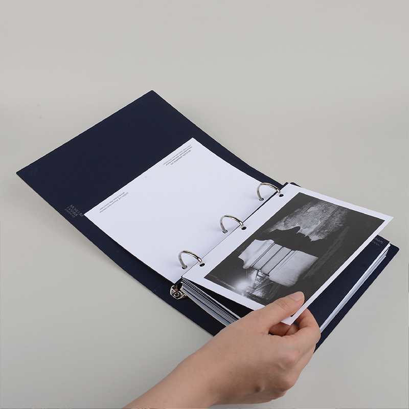
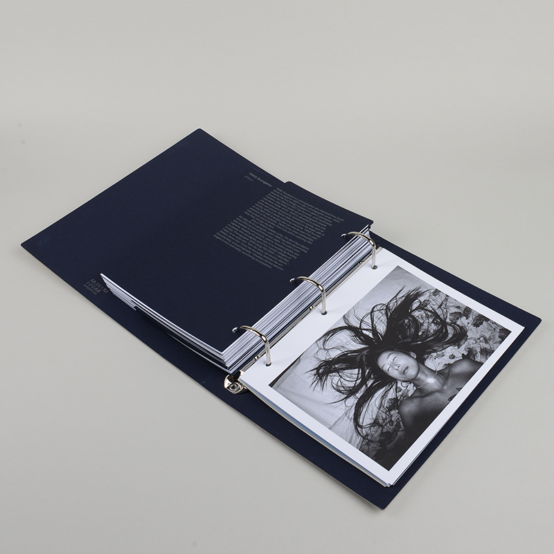
전시 연계 도록 『밤 끝으로의 여행』 디자인
p.1-7
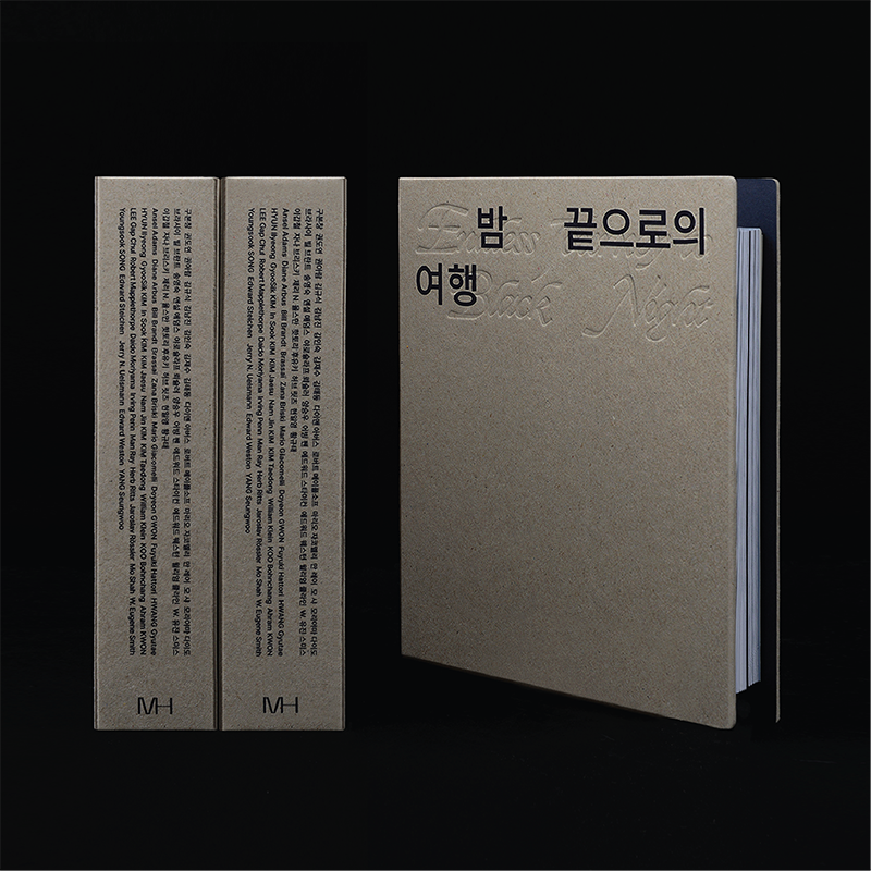
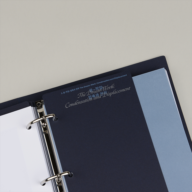
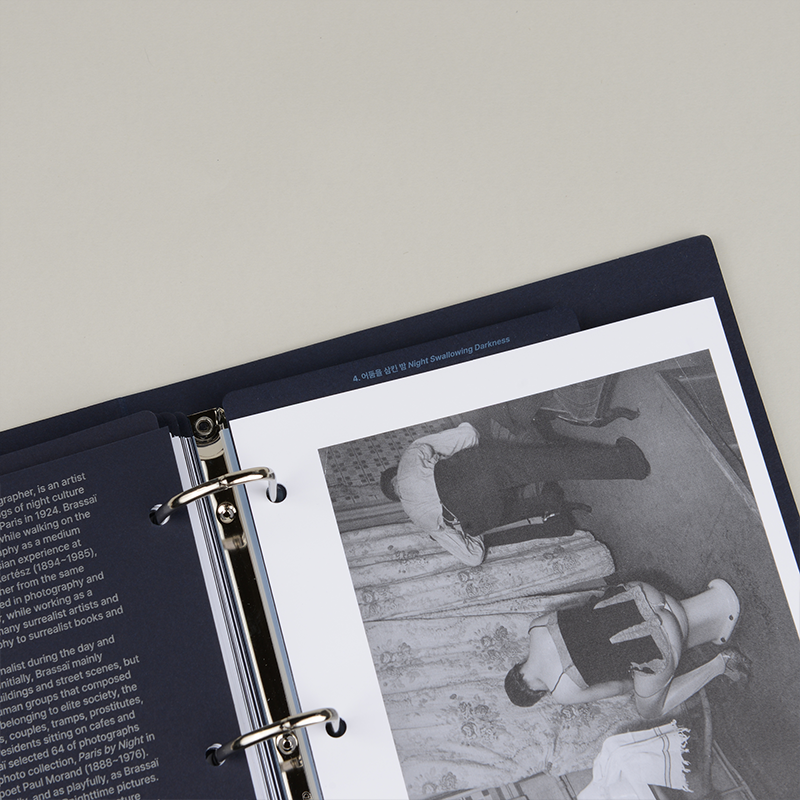
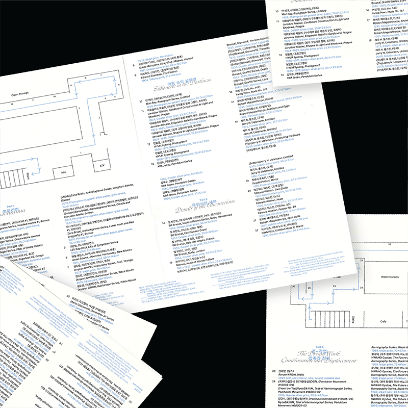
《밤 끝으로의 여행》 전시와 연계하여 도록을 제작했습니다. 세대와 국적을 아우르는 32명의 작품을 선별해 담았으며, 단순히 읽고 보관하는 책의 형식을 넘어 바인더 구조로 엮어 작품을 보다 자유롭게 활용할 수 있도록 디자인했습니다.
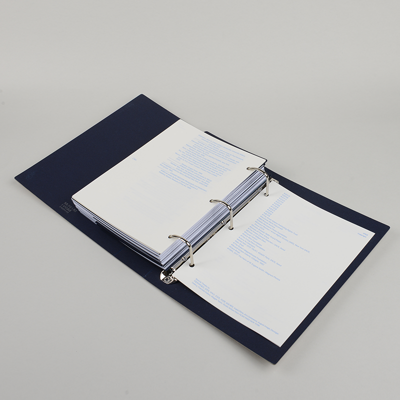
P.8-9
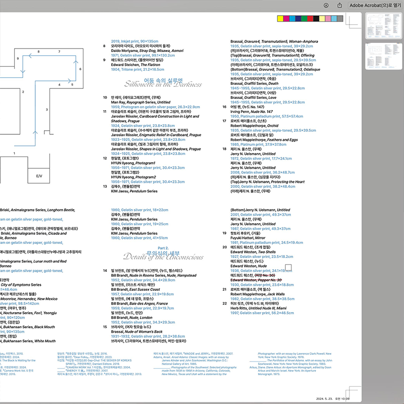
전시된 작품 캡션과 전시 공간 동선 정보를 담은 핸드아웃을 제작했습니다. 관람객이 전시를 따라가며 작품을 이해하고 경험할 수 있도록, 캡션과 공간 정보를 간결하면서도 직관적인 레이아웃으로 구성했습니다.
편집: 김지현 학예연구관
글: 김선영, 조선령
번역: 한국외대통번역센터
교열, 감수: 노경수
인쇄 및 제본: 문성인쇄
©museumhanmi
Internship at 일상의실천
2021
1/8
2/8
3/8
4/8
5/8
6/8

7/8
8/8
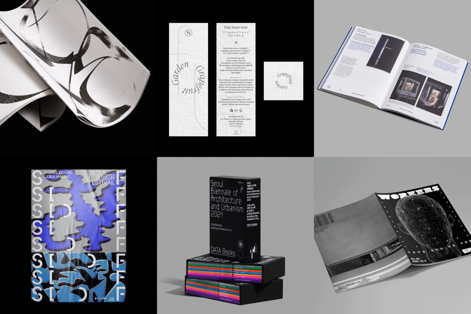
Internship at 일상의실천
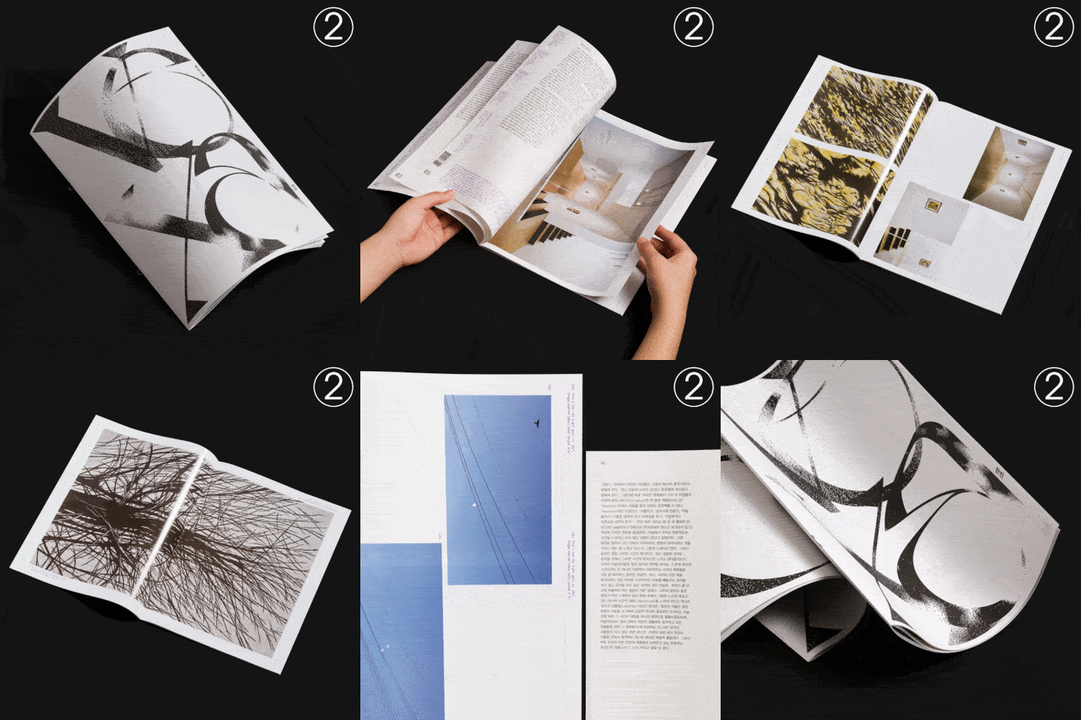
2 Brochure design for an exhibition 벡사시옹
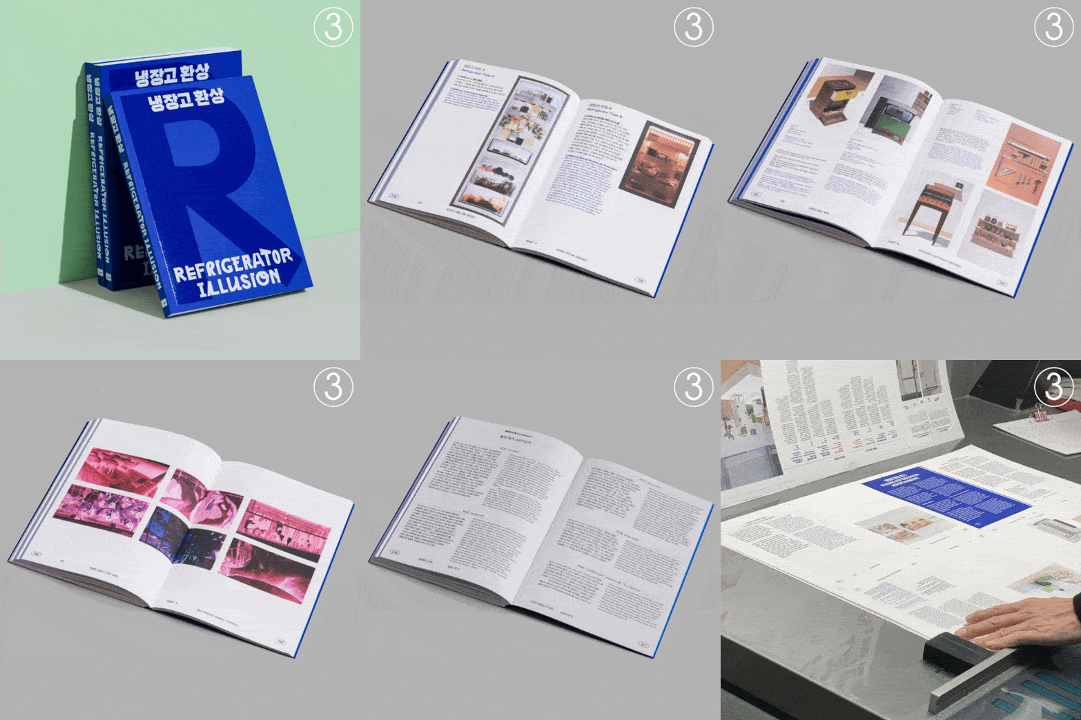
3 Participating as an assistant designer for an exhibition 냉장고환상
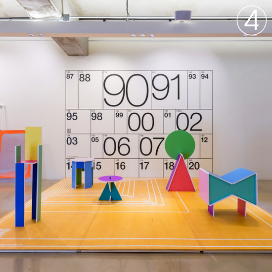
4 Participating as a graphic designer for an exhibition 땅따먹기
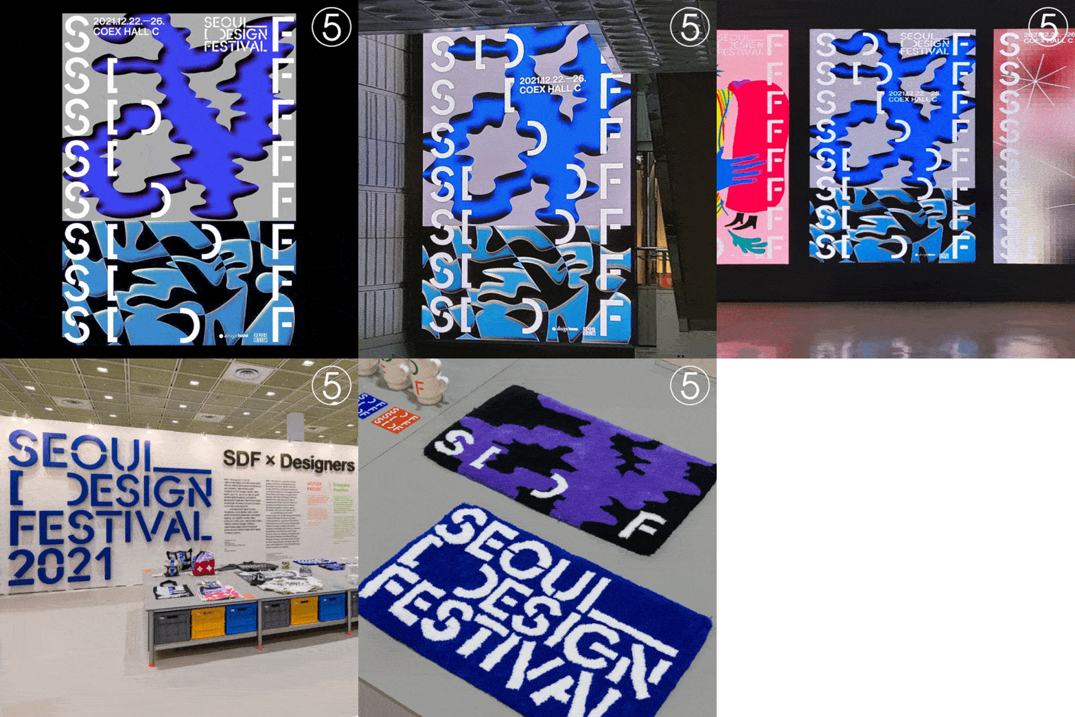
5 Poster Design for Seoul Design Festival 2021
6 Participating as an assistant designer for a magazine Amnesty Magazin Issue 69
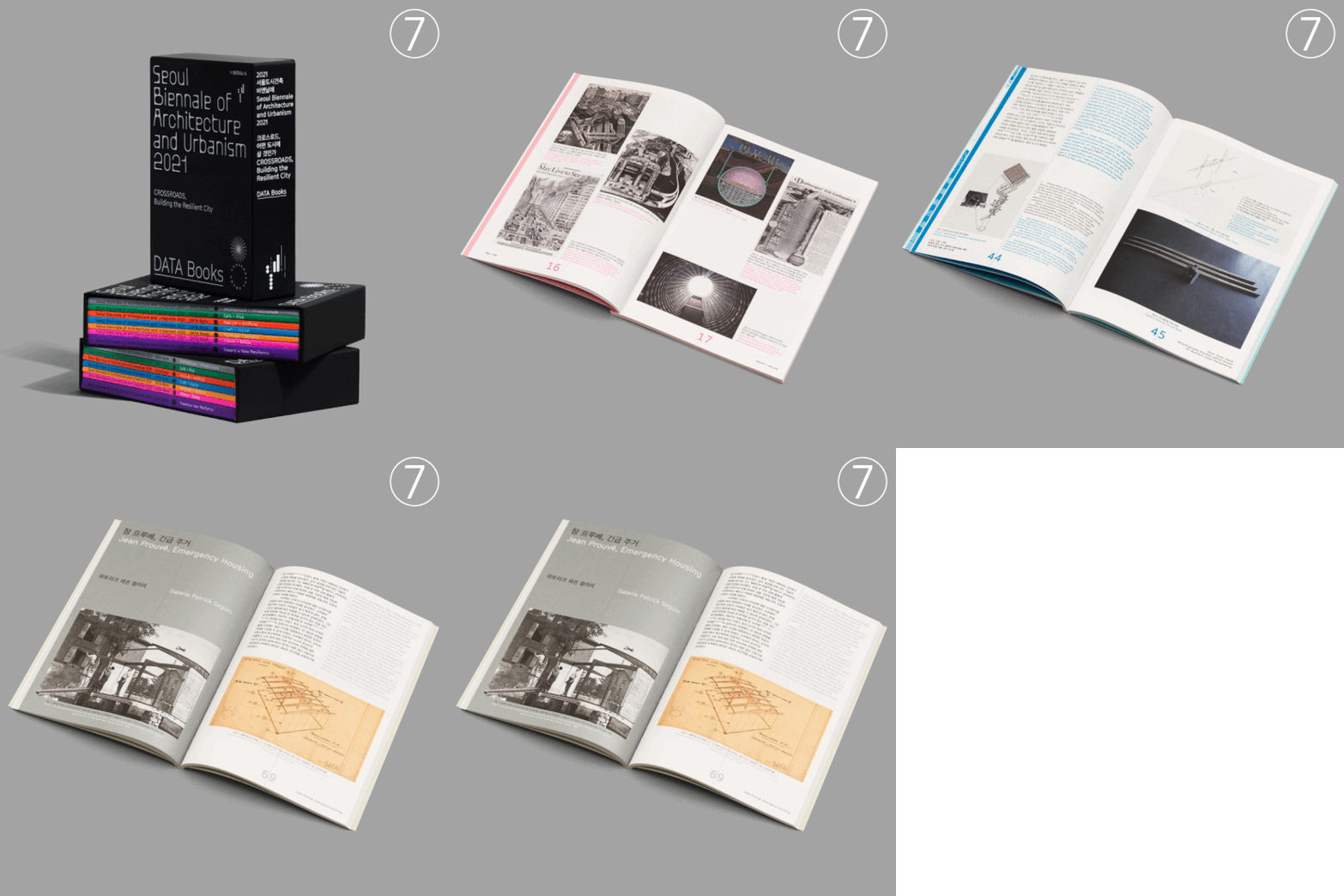
7 Participating as an assistant designer for an exhibition 서울도시건축비엔날레(SBAU) 2021
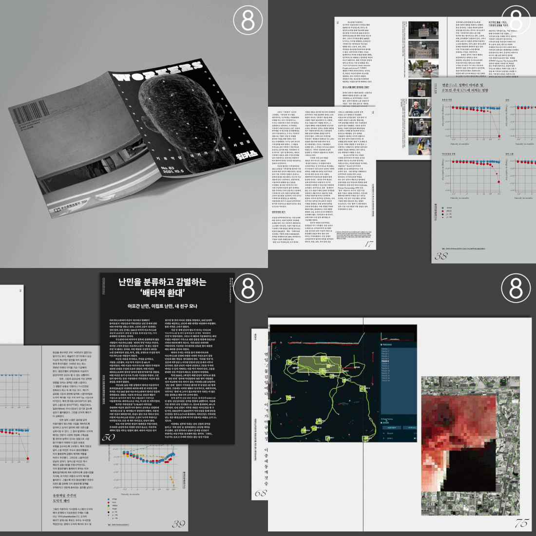
8 Participating as an assistant designer for a magazin Workers
©Everyday Practice
주오스트리아 문화원 《Mega Seoul 8 Decades 서울에서 살으렵니다》
전시 브랜드 디자인
뮤지엄한미, 주오스트리아 문화원
2025
1/8
2/8
3/8
4/8
5/8
6/8
7/8
8/8
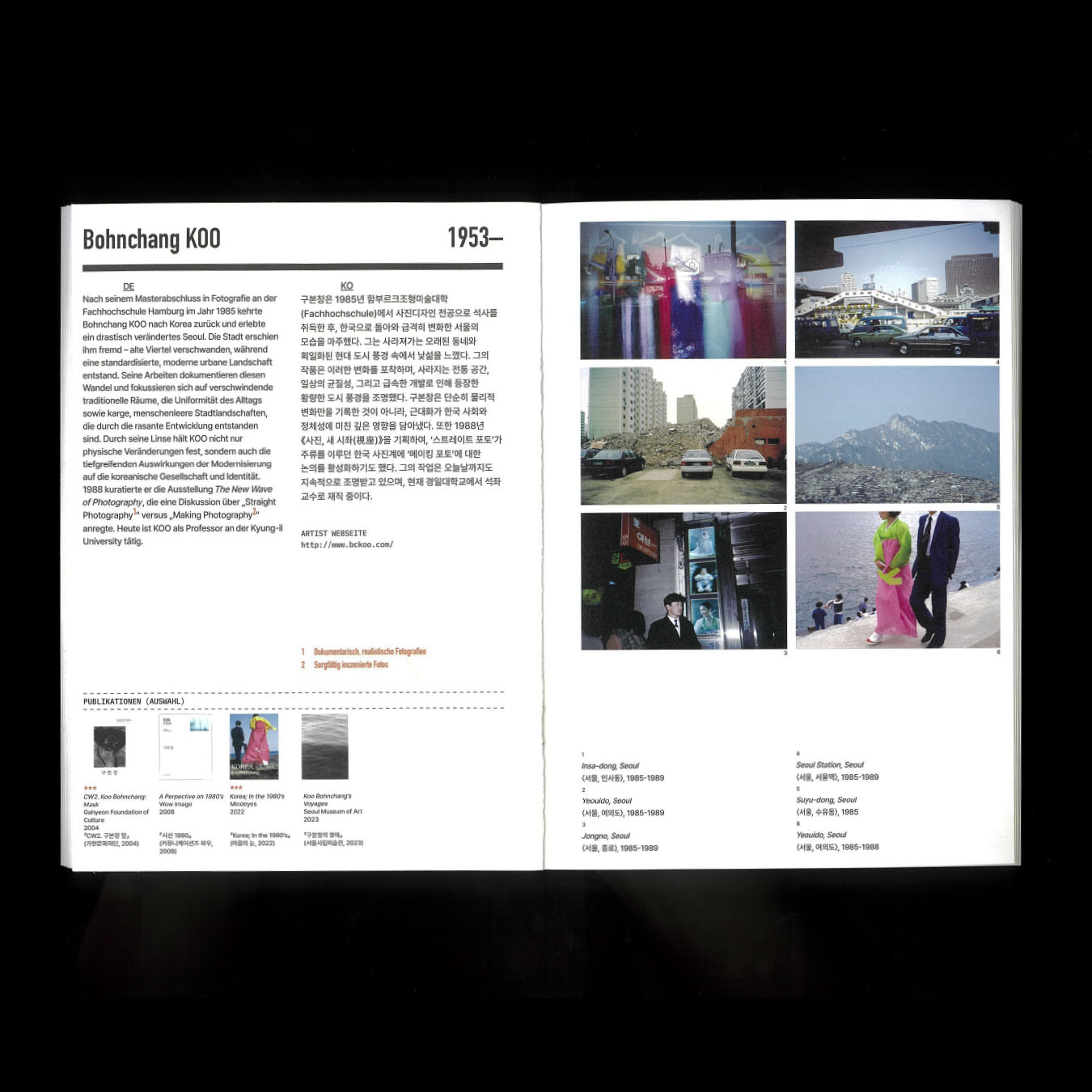
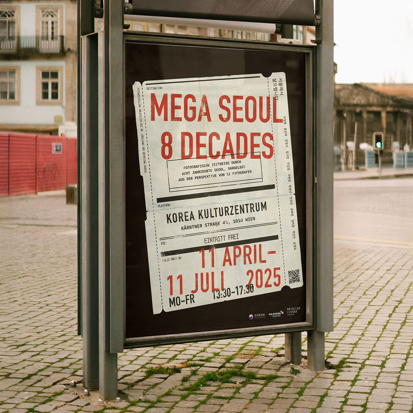
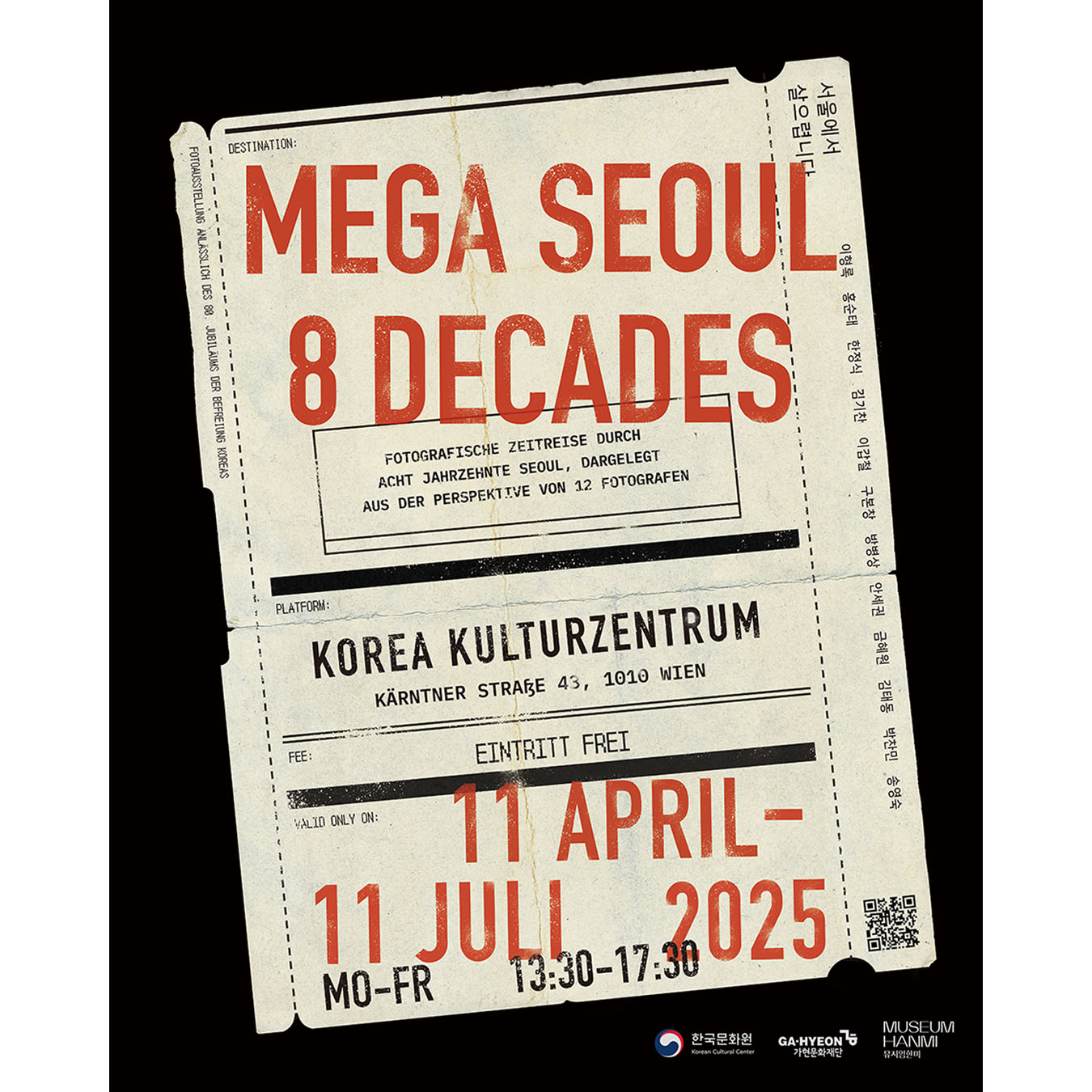
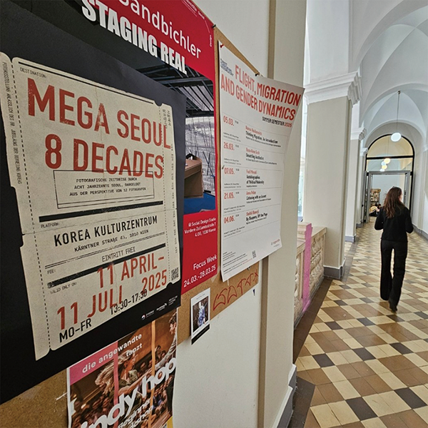
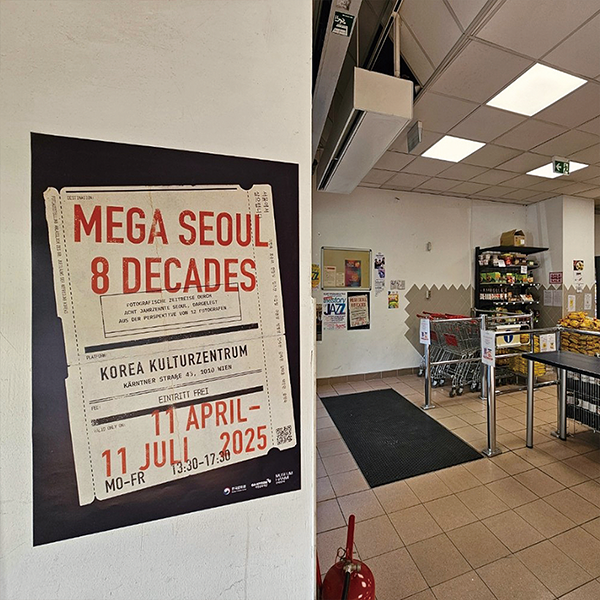
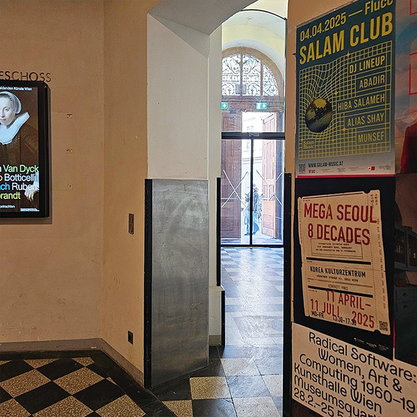
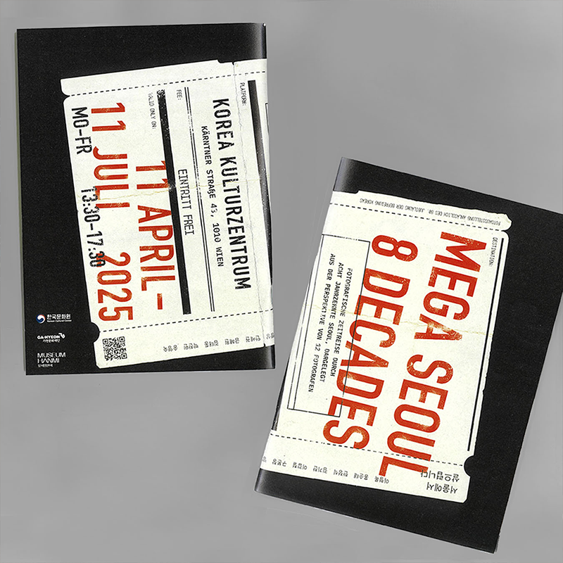
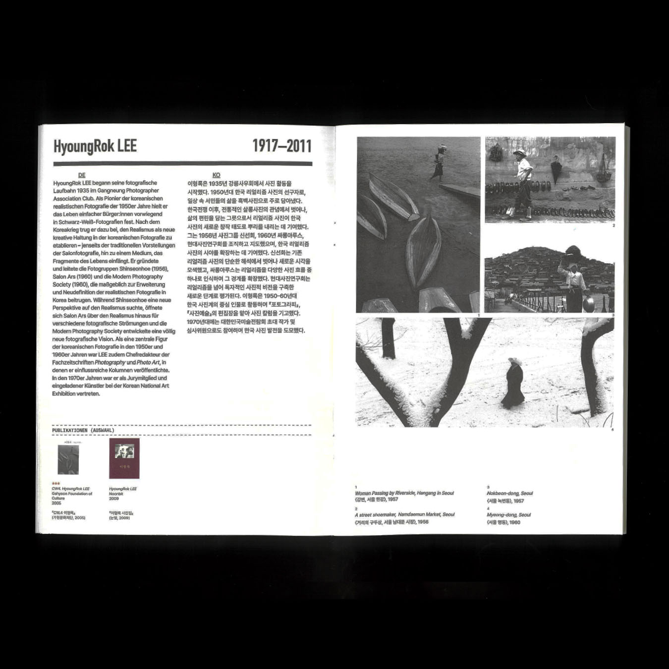
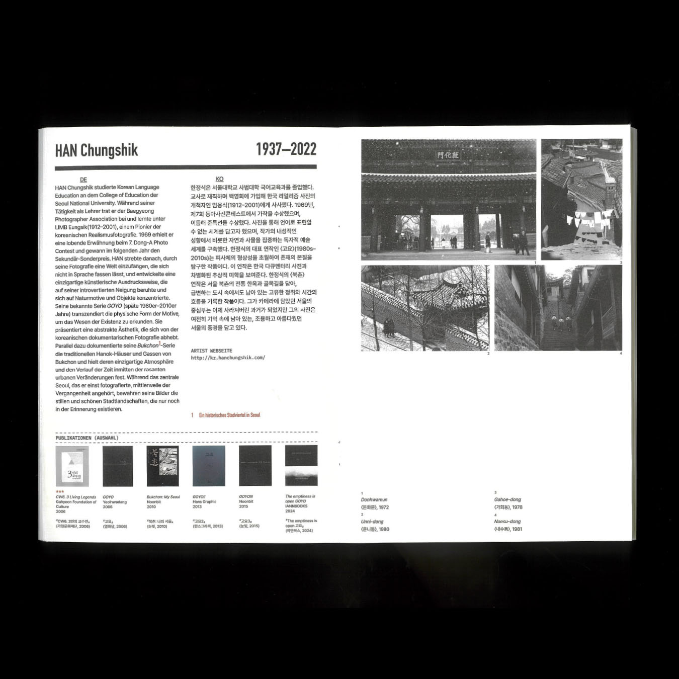
주오스트리아 문화원 《Mega Seoul 8 Decades 서울에서 살으렵니다》 전시 브랜드 디자인
주오스트리아 한국문화원이 주최하고 뮤지엄한미가 기획한 전시 《Mega Seoul 8 Decades 서울에서 살으렵니다》의 포스터와 소책자를 디자인하였습니다.
본 전시는 원로부터 신진까지 12명의 사진가가 각자의 시선으로 기록한 서울의 다양한 풍경을 소개하며, 1950년대 전쟁 이후의 변화, 1960년대 산업화와 도시 집중화, 그리고 오늘날 세계적 메가시티로 성장한 서울의 모습을 조망합니다.
디자인 컨셉으로 ‘시간 여행’이라는 전시의 기획 의도를 시각적으로 풀어내기 위해 기차 티켓을 모티프로 한 디자인을 제안했습니다. 또한, 오스트리아와 한국 양국의 상징색인 붉은색을 키 컬러로 사용하여 두 나라의 연결성과 협력의 의미를 강조했습니다.
편집: 김지현 학예연구관
진행: 최은정 학예연구사, 정지윤 학예연구사, 김소은
디자인: 정다슬
인쇄: 문성인쇄
©museumhanmi

1/4

2/4

3/4
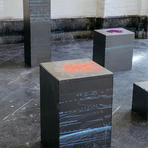
Starting with an investigation into how climate change affects the Netherlands ecosystem, Eunseo and Dahseul discovered that geological conditions in the Netherlands have changed dramatically over the past decade.
They highlighted 6 representative cities in the Netherlands and studied of recoreded soil condition and land subsidence through an open source published by TU Delft. In the end, Eunseo and Dahseul transformed the research into sounds and graphic elements with P5js.
Mirroring me, Mirroring you
2020, 200x230mm
1/7
2/7
3/7
4/7
5/7
6/7
7/7
Mirroring me, Mirroring you
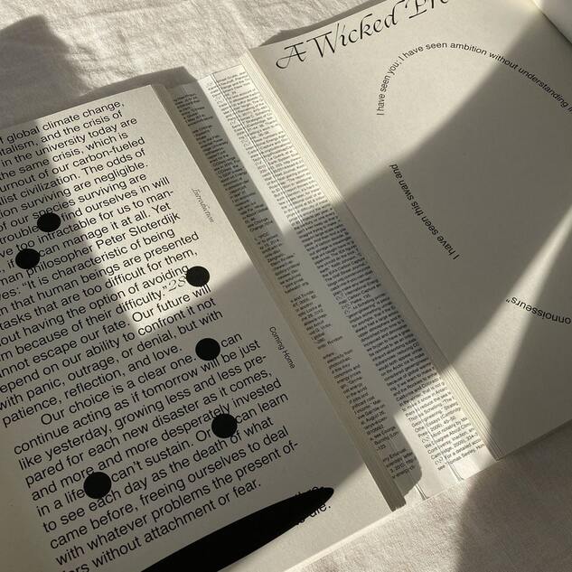
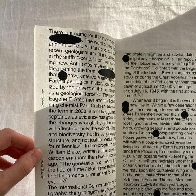
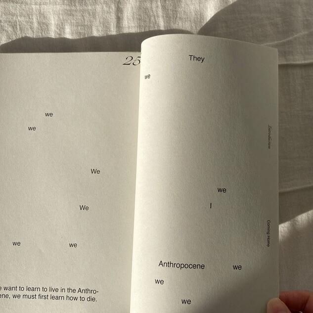
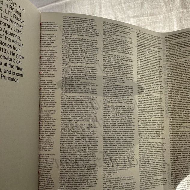
The book, Mirroring me, Mirroring you is aiming to persuade readers to realize and reflect on themselves through the way they read the book.
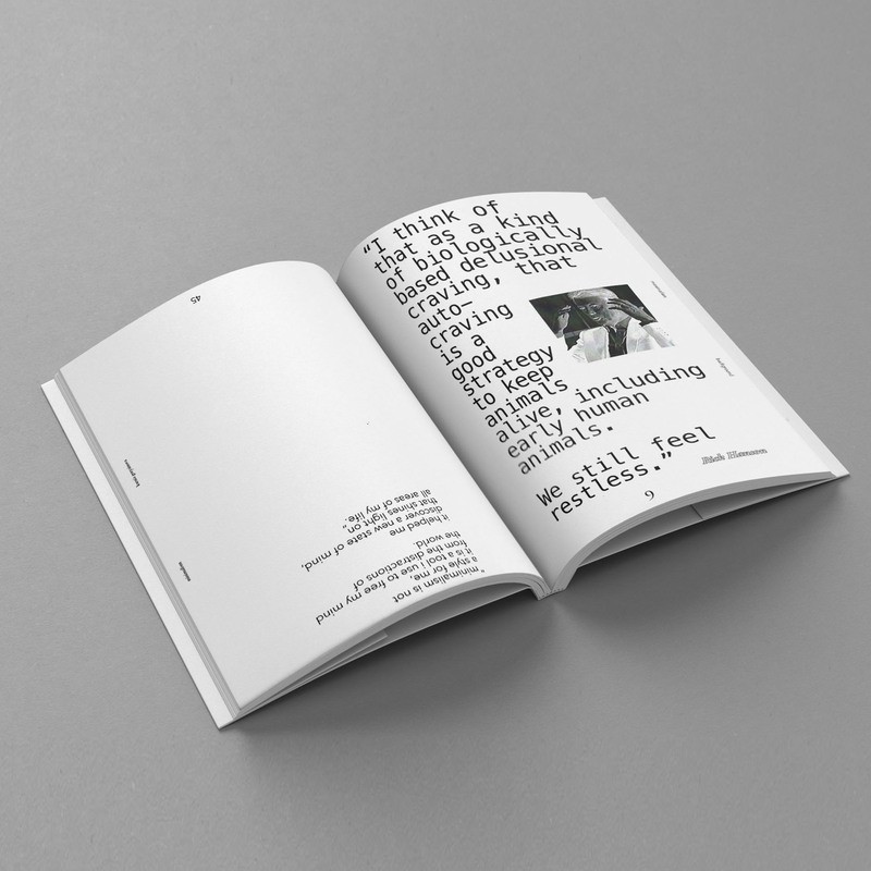
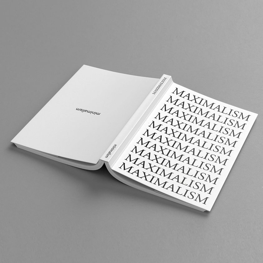
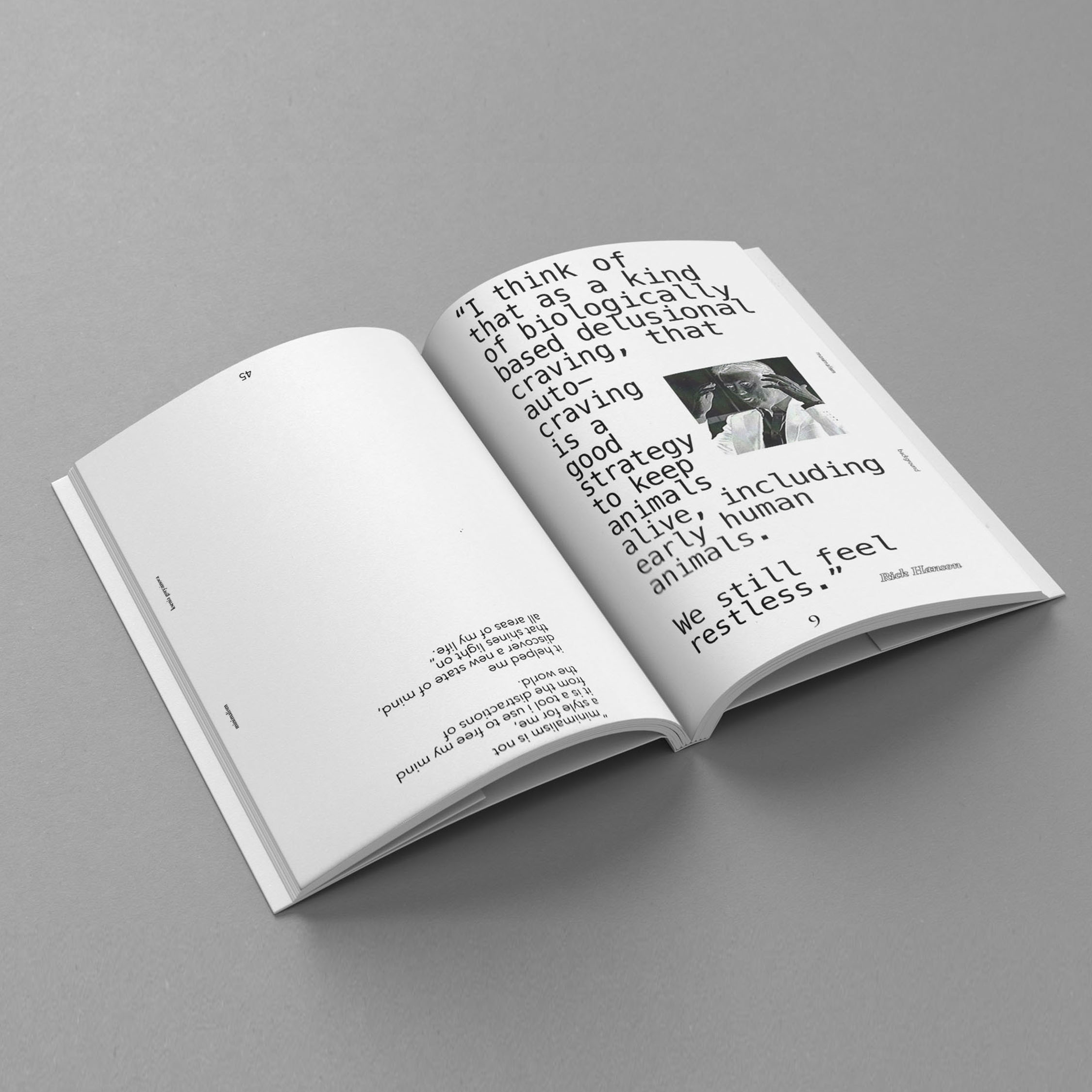
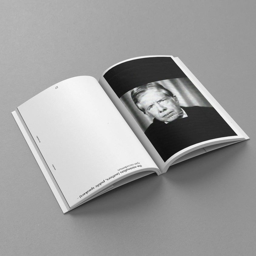
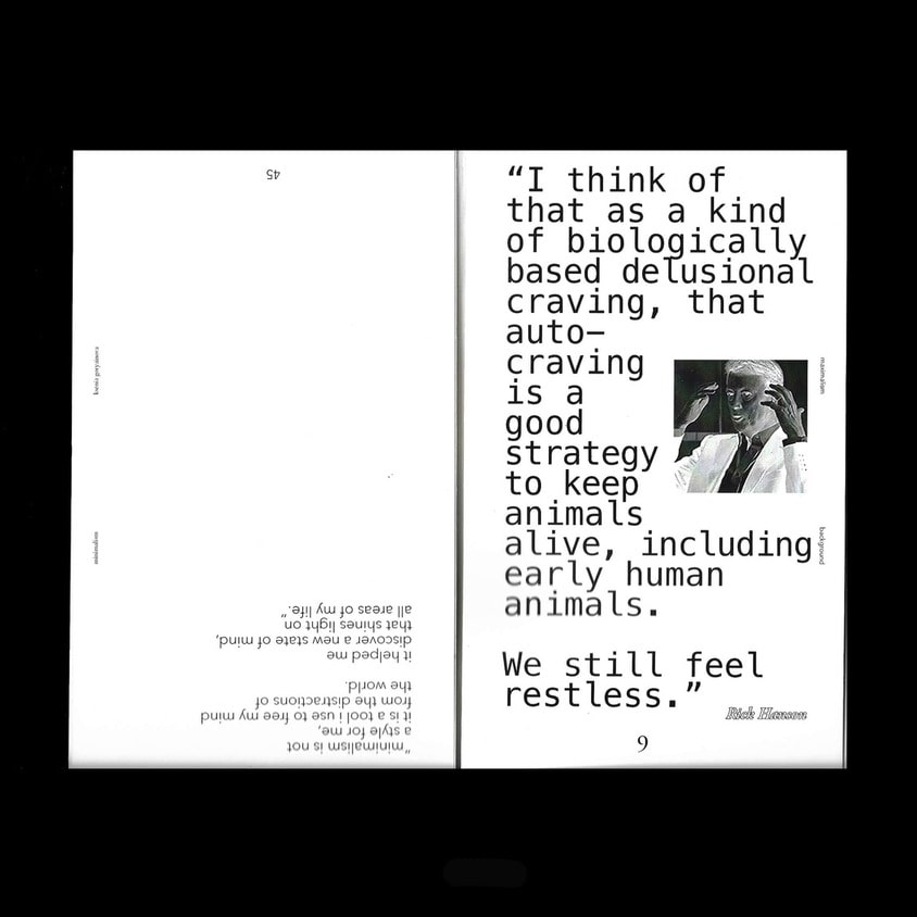
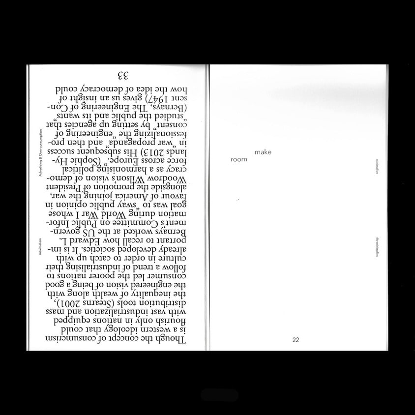
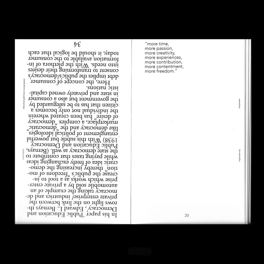
Minimalism and Maximalism
2019, 135x220mm
1/7
2/7
3/7
4/7
5/7
6/7
7/7
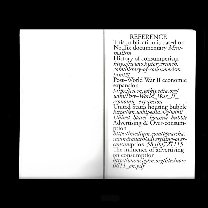
Minimalism and Maximalism
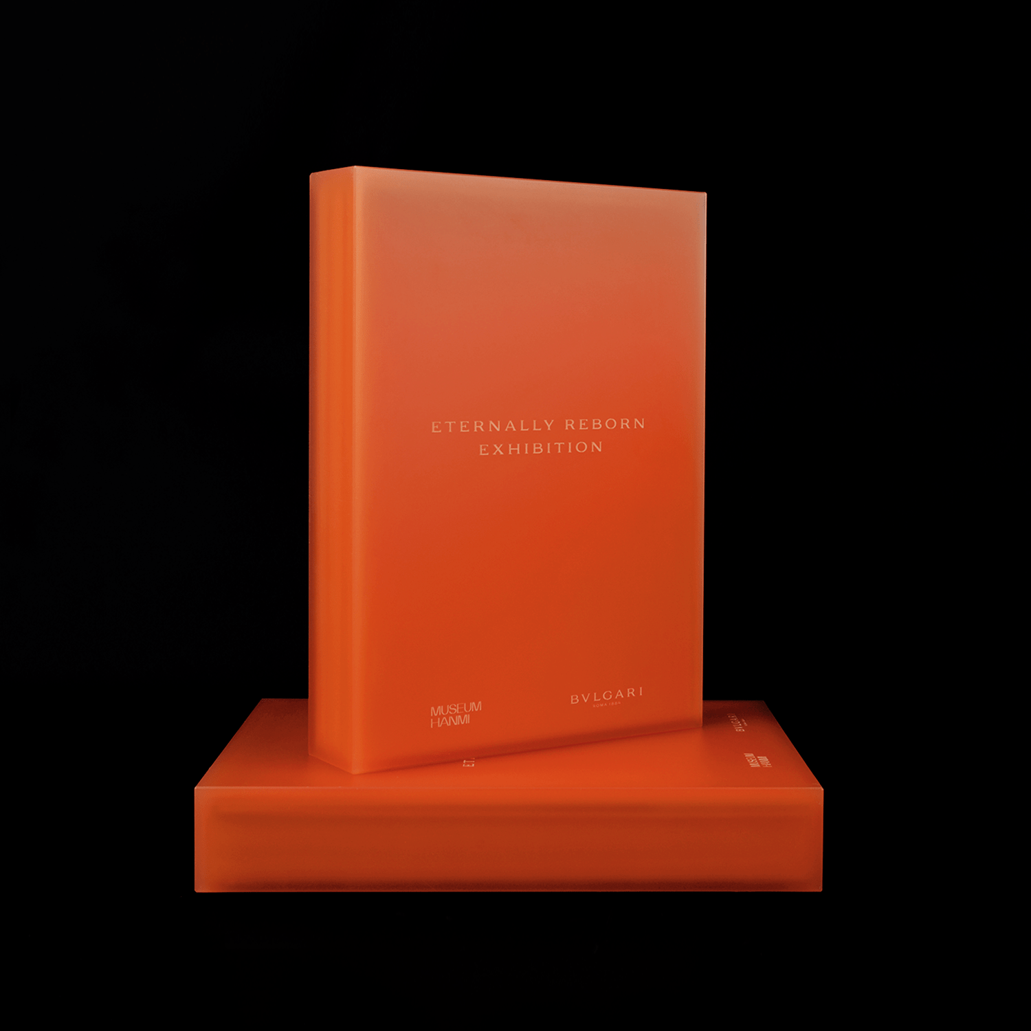
BVLGARI 전시 도록 『Eternally Reborn』
뮤지엄한미 X BVLGARI
2024, 290x210mm
1/7
2/7
3/7
4/7
5/7
6/7

7/7
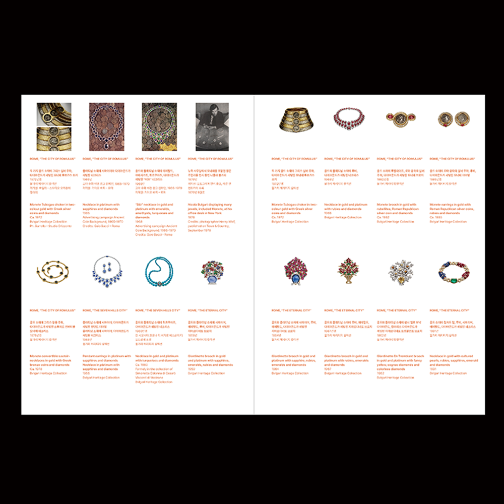
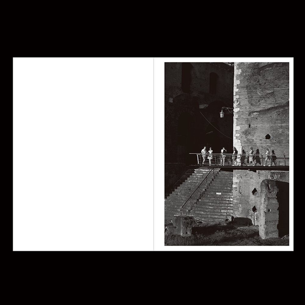
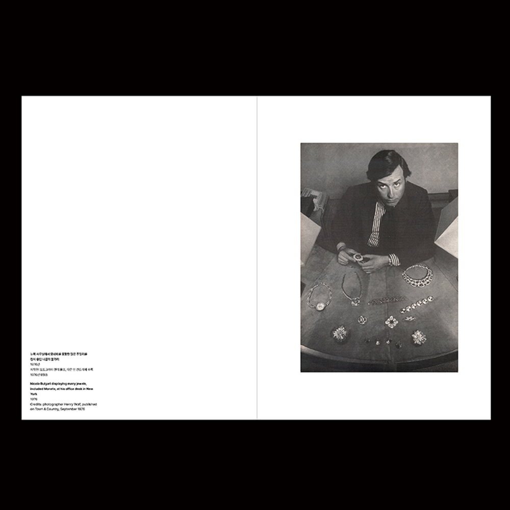
BVLGARI 전시 도록 『Eternally Reborn』
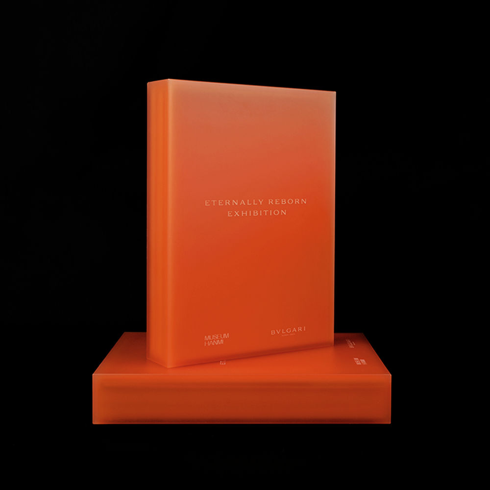
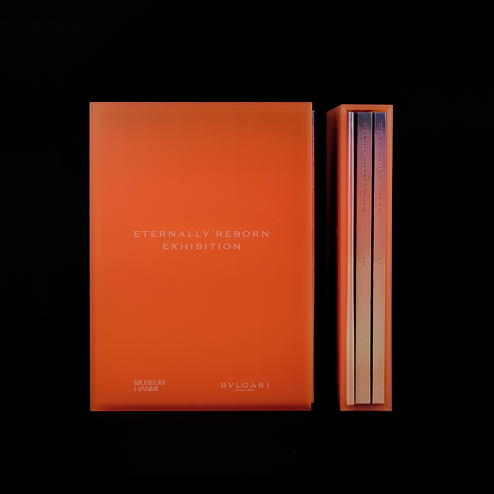
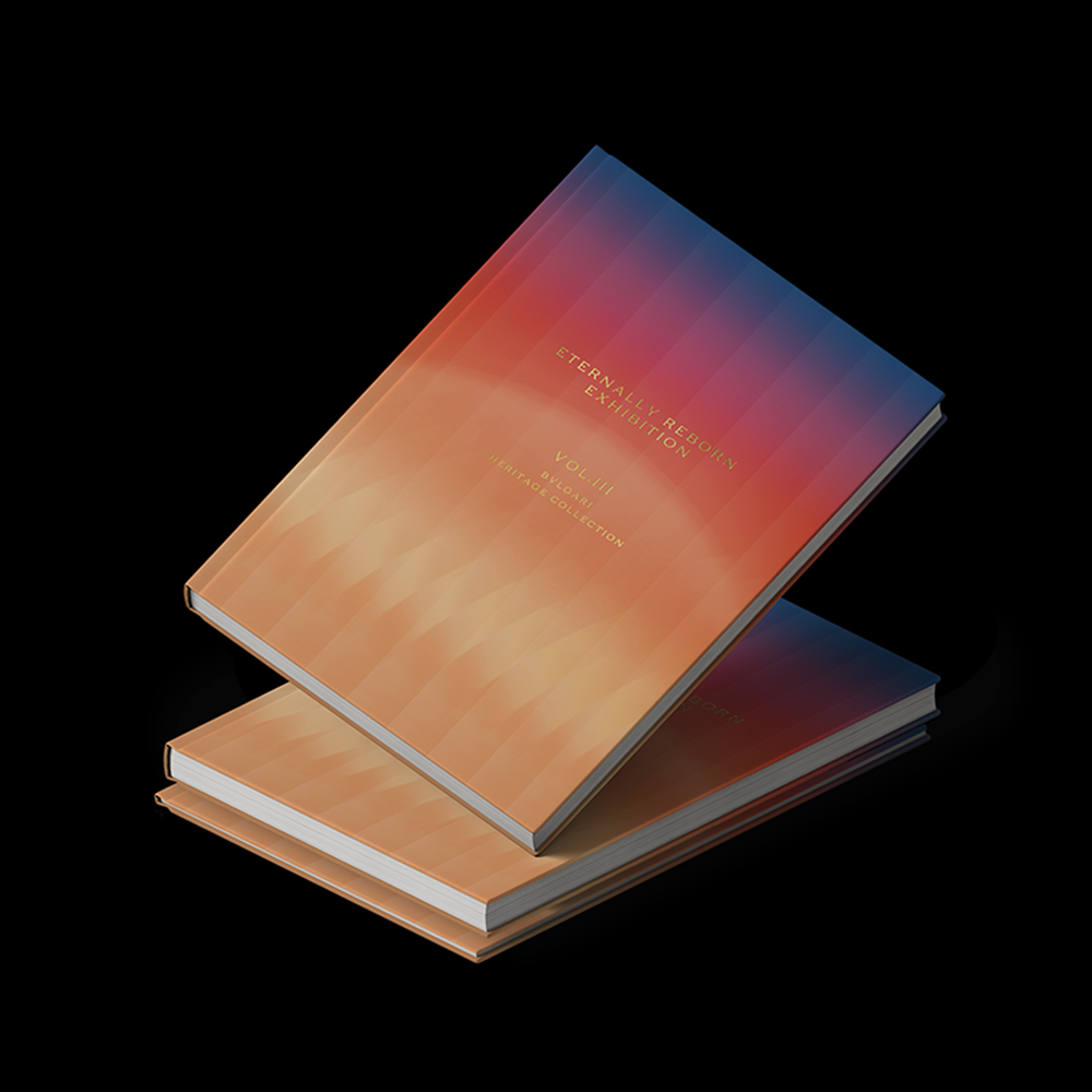
강렬한 주황다홍색을 키 컬러로 설정하고, 불가리의 고급스러움과 주요 타깃층을 반영해 미니멀하고 안정적인 편집 디자인을 구현했습니다. 도록은 세 권의 분권 형식으로 구성되며, 불가리 헤리티지 보석과 배찬효·이갑철·이웅철의 주요 작품, 그리고 불가리와 뮤지엄한미 큐레이터 기획 글을 담았습니다. 이를 아우르는 패키지로 견고한 반투명 아크릴 케이스를 제작해, 도록의 고급스러움과 물리적 완성도를 강화했습니다.
출판
편집: 김지현 학예연구관
디자인: 정다슬
인쇄: 문성인쇄
전시
기획: 김지현 학예연구관
진행: 김선영 학예연구관, 최은정 학예연구사, 정지윤 학예연구사, 김소은 인턴, 원성은 인턴
©museumhanmi
Typography for 3CE Layer-it-all Eyeshadow Palette
3CE
2025
1/5
2/5
3/5
4/5
5/5
5/5

5/5
5/5
5/5

5/5
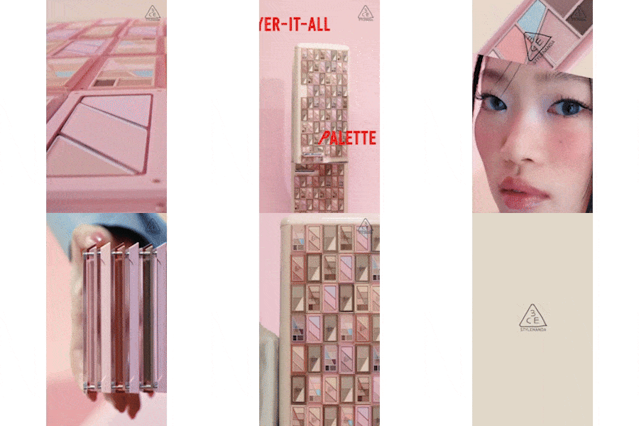
Typography for 3CE Layer-it-all Eyeshadow Palette
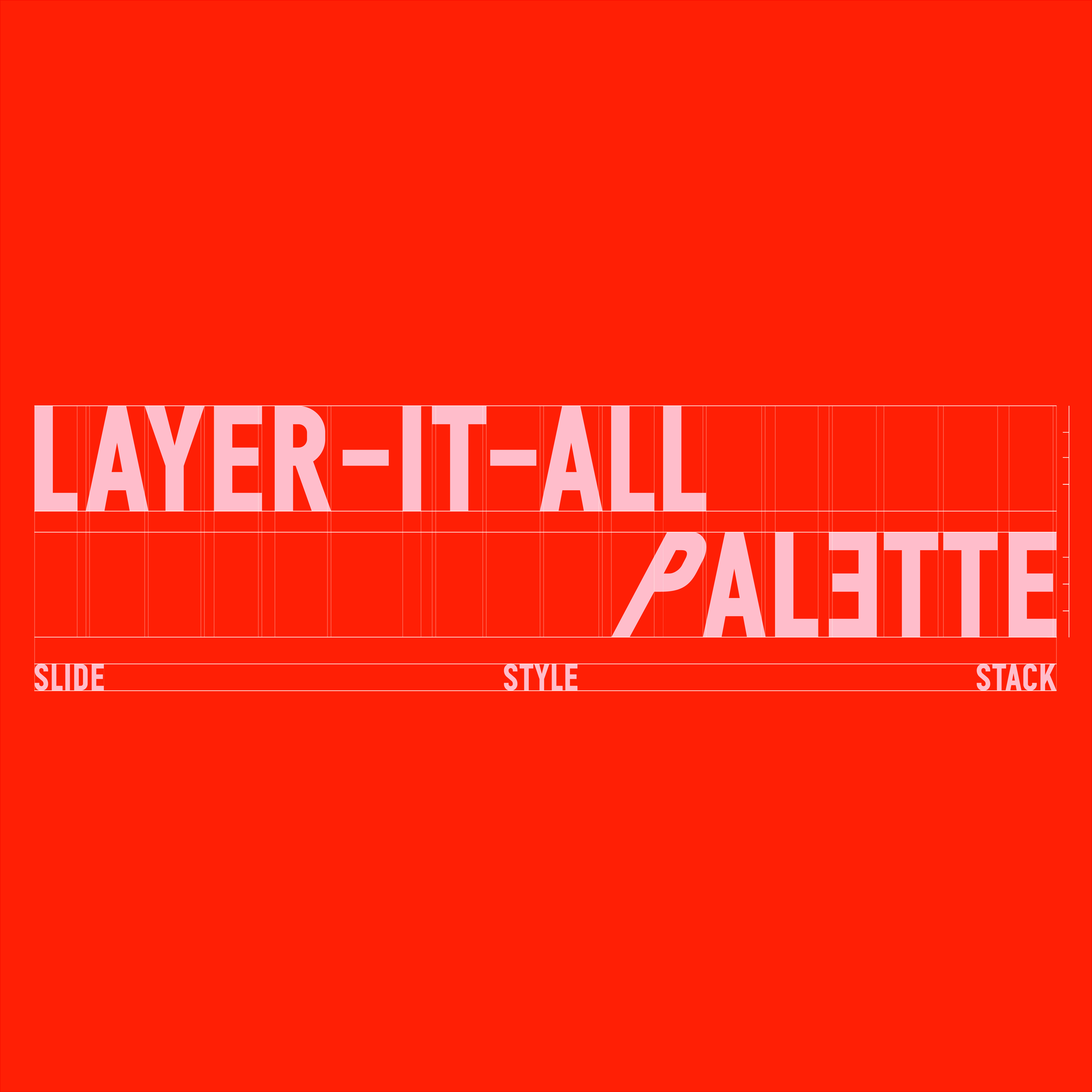
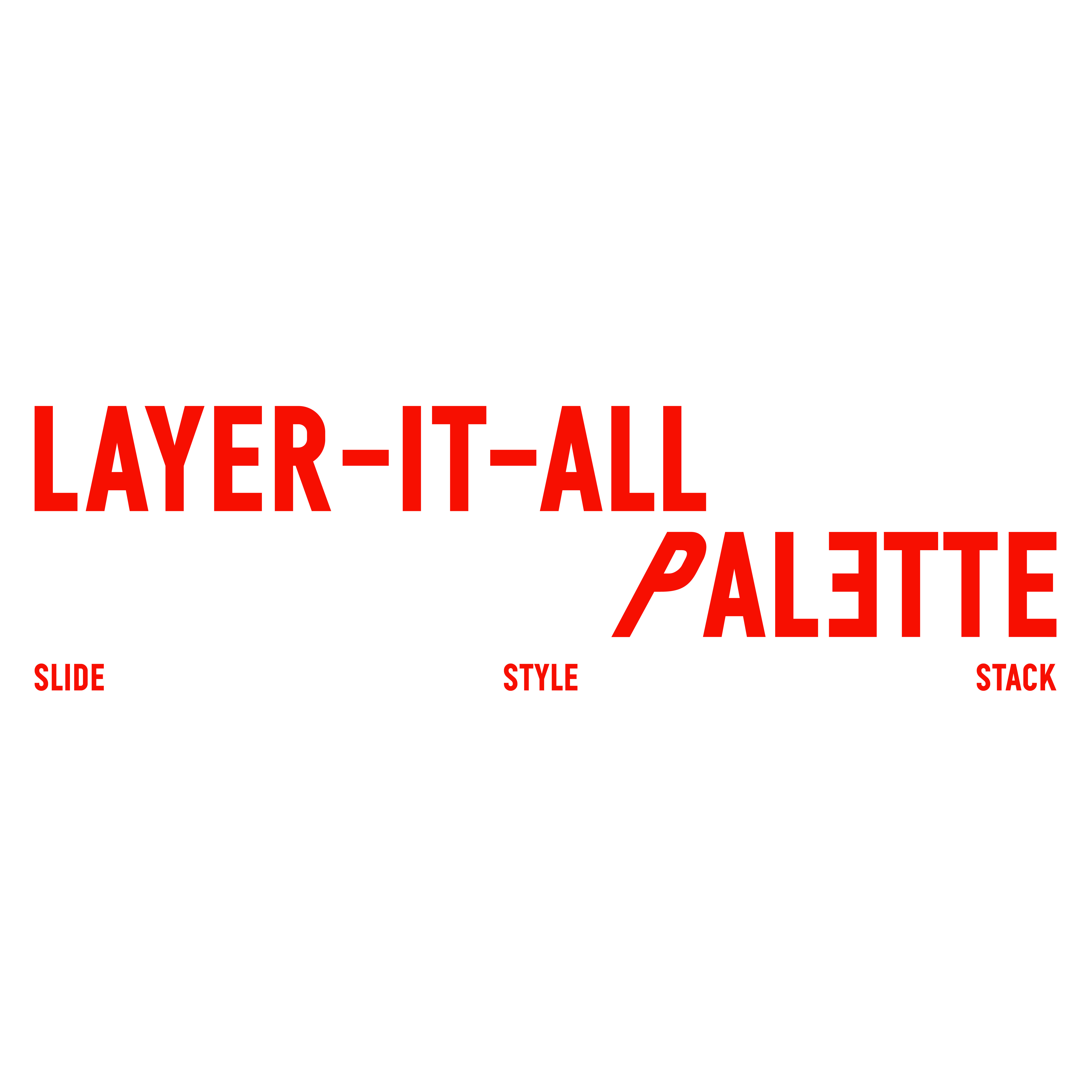
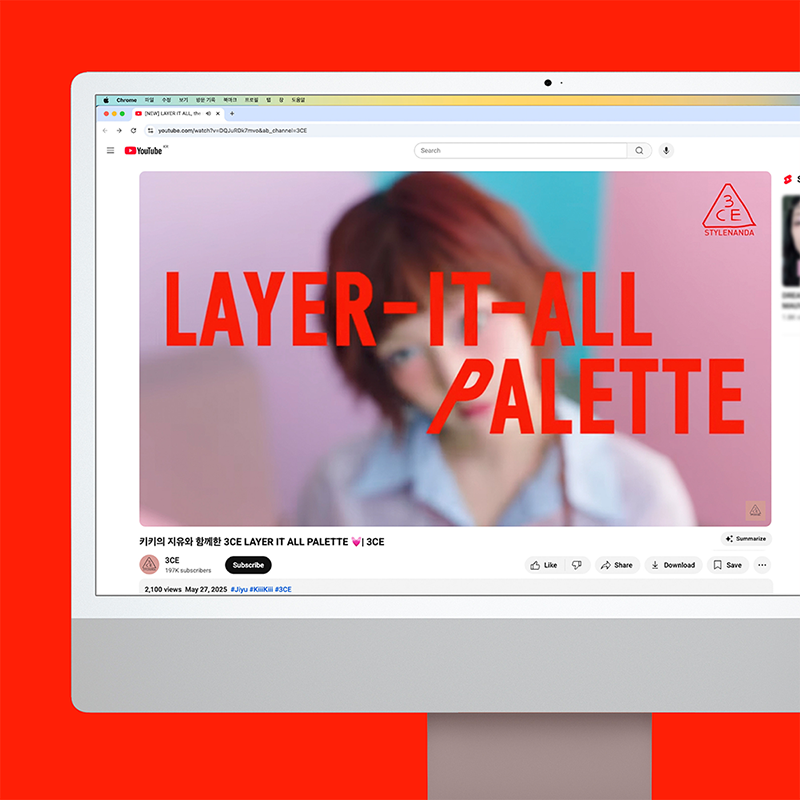
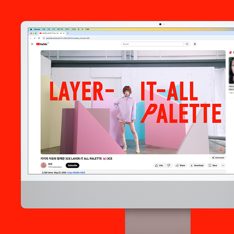
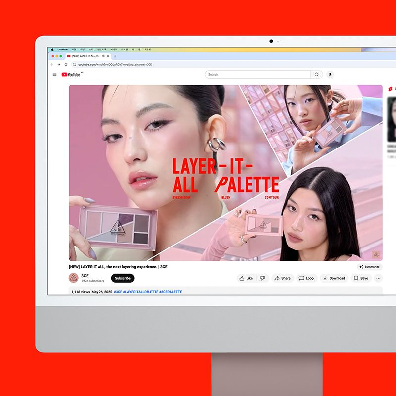
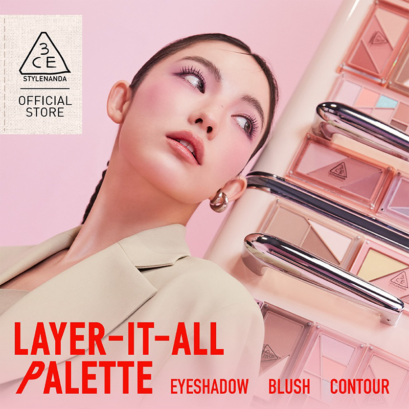
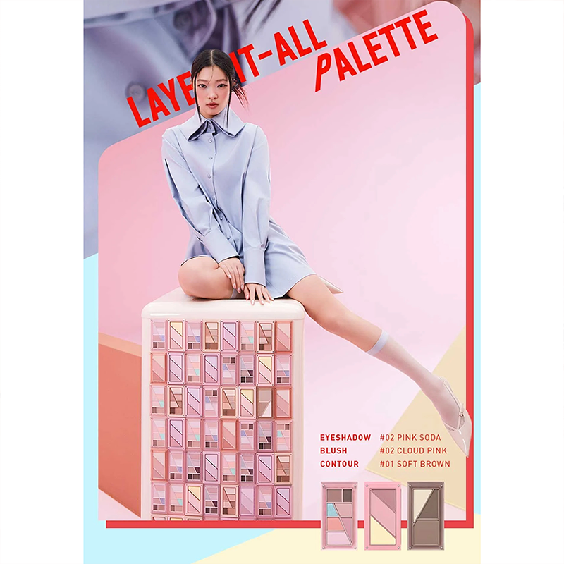
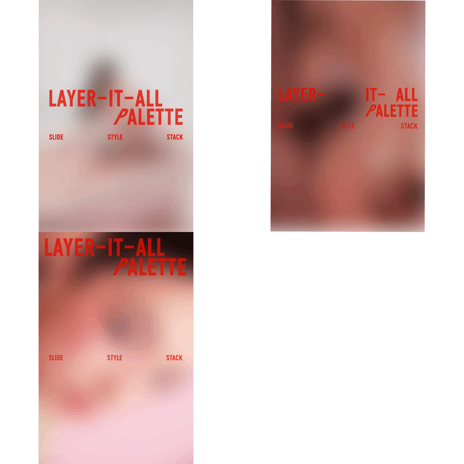
화장품 브랜드 3CE가 2025년 5월에 런칭한 Layer-it-all Eyeshadow Palette의 타이포그래피 디자인을 맡았습니다.
제품의 길쭉한 팔레트 형태와 격자형 구조에서 착안하여, 시각적 연속성과 리듬감을 강조할 수 있는 얇고 긴 현대적 산세리프 서체를 적용했습니다. 특히 타이틀의 Palette에서 P자를 기울여 제품의 직선적이고 기하학적인 레이아웃과 시각적 연관성을 주면서, 브랜드 특유의 위트 있는 개성을 표현했습니다.
Production: 김상은
Photography: 신선혜
Film Direction: 할렉스
Makeup: 정수연
Hair Design: 이현우
Styling: 전현좌
Nail Design: 김수지
Set Design: 이예슬
Assistant Production: 송현아
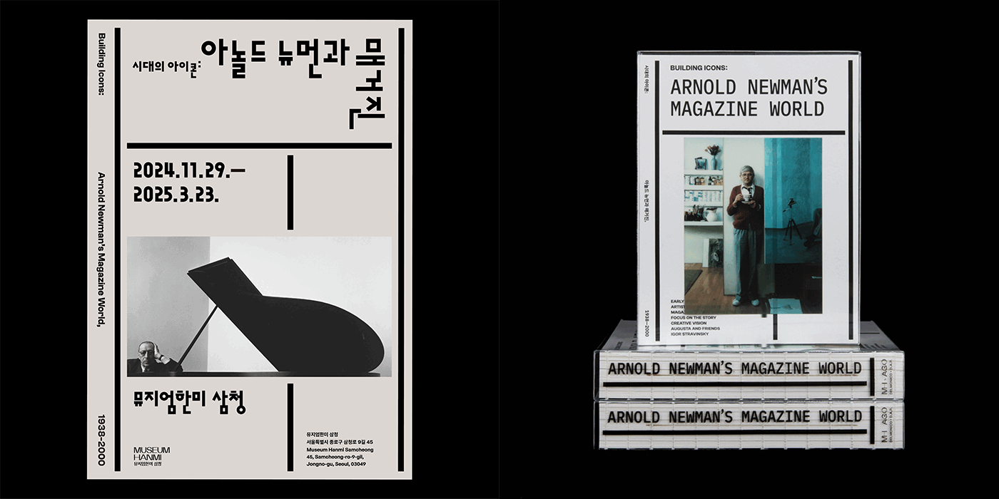
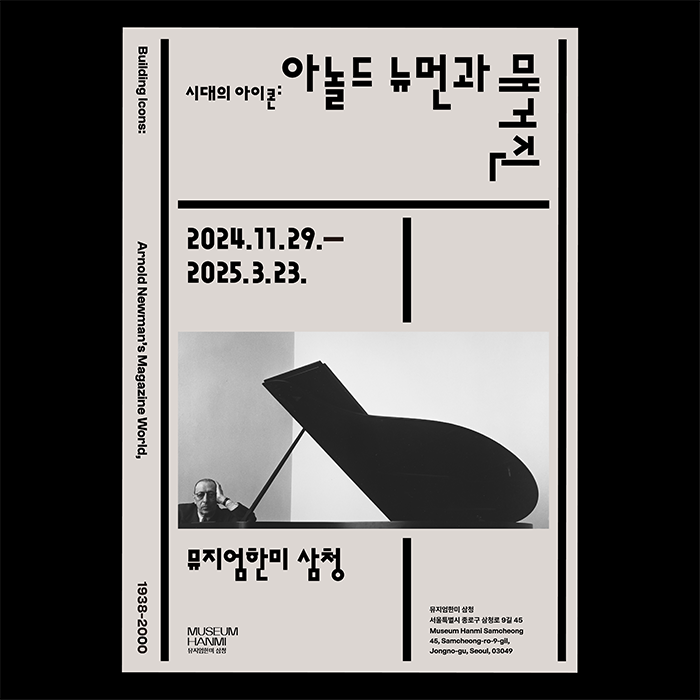
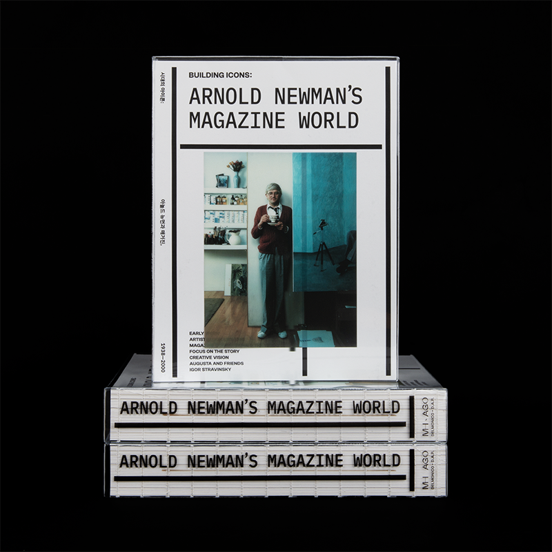
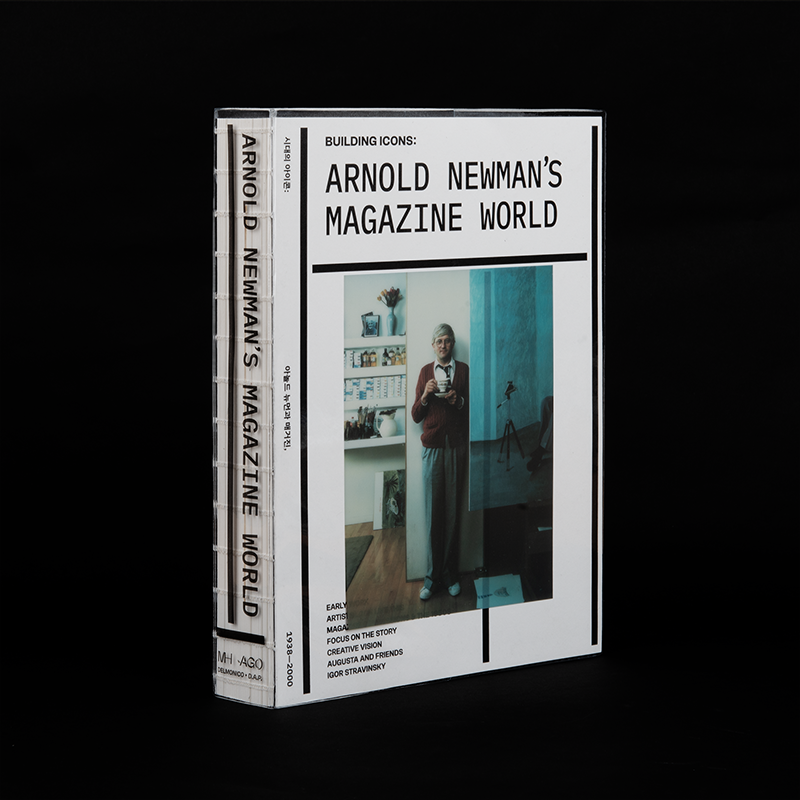
《시대의 아이콘: 아놀드 뉴먼과 매거진, 1938-2000》 전시 브랜드 디자인
뮤지엄한미
2024, 200×260mm, 512p
1/9
2/9
3/9
4/9
5/9
6/9
7/9
8/9
9/9
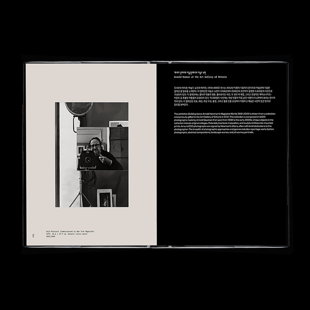
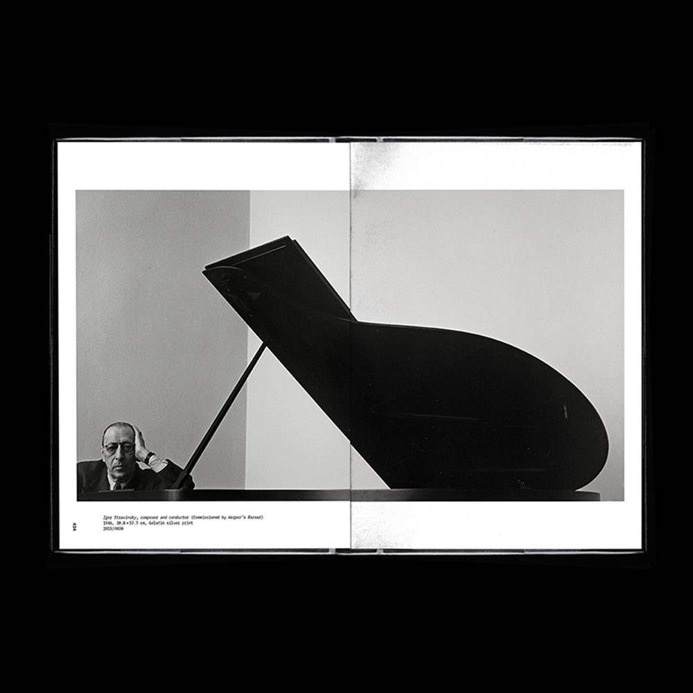
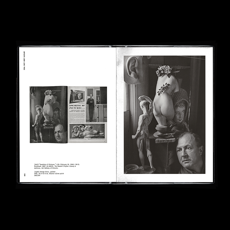
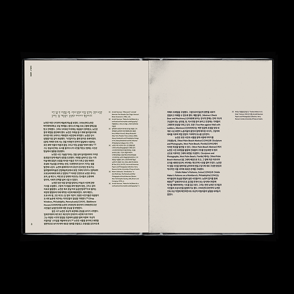
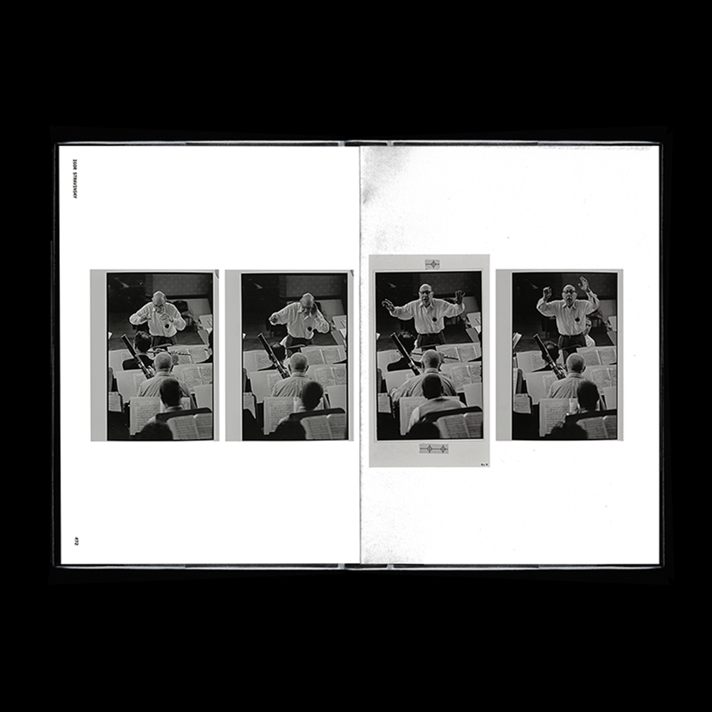
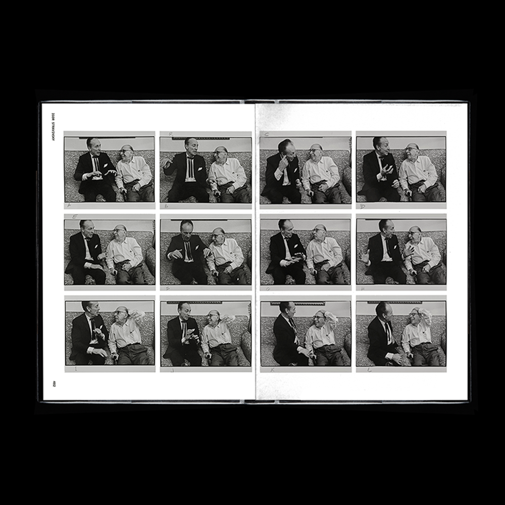
《시대의 아이콘: 아놀드 뉴먼과 매거진, 1938-2000》 전시 브랜드 디자인
포스터 디자인은 뉴먼 작품이 실리던 잡지의 편집 방식과 그리드에서 출발했습니다. 세로 영문 텍스트는 책등처럼 배치해 잡지적 맥락을 드러냈고, 이미지를 그리드 밖으로 확장해 구조적 긴장감을 표현했습니다. 또한 20세기 중후반 한국 잡지의 서체와 조형 언어를 적용해, 당시 시각문화를 현대적으로 재해석했습니다.
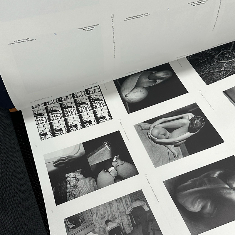
도록 제작에서는 작품 비율을 최적화하고 흑백 사진의 디테일을 살리기 위해 5차례에 걸친 color correction을 진행했습니다. 이를 통해 작품의 원본성을 보존하면서도 디자인과 인쇄 퀄리티를 극대화했습니다.
편집: 김지현 학예연구관
글: 최봉림
번역: 한국외대통번역센터
디자인: 정다슬
인쇄 및 제본: 문성인쇄
AGO Publication Team
Editors: Sophie Hackett, and Tal-Or Ben-Choreen
Managing Editor: Jim Shedden
Publishing Coordinator: Robyn Lew
Content and Productinon Editor: Nives Hajdin-Rorabeck
Photographer: Craig Boyko

1/6
2/6
3/6
4/6
5/6
6/6

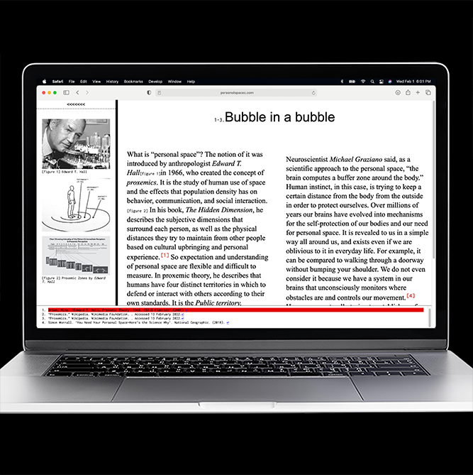
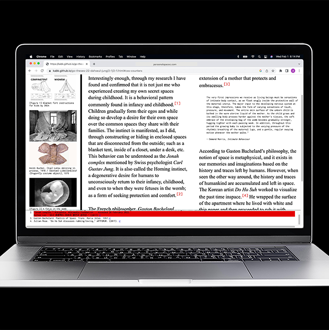
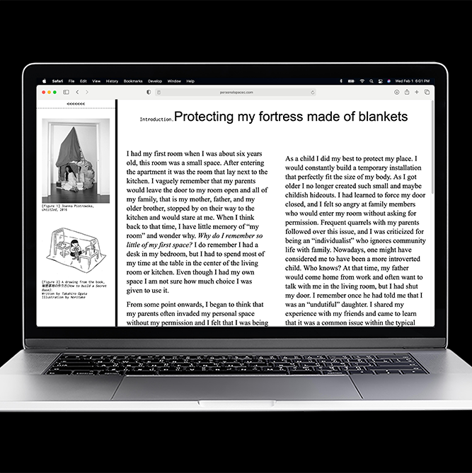
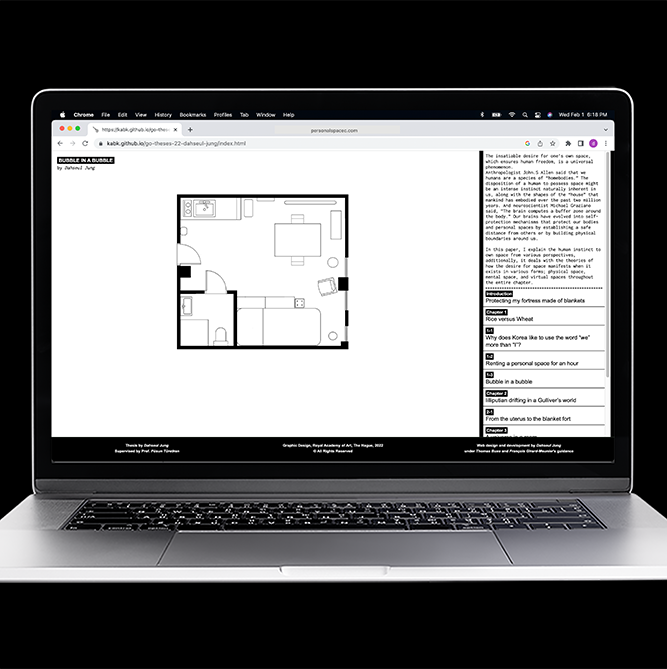
[Web Ver.] Bubble in a Bubble
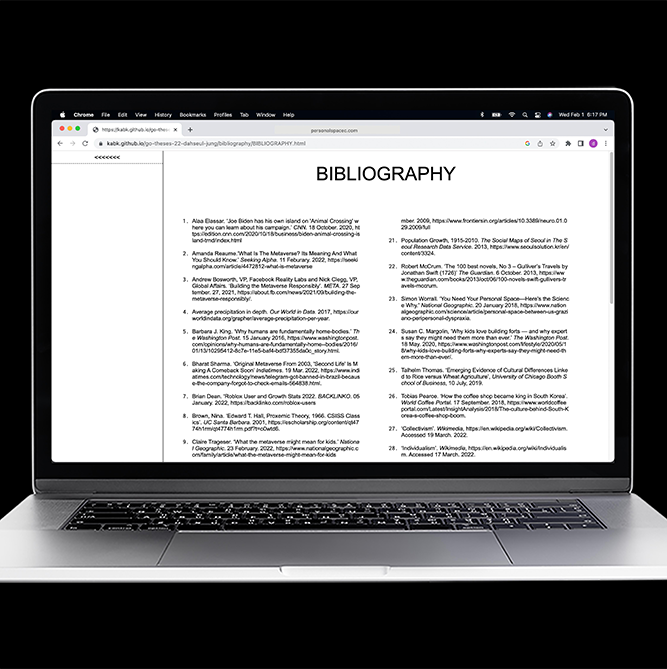
As part of the research for the paper, interviews with people from various social and cultural backgrounds were part of the book to share their perspectives on personal space, and blank questionnaire pages were included in the book to allow visitors to participate and share their thoughts during the exhibition.
Bubble in a Bubble is available in two formats: a book and a website.
1/8
2/8
3/8
4/8
5/8
6/8
7/8
8/8
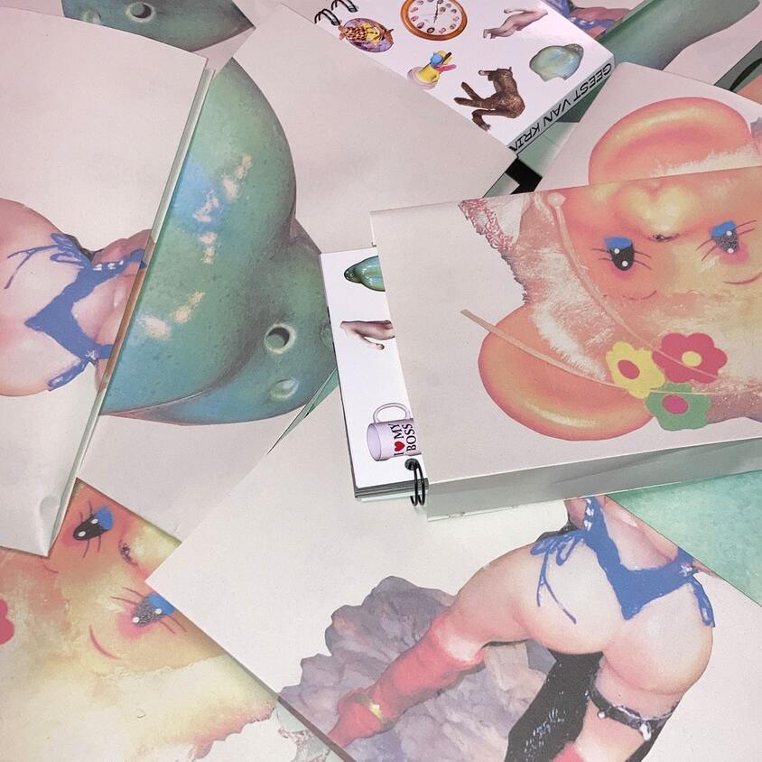
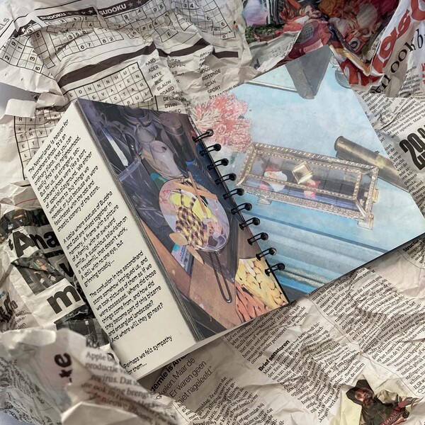
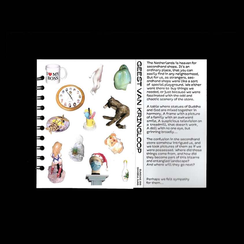
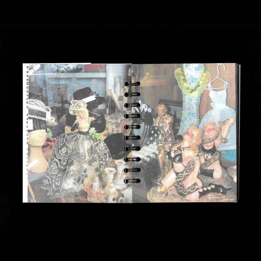
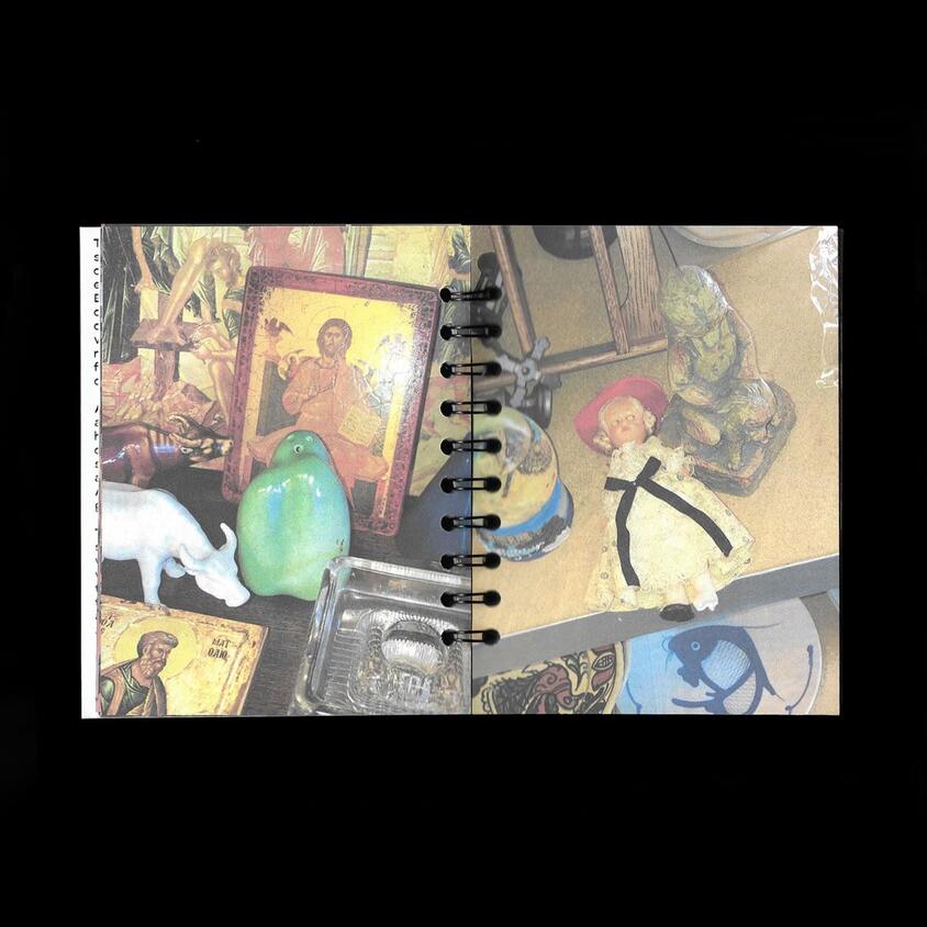
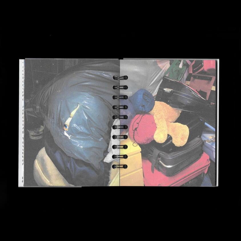
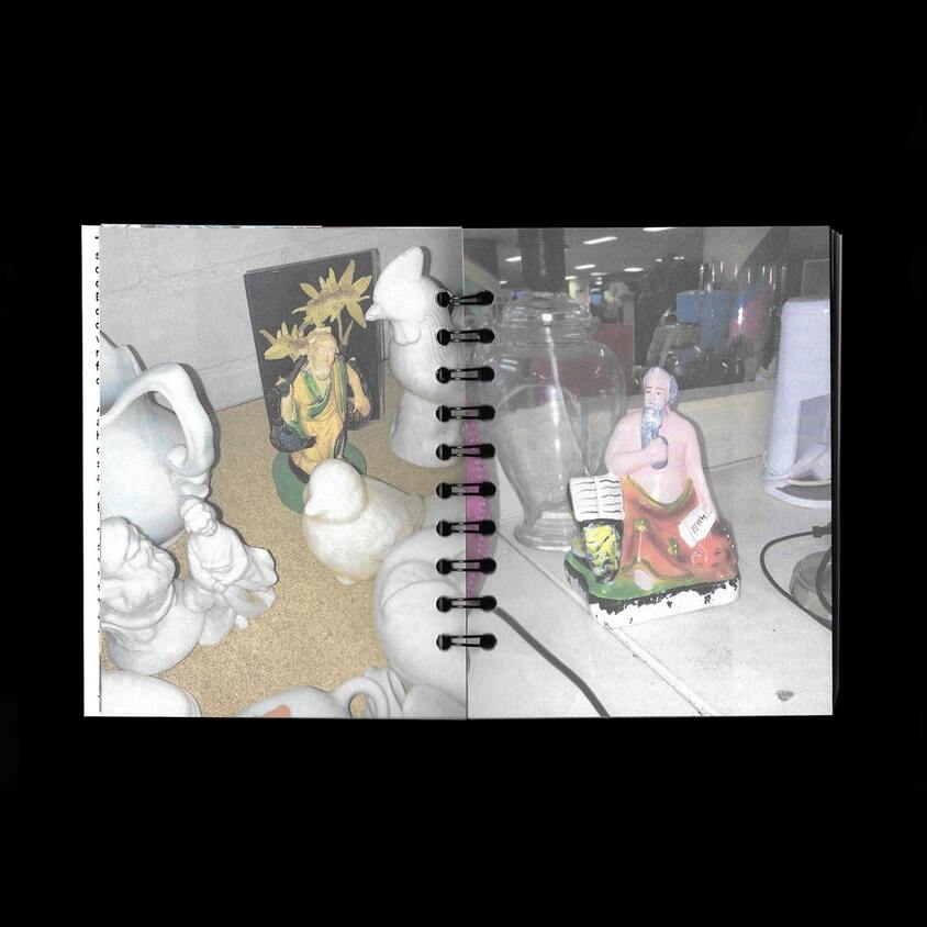
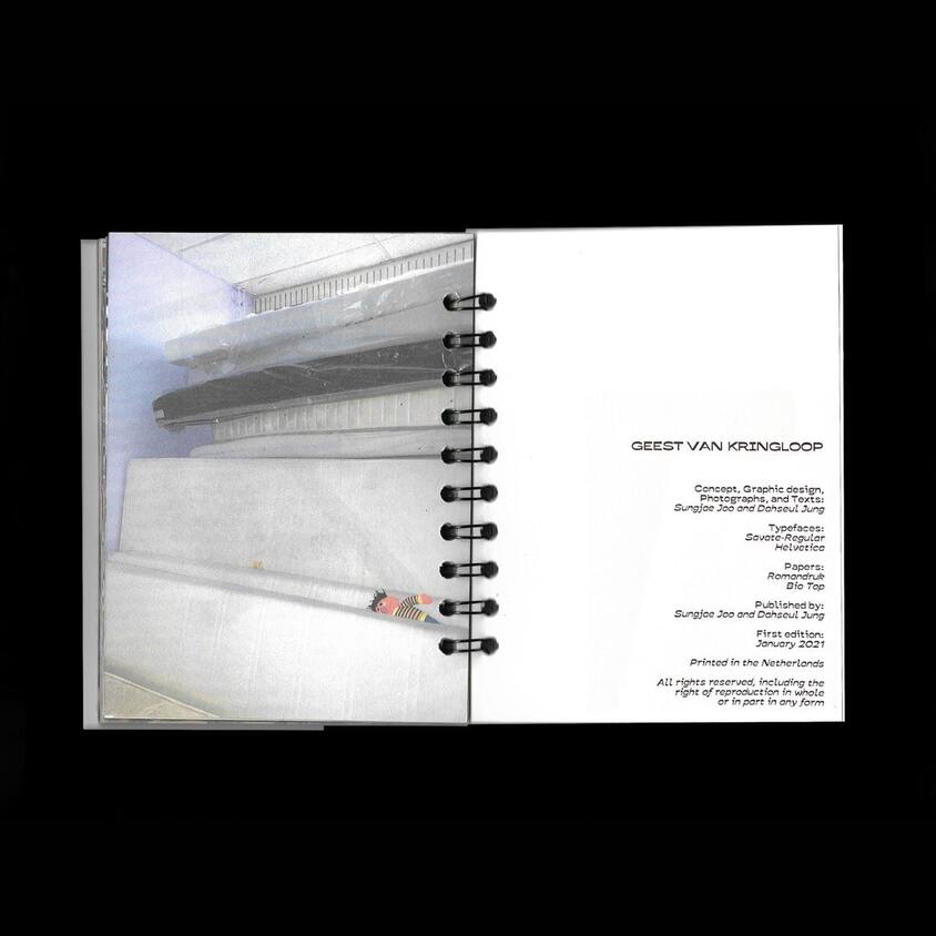
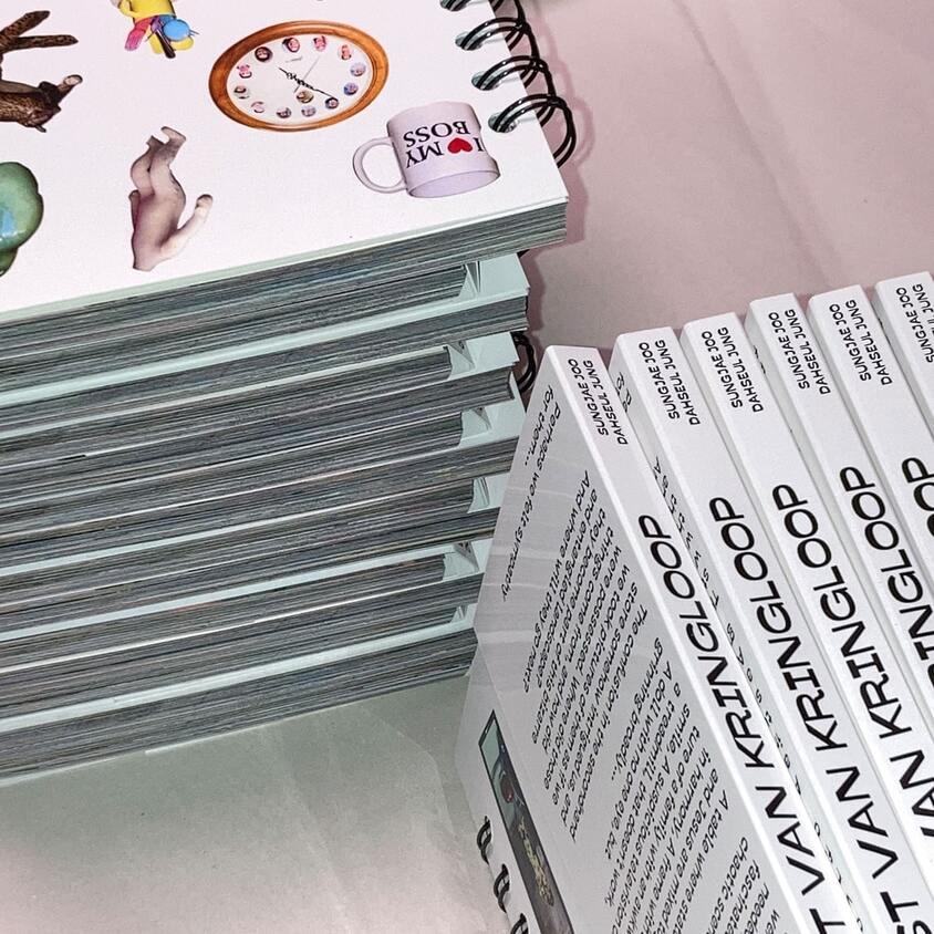
Geest van Kringloop
Self-published a photobook collecting pictures of odd and chaotic scenery of secondhand shops in The Netherlands.
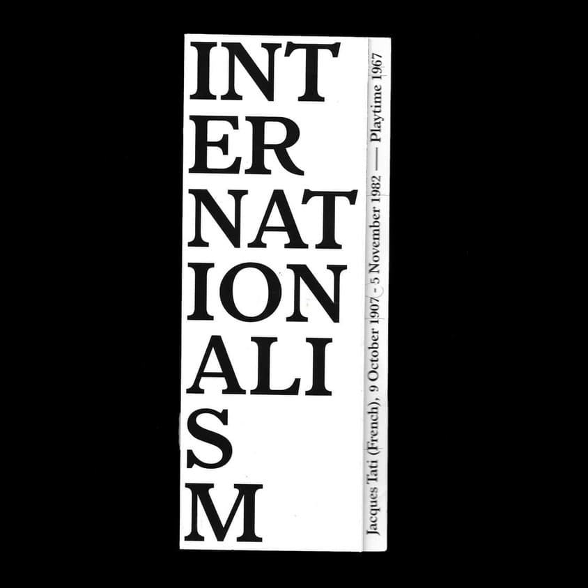
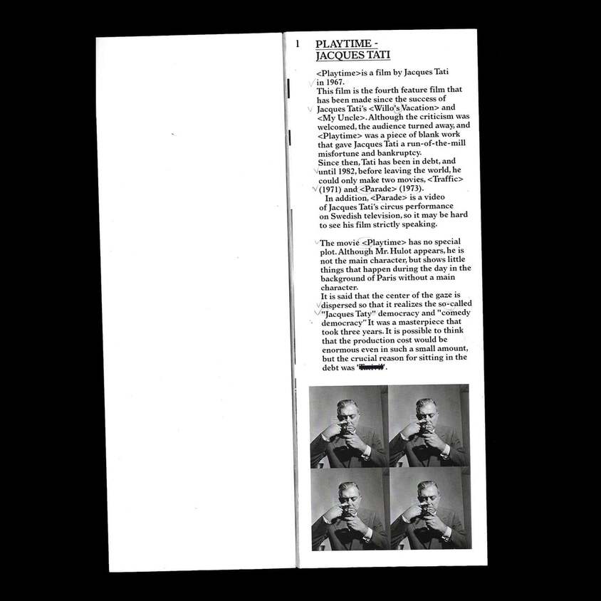
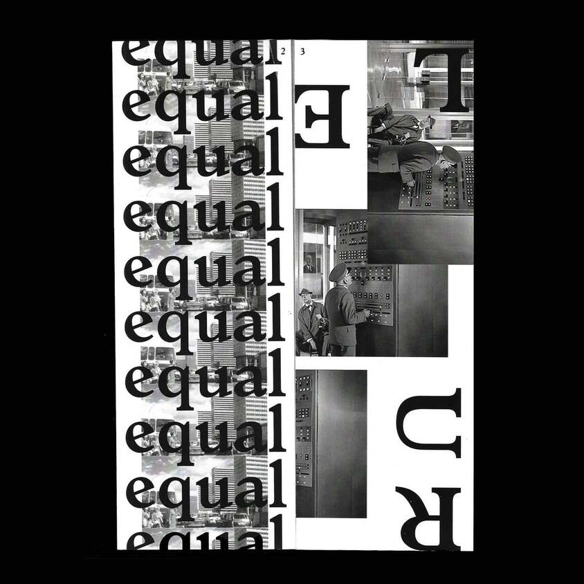
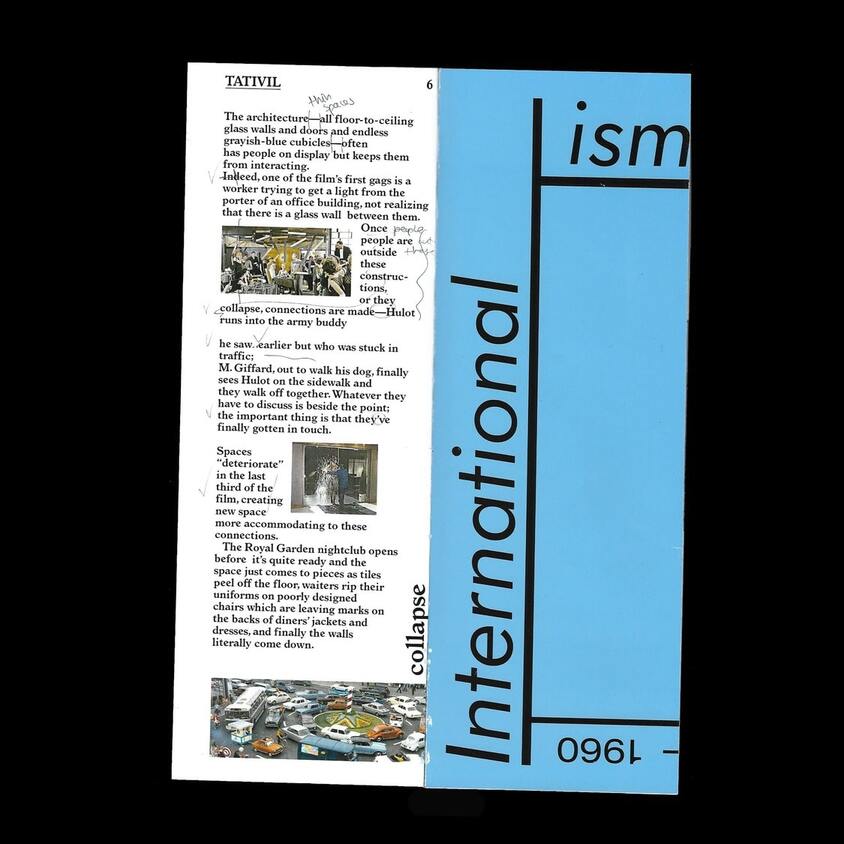
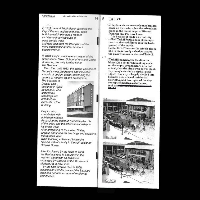
Internationalism: Playtime
2021, 50x70mm

1 / 7
2 / 7
3 / 7
4 / 7
5 / 7

6 / 7
7 / 7
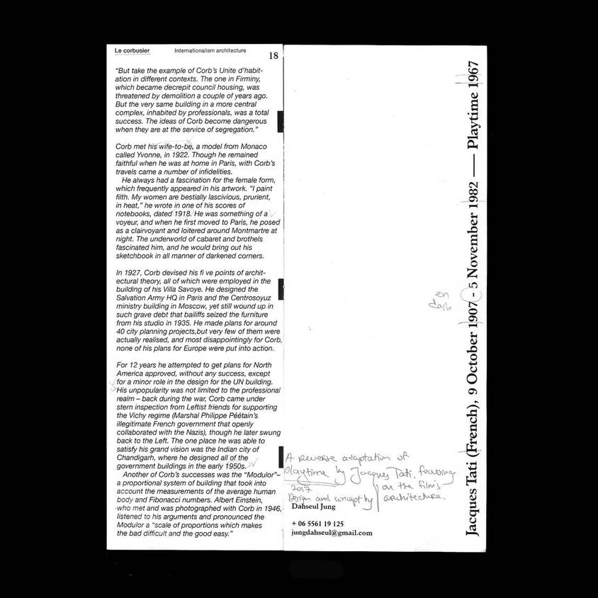
Internationalism: Playtime
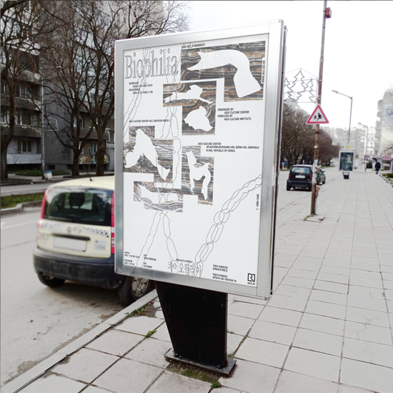
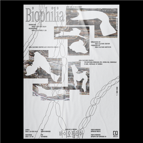
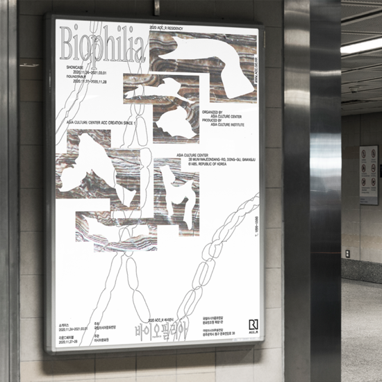
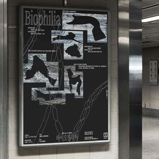
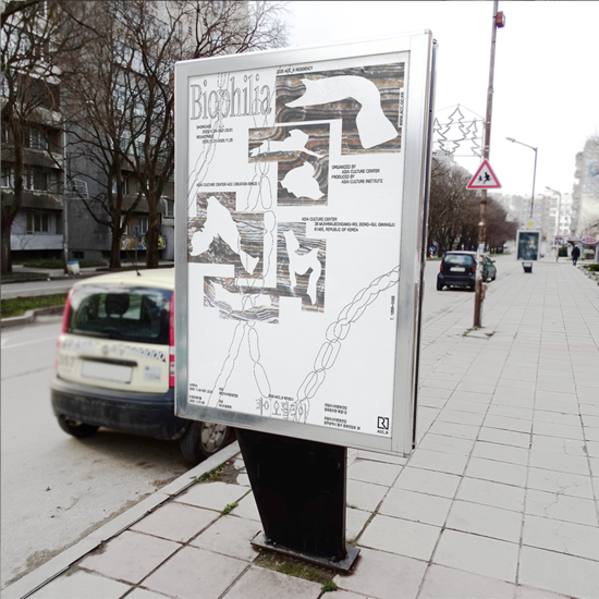
Biophillia
2022
1/4
2/4
3/4
4/4
Biophillia
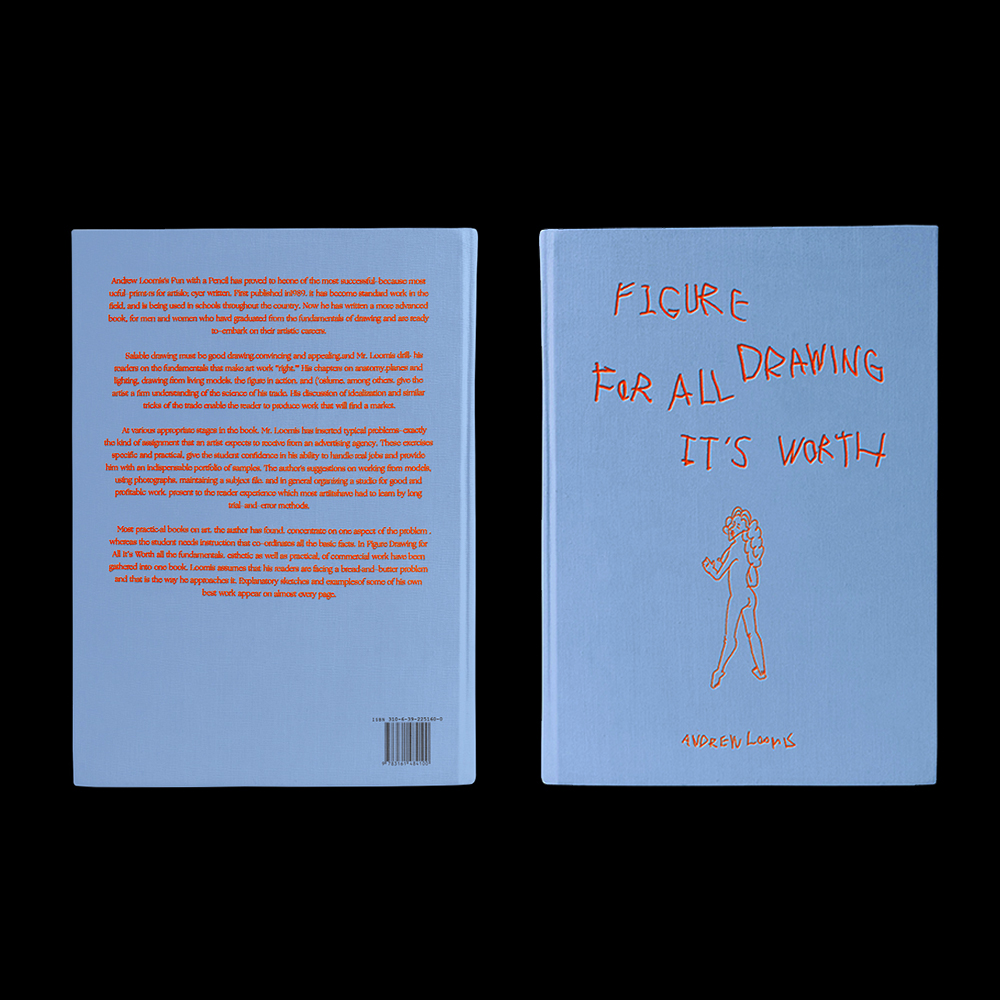
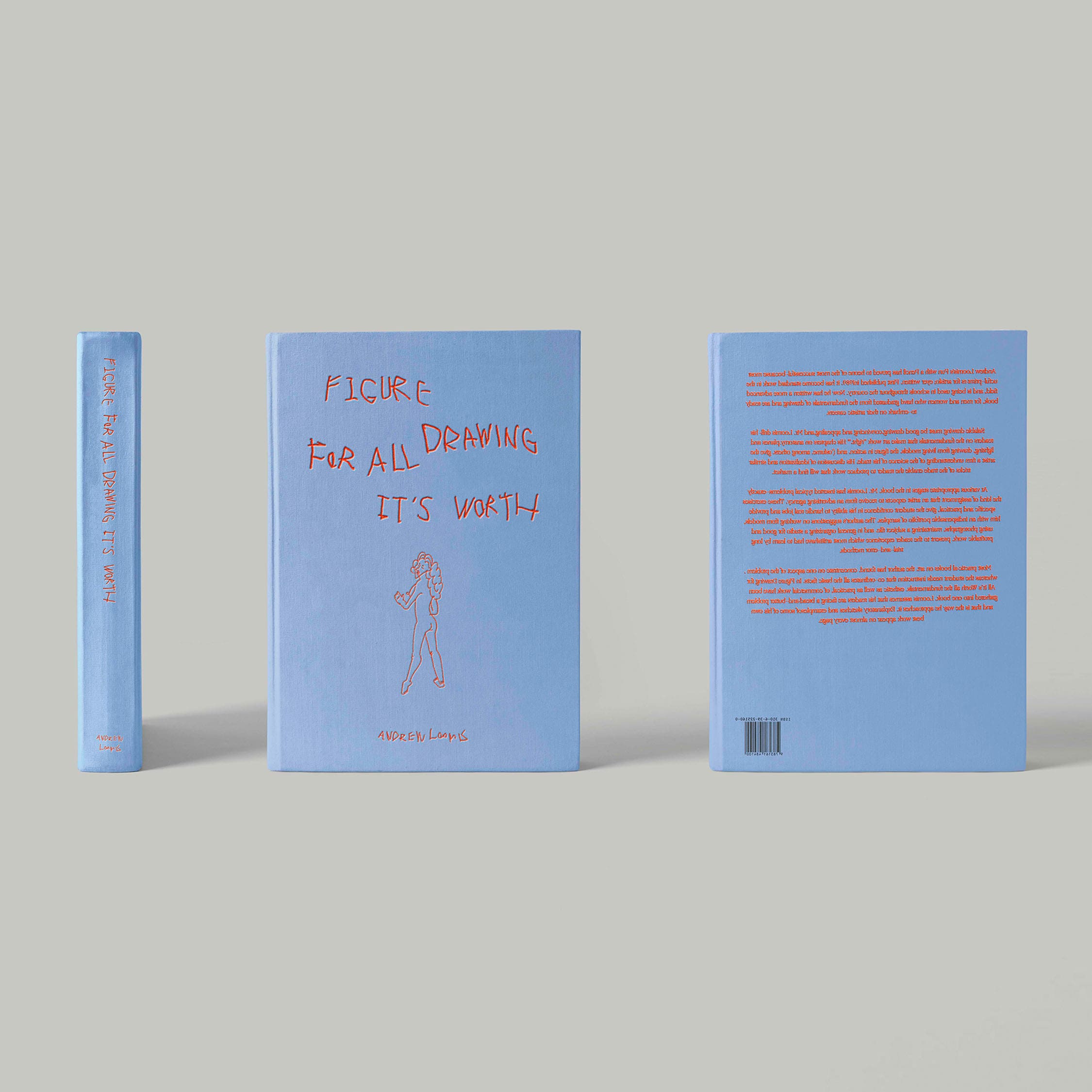
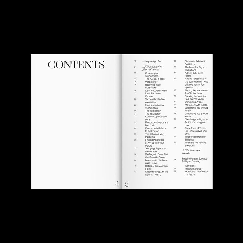
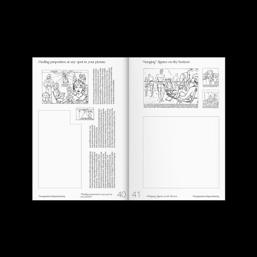
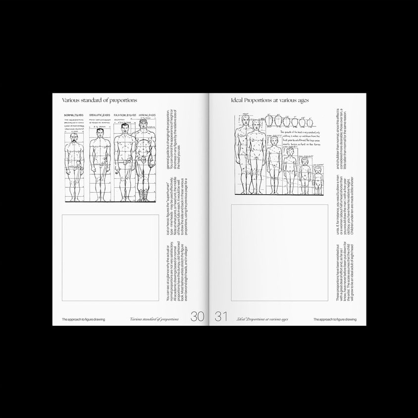
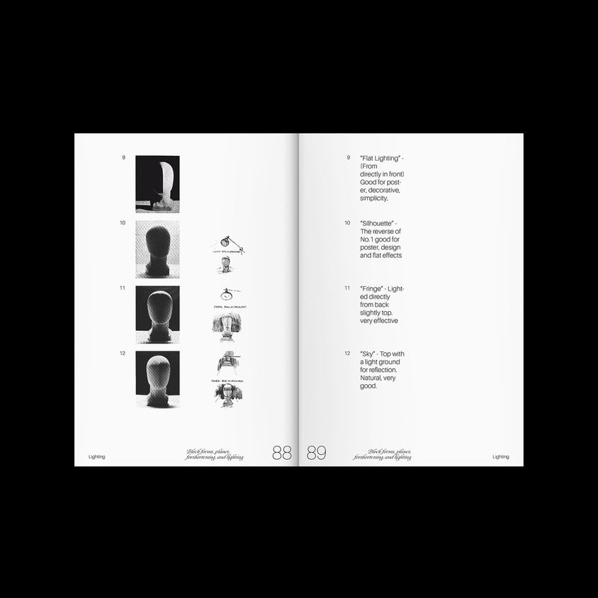
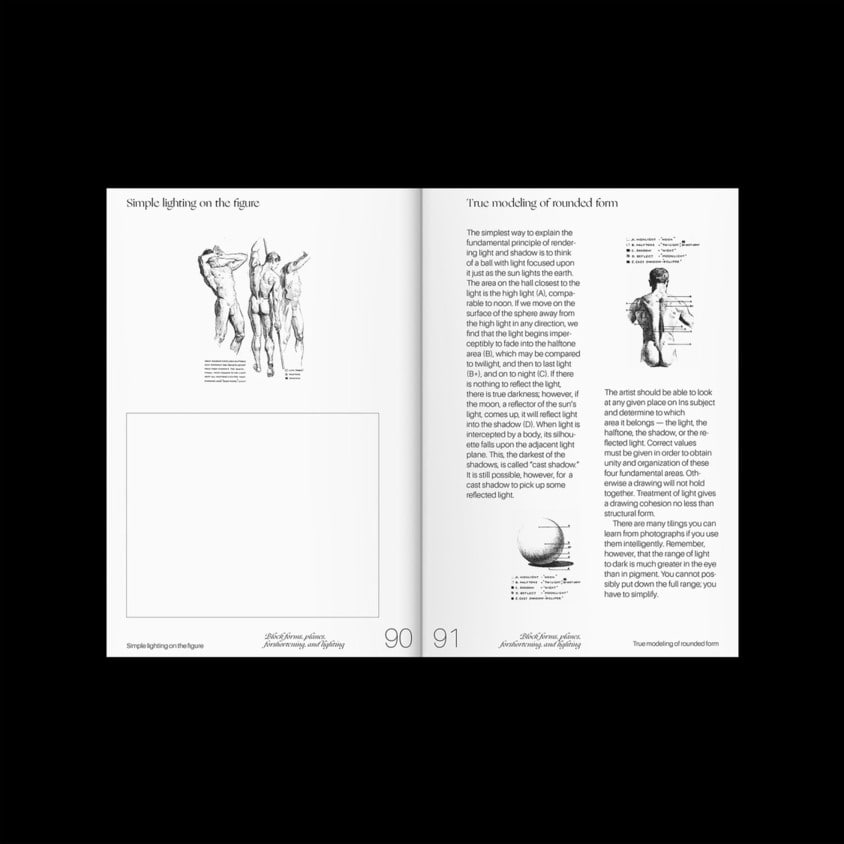
Figure Drawing For All It's Worth
2019, 115x190mm
1/7
2/7
3/7
4/7
5/7
6/7
7/7
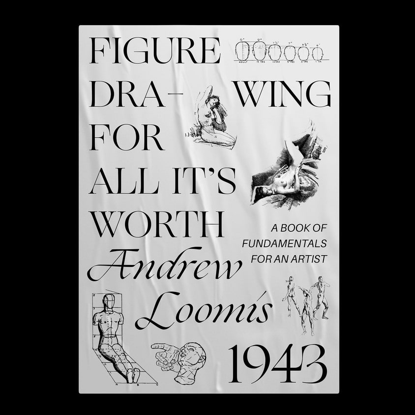
Figure Drawing For All It's Worth
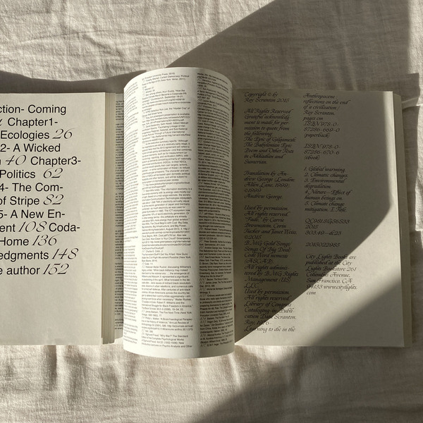
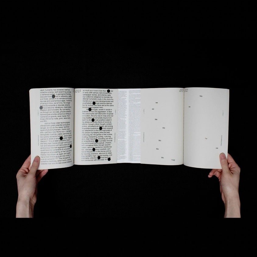
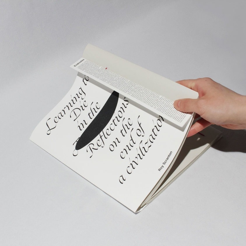
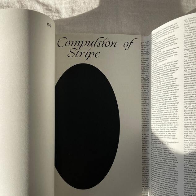
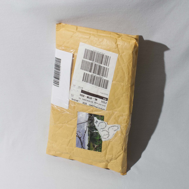
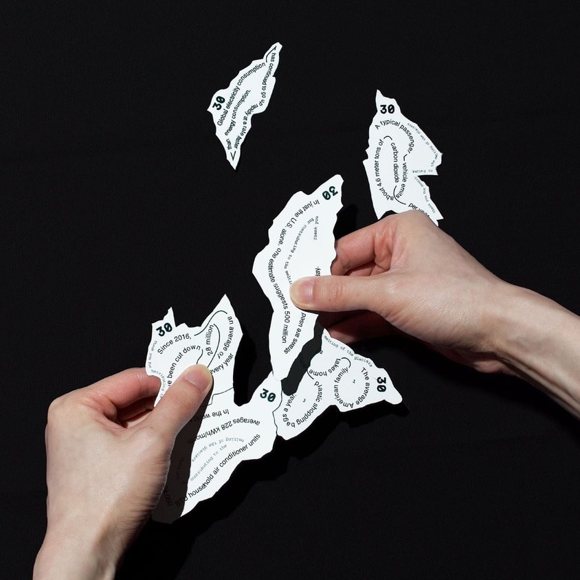
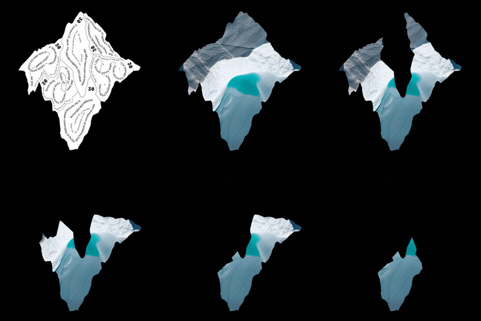
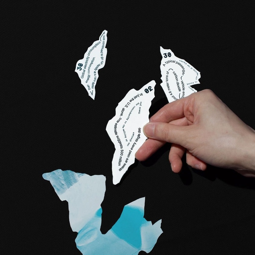
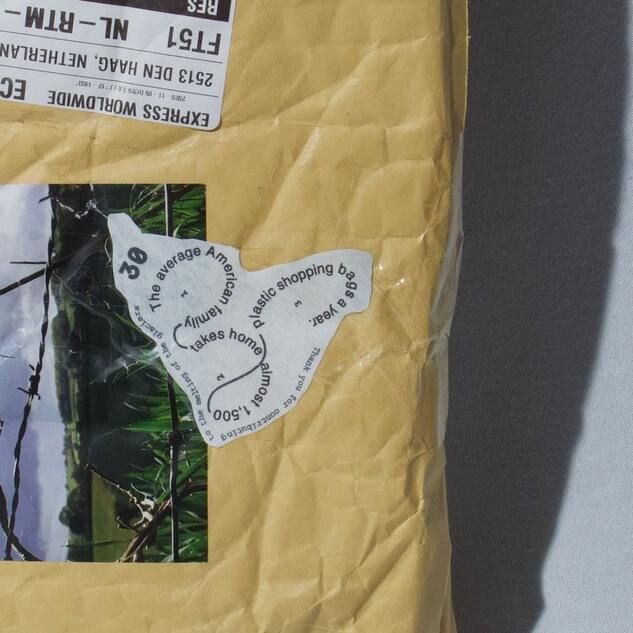
Thanks for contributing to the melting of the glaciers
2020, 140x210mm
1/4
2/4
3/4
4/4
Thanks for contributing to the melting of the glaciers
I highlighted the fact that the glaciers are melting because of human-caused global warning in this project.
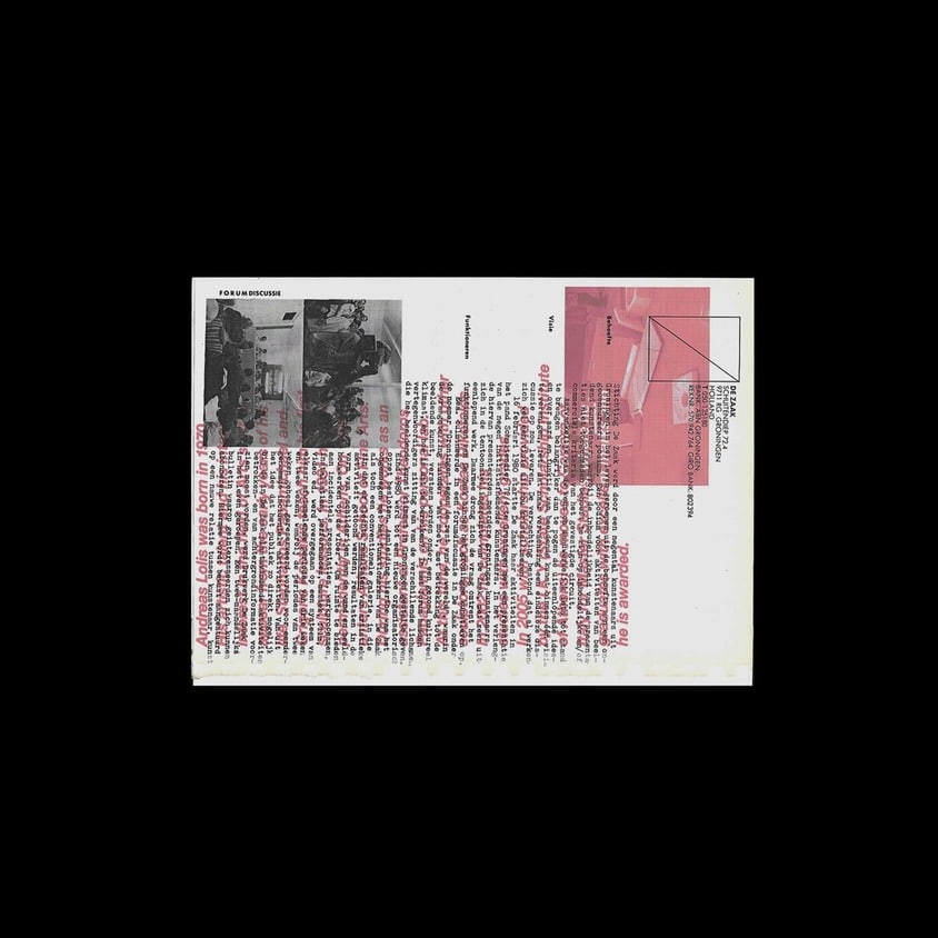
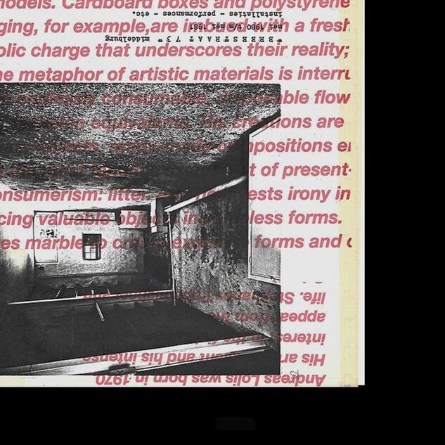
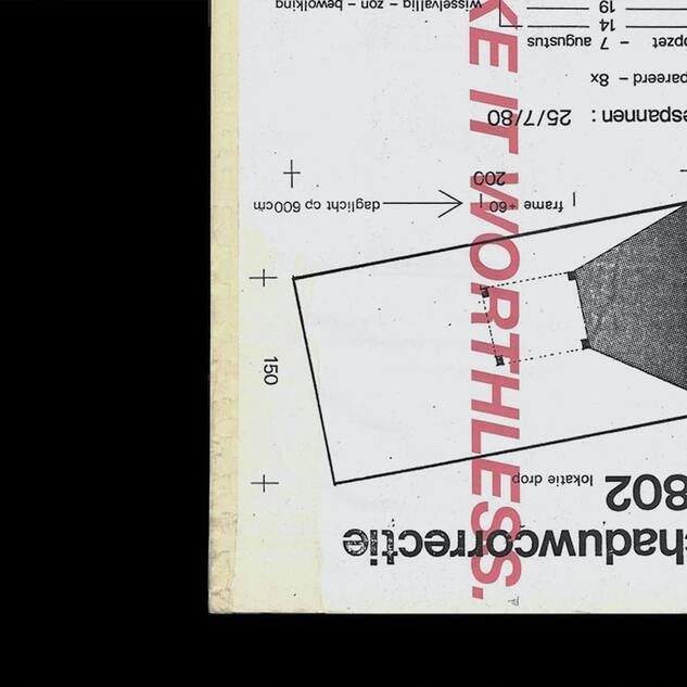
Make it worthless
2018, 140x100mm
1/6
2/6
3/6
4/6
5/6
6/6
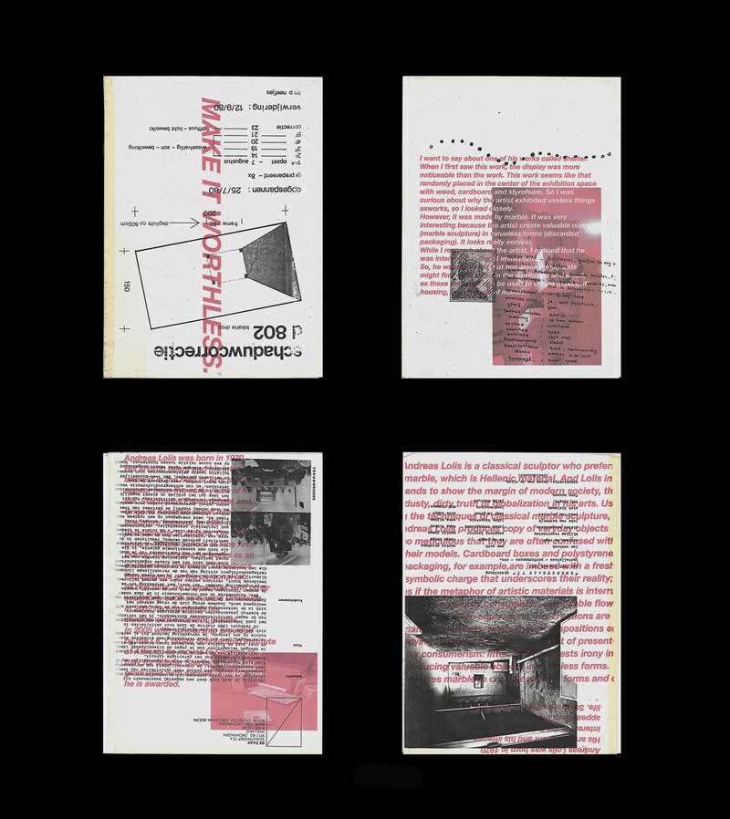
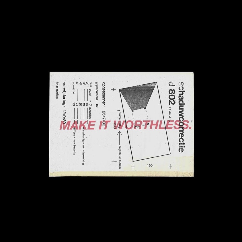
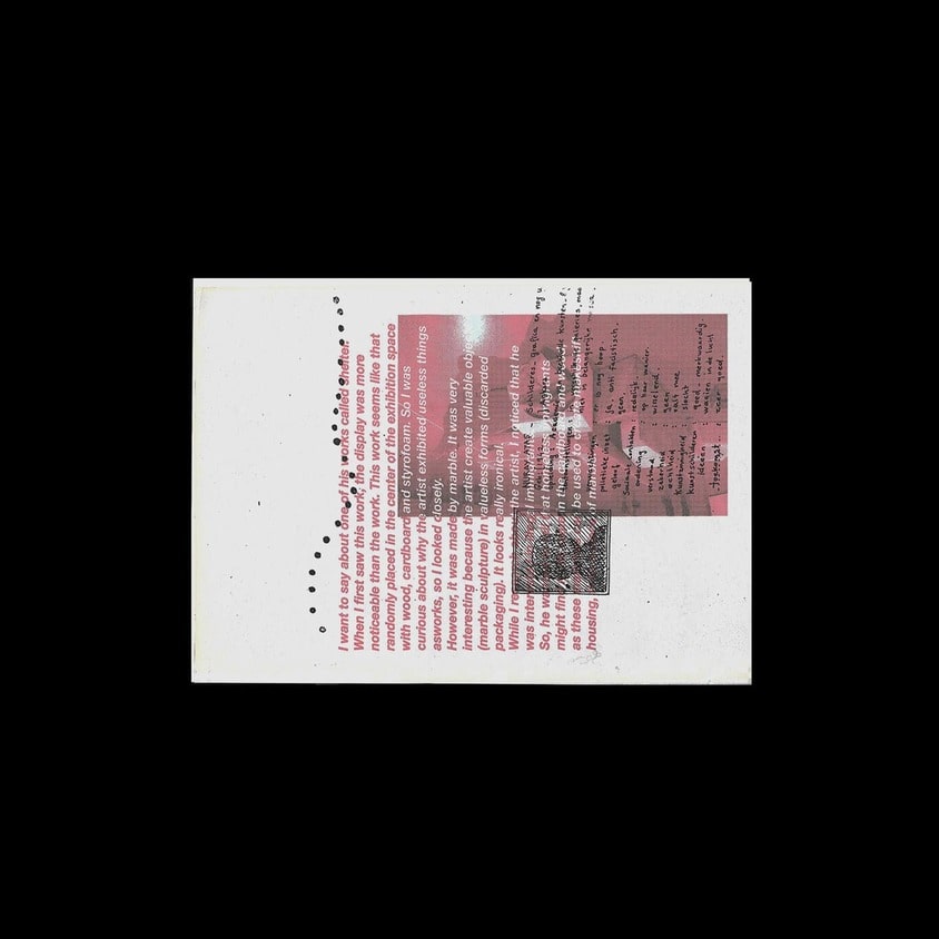
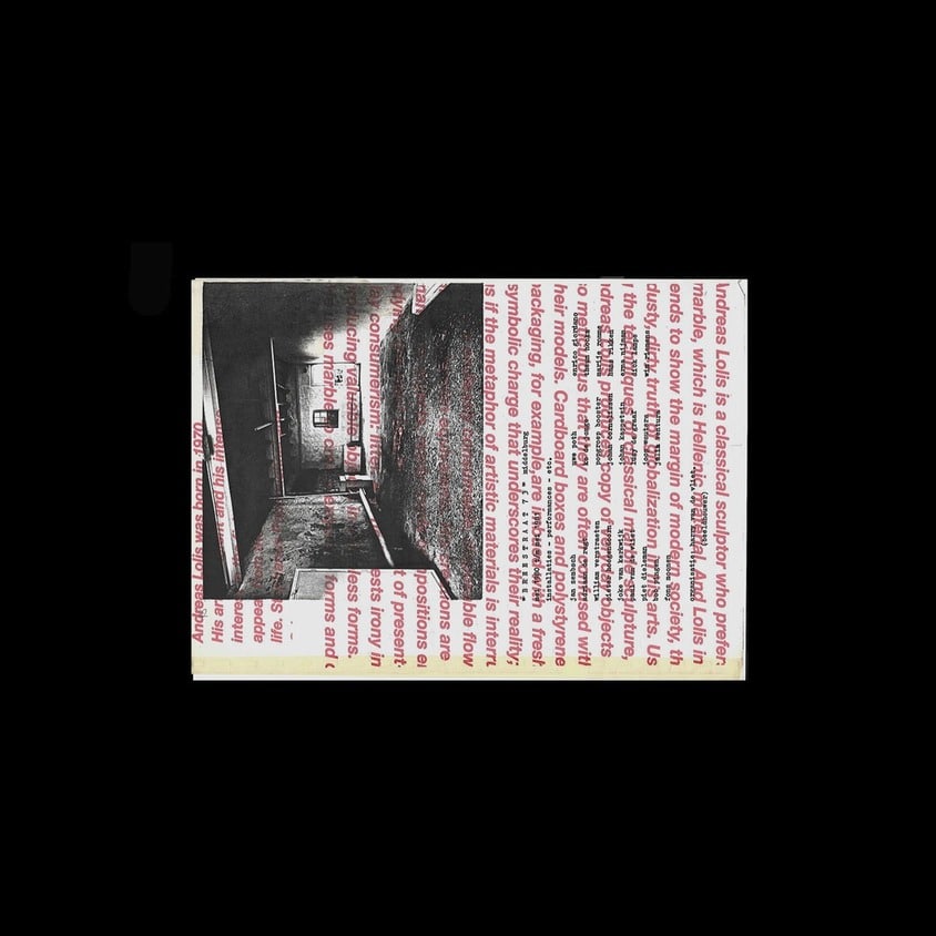
Make it worthless
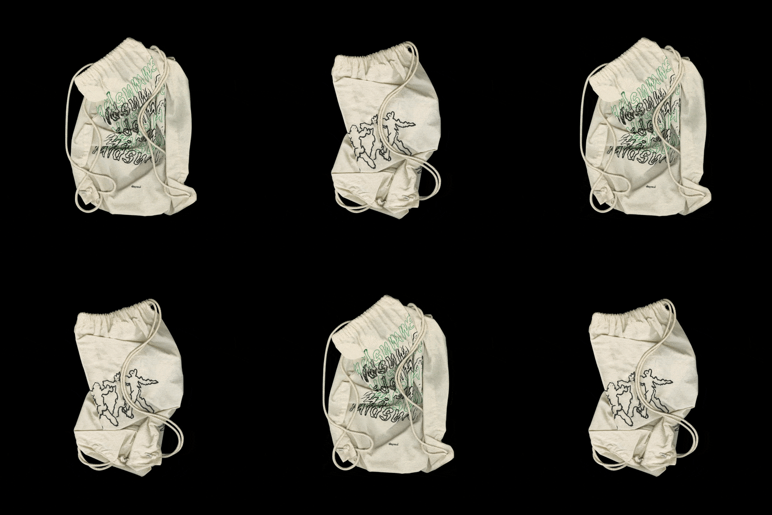
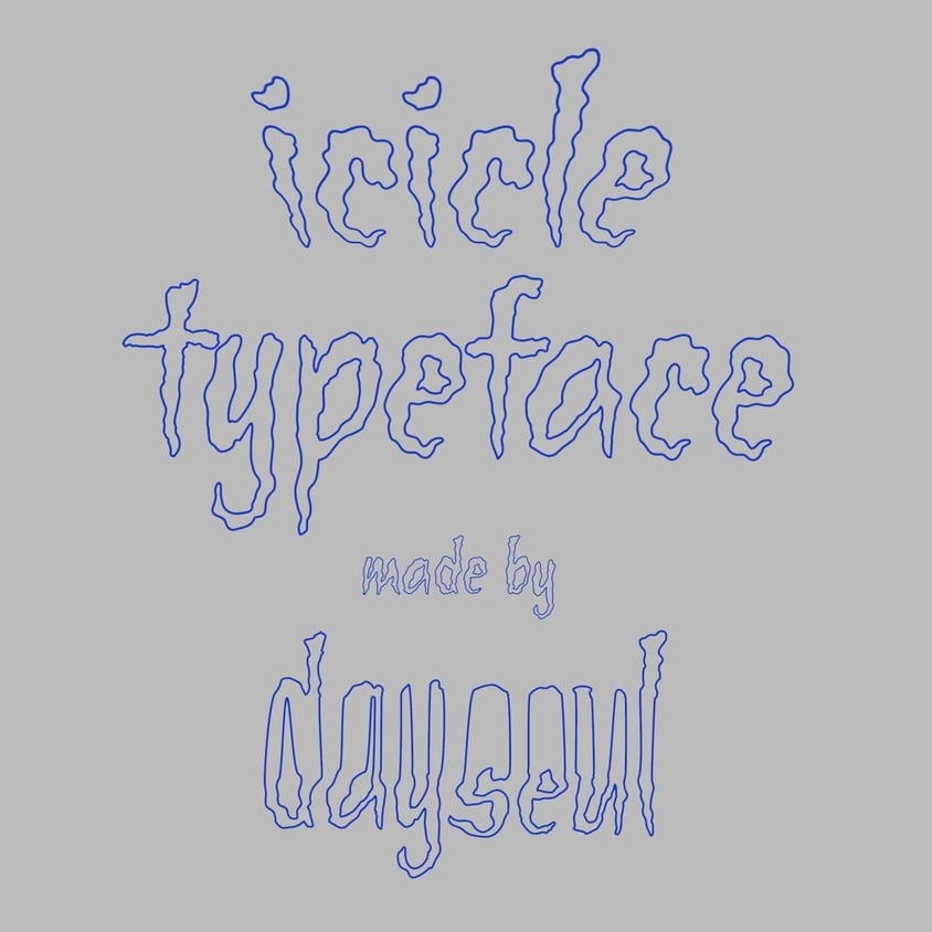
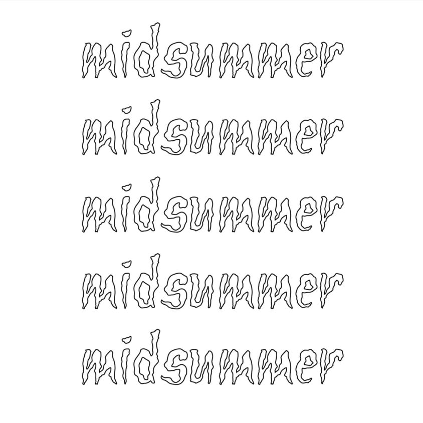
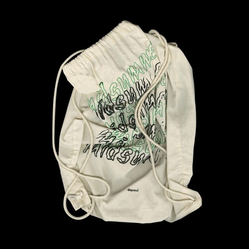
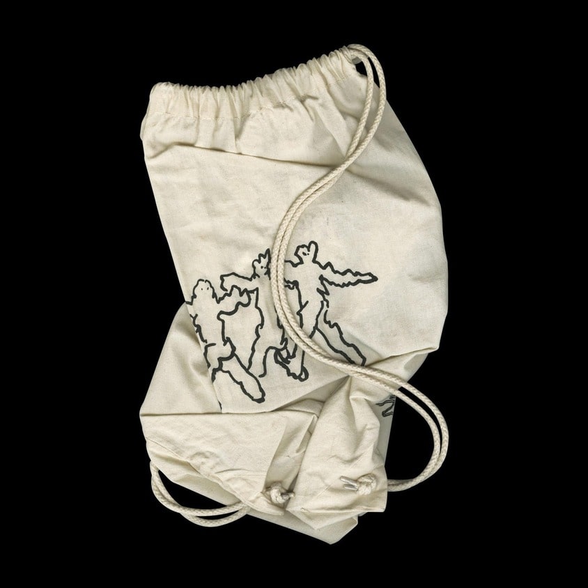
Icicle Typeface
2019
1/4
2/4
3/4
4/4
Icicle Typeface
2019
The era of living on Gaia's stage
2020, 400x400x180mm
1/6

2/6
3/6
4/6
5/6
6/6
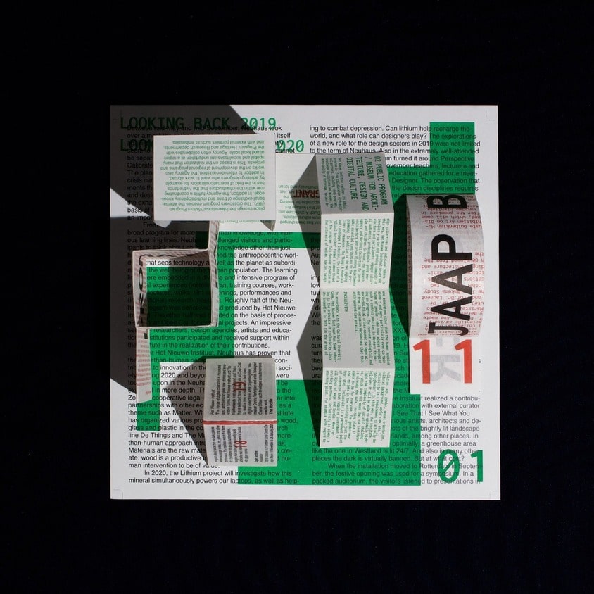
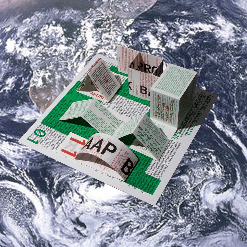
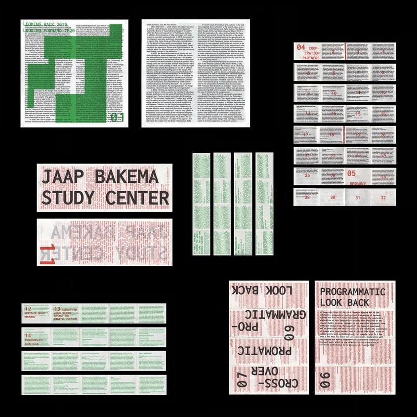
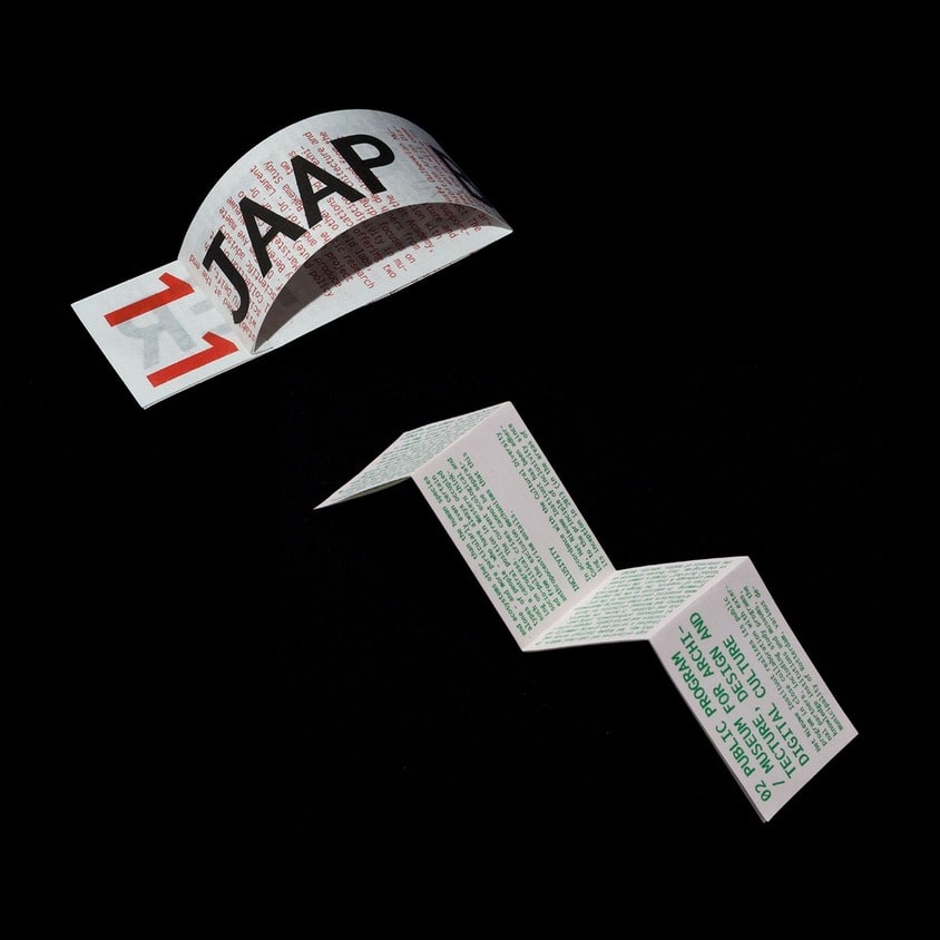
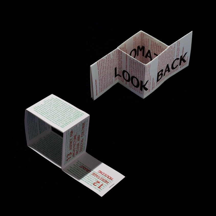
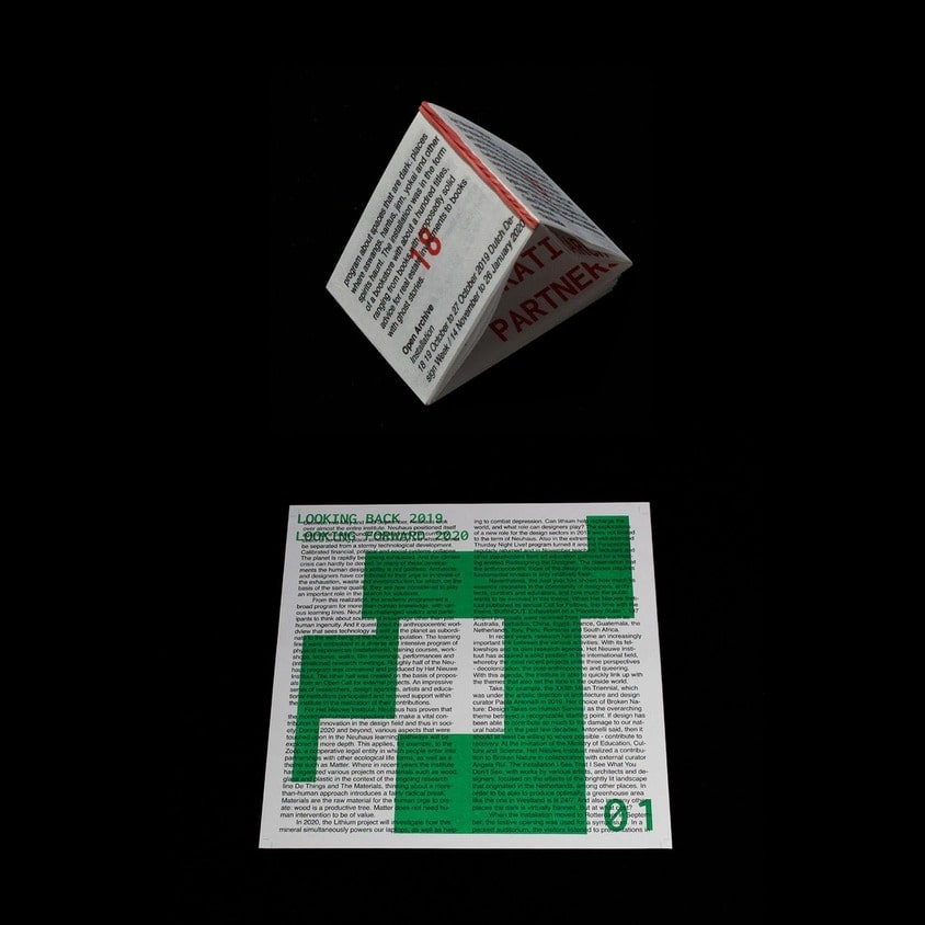
The era of living on Gaia's stage
"We are the only props that play a small role on the stage of Earth."
Human believes that human beings are the most important entity in the university so we interprets the world in terms of human values and experience
However, according to Gaia hypothesis, all of living organisms are self-regulating and have own independent life force, interact with each other to maintain the life of planet, and humans are just one of those organisms.